Presentation font size: Dos and don’ts
- Categories: PowerPoint design , Google Slides
- Comments: 1

It’s no secret that at BrightCarbon we generally recommend keeping text on slides to a minimum . The main reason you need to avoid lots of text in presentations is because it’s virtually impossible to read and listen to someone speaking at the same time. In a presentation, you want to allow the audience to listen to the presenter while looking at an appropriate visual or diagram with minimal words, so that it all comes together seamlessly. Whereas, with documents like reports – while you can create them in PowerPoint – they aren’t presentations; there won’t be anyone talking over them. So you can (and possibly should) have a lot more text.
So, when you are using text in a presentation or document, how do you decide what size it should be? We’ve found there’s no hard-and-fast rule for how big or small text on slides should be. Each presentation has its own unique requirements – it all depends on what you’re using the slides for, what you’re hoping to achieve with them, and how your audience will be viewing them. Accessibility considerations also come into play, as well as readability across different typefaces and devices.

Determining appropriate text size
One way to decide on the right size for your text is to consider the height of each line of text in proportion to the total height of the slide . For example, in a sales or training presentation, the height of the title (per line) should take up approximately 4% of the slide’s total height; headers around 3%; and copy text around 2%.
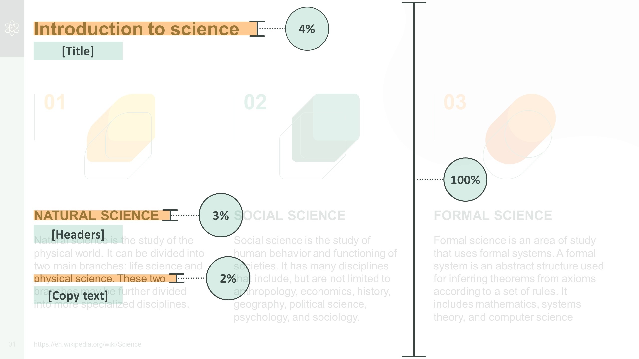
This principle can be applied to text appearing in other types of presentation, too. For example, in a keynote presentation, the height of the text should take up around 6.5% of the slide’s total height. And in a document or report, aim for the height of the title text to take up around 4% of the slide’s total height; headers around 3%; and copy text around 1.5%.
When deciding on the right font size for a face-to-face presentation, it’s also worth considering how close audience members should be seated to the screen in order to be able to read the text easily. Check out presentation expert Dave Paradi’s table on comfortable viewing distances for text in presentation visuals [1] for more on this.
Our text size recommendations
We called upon our team of designers to determine what size they would make the text in a set of example slides. To create the slides, we used PowerPoint’s default widescreen slide size (19.05cm x 33.86cm, or 7.5”13.33”), and Arial – one of the most commonly used fonts.
The examples covered three different use-cases where text is sometimes used:
- A sales or training presentation. Small amounts of text can be used to point out key features and emphasise value and benefits.
- A keynote presentation. You want the audience to focus on the presenter during a keynote presentation, so the amount of text on each slide should be kept to a minimum. This means any text you do use can be much larger.
- A document or report. Text can generally be slightly smaller in stand-alone, static documents like reports, as readers will jump around the page to find the information they’re looking for.
Based on our team’s responses, we’d make the following recommendations:
Use-case 1: Presentation font size for a sales or training presentation
| Titles | 20pt | 28pt or larger |
| Headers | 16pt | 20pt or larger |
| Copy | 12pt | 16pt or larger |
| Callout labels | 12pt | 18pt or larger |
Top tip : As a general rule, aim to keep the number of different font sizes you use across your presentation to a minimum – ideally, no more than three different sizes per slide. And try to use font sizes consistently. For example, if you’ve used 20pt for headers on one slide, make sure headers on other slides are the same size.
Use-case 2: Presentation font size for a keynote presentation
| Body text | 28pt | 48pt or larger |
Top tip : If you’re also using text labels or callouts in a keynote presentation, then make sure the font is slightly smaller than the rest of your text – ideally no smaller than 28pt.
Use-case 3: Font size for a document or report
| Titles | 20pt | 28pt or larger |
| Headers | 16pt | 18pt or larger |
| Copy | 10pt | 14pt or larger |
Top tip : It’s also worth using visual hierarchies to help readers navigate documents like these – check out our blog post for tips on how to do this.
Hopefully, our recommendations help you to decide what size text on your slides should be. Remember, every presentation is different and will have its own individual requirements – for guidance on your particular use-case, get in touch and we’ll be happy to look over your slides. And if you want more help with upping your sales presentations’ font game, have a read of our article packed with typography tips and tricks!
[1] PARADI, D. 2008. Comfortable Viewing Distance for Text on Presentation Visuals [online]. Available from: https://thinkoutsidetheslide.com/wp-content/uploads/2012/08/ViewingDistanceTable16x9.pdf [Accessed 14 November 2022].
Related articles
Linking google slides and google keep.
- Google Slides
If you're using Google Slides regularly then it's worth getting to know how you can integrate it with your other favorite Google Workspace programs - this time, Google Keep!

Productivity tips and tricks for Google Drive
Your friendly neighborhood presentation nerds are back with an all-new article on Productivity tips and tricks for Google Drive to help you optimize your Google Drive experience and get the most out of Google Workspace.

Mastering high-impact conference presentations
- PowerPoint design / Visual communication
Conference presentations are really hard to get right compared to day-to-day presentations. How do you tackle bigger stages, bigger rooms, bigger audiences and higher stakes?

thank you so much that was helpful
Leave a Reply Cancel reply
Save my name and email in this browser for the next time I comment.
Join the BrightCarbon mailing list for monthly invites and resources
First of all the deck looks great, once again you guys have done an outstanding job. Second, I’d like to comment on the quality of the training provided by your colleagues - quite simply it was exceptional. I have spoken to the whole team and that view is unanimous. Please pass this on. James Bagan MyLife Digital

Choosing the Best Font for PowerPoint: 10 Tips & Examples
There’s a fine art to creating a great PowerPont presentation that wows. With so many tricks and features in this little bit of software, it’s more likely to see a bad presentation than a good one (and you don’t want to be that person!)
While there are a lot of factors that contribute to the overall design , choosing a suitable font for PowerPoint is near the top of the list. The audience needs to be able to read the words on the screen with ease, to ensure that your presentation is as effective as possible.
So how do you do it? Where do you start when choosing a font for PowerPoint? We have 10 tips for you with a few examples of PowerPoint slides (and templates) that will impress your audience.
How Does Unlimited PowerPoint Templates Sound?
Download thousands of PowerPoint templates, and many other design elements, with an Envato membership. It starts at $16 per month, and gives you unlimited access to a growing library of over 19+ million presentation templates, fonts, photos, graphics, and more.
Business PPT Templates
Corporate & pro.
Modern PPT Templates
New & innovative.

Mystify Presentation
Explore PowerPoint Templates
1. Stick to Fairly Standard Fonts
One of the most fun parts of a design project is getting to sift through fonts and make selections that fit your project. When it comes to PowerPoint, that selection should be pretty limited.
To make the most of your presentation, stick to a standard font to ensure that your presentation will look the same everywhere – and on every computer – you present. If you don’t use a standard font, chances are when you pop the presentation in a new machine, you’ll end up with a jumbled mess of lettering. PowerPoint will try to replace all the fonts it does not recognize with something else.
This can cause readability concerns and even make the presentation look like it’s error-filled (with words that are in odd locations or even missing).
10 standard fonts to try:
2. Incorporate Plenty of Contrast

White and black text is easiest to read. But no type is readable without plenty of contrast between the background and text itself.
Regardless of what font you select, without adequate contrast, readability will be a concern. Opt for light type on a dark background or a light background with dark text.
Consider the environment here as well. Do you plan to show the presentation on a computer monitor or big presentation screen? How these conditions render can impact how much contrast your color choices actually have.
3. Use a Serif and a Sans Serif
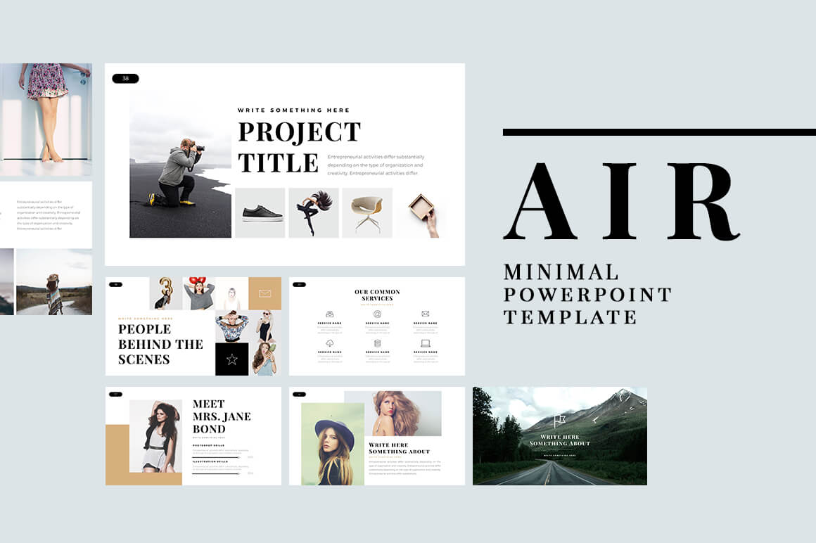
Most presentations use two fonts.
- Header font for headlines on each slide.
- Copy or bullet font for supporting text.
You don’t have to use the same font in each location. It’s actually preferred to select two different fonts for these areas of the presentation. For even more impact pair two different fonts, such as a serif and sans serif, so that the font change creates an extra level of contrast and visual interest.
4. Avoid All Caps
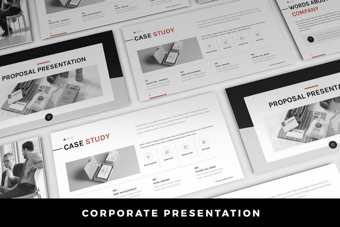
When picking a font, stay away from fonts that only include capital letter sets. All caps in presentations have the same effect as all caps in an email. It feels like you are yelling at the audience.
All caps can also be difficult to read if there are more than a couple of words on the screen. Use all caps as sparingly as possible.
5. Stay Away From Scripts and Italics
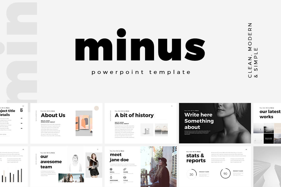
While scripts, handwriting and novelty typefaces might be pretty, they are often difficult to read. Avoid them in PowerPoint presentations. (There’s usually not enough contrast or size to help them maintain readability from a distance.)
The same is true of italics. Anything you do to a font to add emphasis should make it easier to read. While italics can be a great option online or in print applications, presentations come with a different set of rules. The biggest contributing factor is that text often has to be read from a distance – think about audience members in the back of the room – and any slanting can make that more difficult.
6. Make It Big Enough
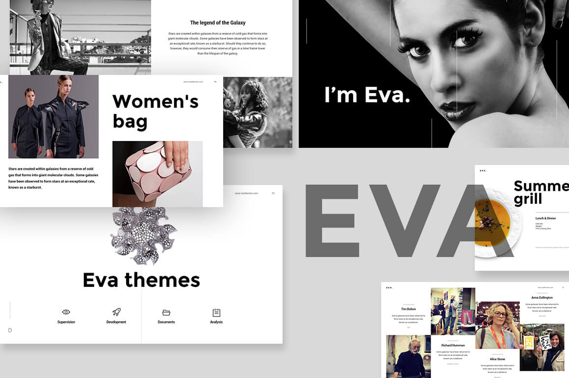
One of the biggest issues with fonts in slideshows is often size. How big should the text in a PowerPoint presentation be?
While a lot of that depends on the font you decide to use, there are some guidelines. (These sizes work wonderfully with the 10 fonts options in top No. 1. As well.)
- Minimum font size for main copy and bullets: 18 points
- Preferred font size for main copy and bullets: 24 points
- Preferred font size for headers or titles: 36 to 44 points
Make sure to think about the size of the screen and room as well when planning font sizes. With a smaller screen in a larger space, everything will look smaller than it is. The opposite is true of an oversized screen in a small room. Think Outside the Slide has a great font cheat sheets for a number of different screen sizes.
7. Turn Off Animations

Don’t let all those PowerPoint tricks suck you in. Moving text, zooming words, letters that fly in from the side of the screen – they are all difficult to read. And really distracting.
If you want to use an effect, “Appear” is acceptable. But there’s no need to dazzle the audience with crazy font tricks. All this really does is distract people from what you are really trying to say.
The same mantra that we use with all other design projects applies here as well – KISS or Keep It Simple, Stupid.
8. Plan for Sharing

While many users work with PowerPoint regularly, chances are that you’ll be asked to share your presentation slides for others. This includes posting with tools such as SlideShare, emailing the PowerPoint (or putting it in a drop folder) or sharing via Google Slides.
When it comes to fonts, Google Slides is the most complicating factor because it has a different suite of standard fonts than PC or Mac operating systems. Make sure to test the presentation in this environment if you plan to share and use a Google standard font or make sure to include the font you plan to use in the customization options.
9. Think About the Notes, Too
The part of PowerPoint presentations that is often neglected is the notes section. If you plan to distribute a presentation file to the audience (digitally or via printouts), the font selection for accompanying notes is important.
Use the same typeface as for the main slideshow with related corresponding headers and body and bulleted text. The big difference here is size. Body copy/bulleted information should fall in the range of 9 to 12 points and headers should be 18 to 20 points. This is a comfortable reading size for most documents. (These sizes also help ensure clear printing on standard office machines.)
10. Use Fonts Consistently

You don’t need a huge font library to create great PowerPoint presentations. Having a couple of go-to fonts that you use consistently is enough.
Make sure to use fonts consistently within a document as well. Create a PowerPoint template file so that when you use different levels of bulleting and headers, the sizes, color variations, and fonts change automatically. (Web designers, this is just like using H1 through H6 tags.)
A clear consistent use of fonts makes your presentation about how it looks and how easy (or tough) it may be to read and more about the content therein. (And that’s what it should be about.)
If you don’t feel comfortable making your own PowerPoint presentation template, you can download one to get started. These options might have a more refined look than some of the software defaults (and all of the examples in this article come from these collections).
- 25+ Minimal PowerPoint Templates
- 20+ Best PowerPoint Templates of 2018
- 60+ Beautiful, Premium PowerPoint Presentation Templates
The Essential Guide to Font Size in Presentations: Finding the Perfect Balance
Master the art of font size in presentations to enhance readability and engagement with this essential guide.
Understanding the Importance of Font Size in Presentations
Impact on readability.

Audience Engagement
Professional appearance.

Determining the Ideal Font Size
Minimum font size: a rule of thumb, factors influencing font size choice.
- Distance of the Audience : The further away the audience, the larger the font required.
- Room Size and Layout : Larger rooms and unusual layouts may necessitate bigger fonts to accommodate viewing from all angles.
- Screen or Projector Size : The size and quality of the screen or projector also affect how small you can go with your font size.
- Content Density : Slides heavy with text need careful consideration to balance font size and content.
Minimum Font Sizes for Different Settings
Seminars and workshops, conferences and large halls, virtual meetings and webinars, font size tips for specific presentation elements, headings and titles.

Footnotes and References
Enhancing readability beyond font size, font style and weight, contrast and background, line spacing and margins, minimalistic slide design, create ppt using ai.
Just Enter Topic, Youtube URL, PDF, or Text to get a beautiful PPT in seconds. Use the bulb for AI suggestions.
character count: 0 / 6000 (we can fetch data from google)
upload pdf, docx, .png
less than 2 min
Mehjabi Khan
How to Apply and Save All Changes to a Presentation in PowerPoint
31 July 2024
The Importance of Using Hook Lines in a Presentation
What Slides to Include in a Business Proposal Presentation: A Detailed Guide
Canva vs Google Slides: Which is the Best Presentation Maker and Why?
Role of Body Language in Giving a Presentation
Why is it Important to Use Color When Preparing a Presentation Aid?
How to Present Quotes in a Presentation
29 July 2024
How to Present Statistics in a Presentation
30 July 2024
Stunning presentations in seconds with AI
Install MagicSlides app now and start creating beautiful presentations. It's free!
Get AI-Generated Presentations Ready in Seconds
Free AI PPT Tools
Unsupported browser
This site was designed for modern browsers and tested with Internet Explorer version 10 and later.
It may not look or work correctly on your browser.
- Presentations
What Are the Best Fonts to Use in PowerPoint PPT Presentations? (Complete 2024 Guide)
If you're giving a PowerPoint presentation, you've got many design decisions to make. One of those decisions is choosing the best fonts for PowerPoint presentations . Typography sets the tone for your presentation and is instrumental in presenting your content.

If you're wondering, " what is the best font for PowerPoint presentations ?" we'll answer that question in this tutorial. We'll survey the best font for PowerPoint designs but leave plenty of room for creative choice.
We'll discuss the best font size and type for PowerPoint presentations. Learn how you can use them to your advantage. You might be surprised how many PowerPoint font options exist.
Choose the Right Fonts for PowerPoint (Quickstart Guide)
Are you looking for the best PowerPoint fonts, but aren't quite sure how to make the choice? The video below will help you make the choice.
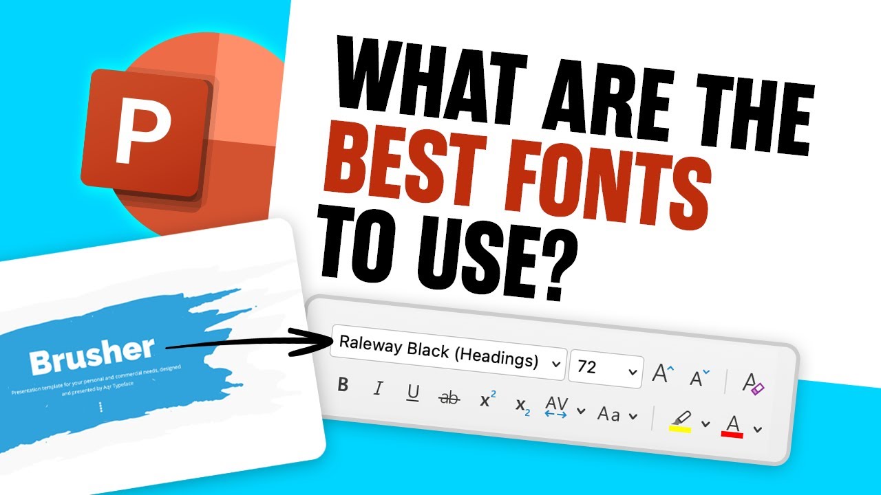
To learn even more about fonts for PowerPoint and other presentations, continue reading the tutorial below.
Jump to content in this section:
The Essentials of Font Selection
The 10 best fonts to use for powerpoint ppt presentations in 2024, how to quickly customize fonts in a premium powerpoint template, templates featuring the best fonts for powerpoint presentations, common powerpoint questions answered (faq), learn more about powerpoint, design a great powerpoint with top typography today.
Fonts for PowerPoint can take many forms. And with thousands of PowerPoint font options, it can be really hard to decide.
What style is right? How should you steer your PPT best font decisions? In this section, I’ll share some quick tips to help you choose the best PowerPoint font for you.
1. Understand the Types of Fonts
When you're choosing the best font for PowerPoint slides, it's key to learn some ground rules of style. And it helps to understand the basic types of fonts that you can choose from. In this section, we'll discuss popular font styles:
First, let's cover serif fonts. Serif fonts, PowerPoint presentation or not, have a more classic feel to them. Serif fonts have brush strokes on the edges of the letters, sometimes called "feet." These edge strokes are called the serifs. The popular system-installed serif fonts include Garamond, Georgia, and Times New Roman. They can definitely serve as some of the best fonts for presentations.

In 2024, the best font for PowerPoint presentations are sans-serif fonts. These are the modern and smooth typefaces that you'll find in most presentations. Sans means "without," so it's only natural that these fonts lack the edge strokes. The result is smooth, rounded fonts that are popular in modern design.
These two simple categories are useful to describe most fonts. But other choices might be the best font for your PowerPoint presentation. Script and decorative fonts are other unique options.
They may be right for special purpose presentations.

What is the best font for PowerPoint presentations? The answer is, "it depends." As always, let the content drive your design decisions. But as a general rule, sticking to serif and sans-serif designs helps you stay stylish. And you won't lose the focus of your audience by having text that's too hard to read.
Formal presentations in ideal environments should opt for serif options. But most presentations should typically use sans-serif fonts. Those decorative PowerPoint options should be used sparingly at most.
2. Choose Font Sizes for Your PowerPoint Presentation
For the best use of PowerPoint fonts, it's crucial to consider your choice of font size. Many PowerPoint users will ask, " what is a good font size for PowerPoint presentations? " In reality, you should vary your font size based on the content that you're presenting. Headlines should always be larger than the supporting points, for example.
My rule of thumb for PowerPoint fonts is to use a size 32 or larger for headlines, with 24 or larger for supporting points. Go much smaller than that, and you're entering "only readable for print outs" territory.
Font size goes hand-in-hand with the principle of "less is more" on your PowerPoint slides. When you don't have to cram tons of content onto your slide, you can use larger font sizes.
3. Use Font Pairings
Many graphic designers use more than one font when building PowerPoint presentations. Using more than a few fonts is over the top but combining two complementary font choices is a pro design move.
This practice is an art called font pairing. The best font for PowerPoint might actually be a combination of fonts.
One idea for a font pairing is to use a sophisticated serif font for headlines and titles. Then, use sans-serif fonts for the majority of the body points. This gives you the PPT best font for both kinds of text.

If you use a free font resource like Google Fonts , you'll see pairing suggestions that help you combine fonts that work together well. The key to font pairing is to use the alternate font choices consistently. For example, always reserve headlines for one font in your selection.
4. Select Color and Contrast in Your Font for PowerPoint
Beyond size, style, and pairings, one element of font choice that you can't avoid is color and contrast. You can choose the perfect font and format it correctly, but clashing color schemes disrupt slides.
Keep three essential tips in mind when considering font color and contrast:
- Create contrast . Contrast is important so that your text stands out on the slide and is easy to read. Don't use a dark grey font on a black background, for example. Ensuring proper contrast will make the important content stand out.
- Consider accessibility . Colorblindness is surprisingly common. It's likely that a member of your audience has some form of it and will experience your slides differently. Make sure to choose color schemes that don't interfere with their experience.
- Use colors that fit the scheme . Make sure that you consistently use font colors that are part of your branding guide. Use the color swatches to ensure no variation from one slide to the next.
It’s key to use the best font for presentations to ensure your slides are accessible to everyone. Learn more below:

5. Use Creative Text Effects
So far, we've covered font choice, including style, size, and pairings. We’ve already looked at how to put the best font for PowerPoint onto your slides. But now, you might be wondering about how to be more creative with your style and design.
PowerPoint has plenty of effects to ensure that your text doesn't go unnoticed. You can add animations, shadows, and more. These text effects make your PowerPoint font choices more lively and fun.
The tutorial below is a complete guide to working with text in PowerPoint. Check it out to learn more about adding text as well as advanced effects to make the most of your content:
6. Understand the Power of Custom Fonts
Sure, every device includes standard fonts to choose from. But they're not the best font for PowerPoint designs! When you want to really set your slides apart, consider using custom PowerPoint fonts. These are sleek designs that your audience may have never seen.
Above, I've shared screenshots with custom fonts from Envato Elements. With an Elements subscription , you'll enjoy thousands of custom PowerPoint fonts . You can use each of them in your next presentation.

Elements includes access to fonts across every category that we highlighted above. They're some of the best font for PowerPoint options. Elements' library has PowerPoint font options that you won't find anywhere else!
After you discover the best font for presentations, you'll need to add it to PowerPoint. To learn how to install PowerPoint fonts, check out the quick screencast lesson below:

Ready to see options for the best font for presentations? Now that we’ve covered how to choose the right fonts for your presentation, here are the best fonts to use for your PPT presentations in 2024:
Calibri is a modern sans-serif font that comes in several weights. It’s a perfect choice for the body text of your presentation.
2. Palatino Linotype
Here’s another stylish serif font that makes a great choice for headings or quote slides in your presentations.
Roboto features geometric forms with friendly and open curves. It's a modern and clean look that makes it a good choice for your body text.
4. RNS Sanz

With seven weights ranging from Light to Black and small caps, the RNS Sanz is a great choice for any type of presentation.
5. Playfair Display
Give any presentation a sophisticated and elegant look by using Playfair Display for the headings or quote slides.
6. CA Texteron

The CA Texteron font is a modern serif font with high legibility. Use it for both headings and body text for your presentation.
Lato has an elegant yet friendly look and feel. It’s a great choice for your body text and a true workhorse as it features multiple weights ranging from thin to black.

The Arthura font is a premium sans-serif font with a humanist warmth and simple geometric forms. It's one of the best PowerPoint fonts for body copy.
Once you've selected your font for presentation designs, it's time to get to work. But the best font for PowerPoint slides is just part of the process. Here, we'll show you five key steps to PPT change all fonts options.

We'll demonstrate with the premium Brusher PowerPoint Template from Envato Elements. It's compatible with all of the fonts for PowerPoint techniques you'll see. Download it now to follow along.
1. Choose Your Slides
The first step is to select the slides you’re going to use in your presentation. To do this, switch to Slide Sorter under the View tab.
Then hold Shift and click the slides you don’t want to use. Finally, right-click and select Delete Slide to remove them from the presentation.

2. Add Your Text
To add your content to the presentation, double-click on a text area. Press CTRL+A to select all the text and then start typing in your own content.

3. Change the Body Font
After you've added your content, it’s time to customize the fonts. Start by selecting your body text. Then, in the Home tab, click on the font drop-down menu and select the font you want to use. In this example, I’m using the Calibri font for the body text.

4. Change the Heading Font
To add more flair to your presentation, customize the heading font as well. You can opt for a completely different font or simply use a different weight from the font you used for body text. In this example, I’ve opted to use Palatino Linotype for my headings.

5. Adjust the Font Styles
Lastly, don’t forget to customize the font styles. For example, both Calibri and Palatino Linotype offer different font weights. I’ve chosen to use Calibri Regular for body font and Palatino Linotype Bold for headings.

Aside from weight, you can also customize the font size and even assign a different color to your headings to make them stand out more.
Need help choosing the best PowerPoint fonts? My top recommendation is to use a template that already has the fonts selected. If you can cut the hard work of choosing the best PowerPoint font, you can re-focus on presentation content.
Once again, Envato Elements is your answer. As a member, you'll enjoy unlimited access to thousands of custom PowerPoint templates . Many have the best PowerPoint font designs already built in. And of course, Elements has thousands of custom fonts , too!
Find PowerPoint Templates

When you use custom PowerPoint templates, you outsource the design work. The challenge of choosing the best font for PowerPoint presentations is left to creative designers. They've already built slides that feature good font choices for presentations. Just fill them in with your content, and you'll be finished in no time.
In this section, you'll see templates with the best font for PowerPoint presentations. All are included with a subscription to Elements, the creative service you saw above.
1. Agio PowerPoint Presentation

Agio uses smooth sans-serif font choices throughout. These are among the best fonts for PowerPoint options, since they're extra crisp and clear.
Nine color schemes are used, each of which is already set up with color-coordinated text. It's an example of using fonts that highlight the content, while staying stylish. Keep Agio in mind as a template with good fonts for presentations PowerPoint.
2. Fashioned Stylist PowerPoint

The Fashioned presentation template also uses popular sans-serif choices. But it also uses variations on typography for an impact.
Notice that many of these slides in the preview use all-caps strings of text to add emphasis to slides. It's a great example of using text effects to enhance slides with bold design.
3. Brutto Real Estate PowerPoint Template

With a major focus on serif fonts, it's no wonder why this template is an ideal fit for the traditional world of real estate. Serif fonts have a classic feel to them, and this template illustrates that perfectly.
This template also features many infographic and business-centric slides. They're perfect for showcasing your business concept.
4. Brusher PowerPoint Template

Brusher's 120 slides use popular PPT font options that are included for free. It also has modern, custom image masks that can enhance your images. The starkly contrasting black and white color scheme is an excellent example of font contrast. Use Brusher to build a presentation with balanced typography in no time.
We’ve looked at some of the best font for presentation designs for 2024. But you may have some other questions. What else can you do with the best font for presentations? How can PowerPoint work better for you? Here, we’ve gathered answers to five of these common questions.
1. Can I Wrap Text in PowerPoint?
Yes! The best fonts for presentations can be featured as wrapped text. Or you can even curve the text! This adds a cool, dramatic effect very easily. Learn how to do it here:

2. How Do I Animate the Best PowerPoint Fonts?
The Animations tab in PowerPoint is really your best friend here. On it, you can add sleek animation effects.
What’s more: these work with all of your PPT best font favorites . You can even PPT change all fonts to be animated in order to maintain a steady look and feel across your slide deck.
Turn to our full guide for more details:

3. Is a PowerPoint Font Able to Be a Word Cloud Design?
Absolutely. A font for presentation use is perfect for building a PPT word cloud. Word clouds are visuals with words shown in an array of colors, layouts, and sizes.
You can even leverage the best font for presentations in word clouds. These are sure to make an impact. They help you illustrate ideas, and they’re easy to make with your best PowerPoint font choice. Learn more:

4. How Do I Highlight the Best Font for Presentations?
Sometimes, even the best font for PowerPoint needs some help standing out. That’s where highlighting comes in. When you highlight your PPT best font, you’ll see it shaded in a new color of your choice.
The Text Highlight Color button on the home tab controls this. Learn more about it in our highlighting tutorial for PowerPoint:

5. Can I Add Superscripts to Fonts for PowerPoint?
Yes, easily! Superscripts are small numbers that sit above the rest of your text. They’re most commonly used for citations in PowerPoint. Again, they’re quick to add using your favorite font for presentation options.
Learn how to do it in just sixty seconds here:
.jpg)
Choosing the best font for a PowerPoint presentation is just one part of designing your next slide deck. PowerPoint has so many features that it can be overwhelming to know where to start. But don't worry—PowerPoint can be mastered just like any other app.
If you're still learning PowerPoint, we've got you covered with many helpful resources. The single best starting point is How to Use PowerPoint (Ultimate Tutorial Guide.) This single resource is loaded with tutorials that you can use to improve every aspect of your presentation.
The best fonts for presentations are more powerful with the help of learning resources. For more templates and guides that include PowerPoint design tips, check out the tutorials below:

Typography is a huge part of setting the style of your presentation. The tips in this round-up are helpful to choose custom fonts that fit with your presentation's style.
Remember to choose a font style (serif or sans-serif) that matches your presentation's tone. Also, use font sizes and weights to bring emphasis to the most essential parts of your presentation.
Turn to Envato Elements for the best PowerPoint font designs available today. With thousands to choose from , it’s easy to find a winning PPT best font for you. And remember to pair it with a stunning best PowerPoint font template , with slide layouts hand-crafted for you.
Get started on your next presentation today. Choose and download your favorite template.
Editorial Note: This post was originally published in June of 2019. It's been revised to make it current, accurate, and up to date by our staff—with special help from Brenda Barron and Andrew Childress . A video has been added by Andrew Childress.


Tips for creating and delivering an effective presentation
In this article.
Creating an effective presentation
Delivering an effective presentation
Tips for creating an effective presentation
|
|
|
|---|---|
| Choose a font style that your audience can read from a distance. | Choosing a simple font style, such as Arial or Calibri, helps to get your message across. Avoid very thin or decorative fonts that might impair readability, especially at small sizes. |
| Choose a font size that your audience can read from a distance. | Try to avoid using font sizes smaller than 18 pt, and you may need to go larger for a large room where the audience is far away. |
| Keep your text simple and minimize the amount of text on your slides | Use bullets or short sentences, and try to keep each to one line; that is, without text wrapping. You want your audience to listen to you present your information, rather than read the screen. Some projectors crop slides at the edges, so long sentences may be cropped. You can remove articles such as "a" and "the" to help reduce the word count on a line. |
| Use art to help convey your message. | Use graphics to help tell your story. Don't overwhelm your audience by adding too many graphics to a slide, however. |
| Make labels for charts and graphs understandable. | Use only enough text to make label elements in a chart or graph comprehensible. |
| Make slide backgrounds subtle and keep them consistent. | Choose an appealing, consistent template or theme that is not too eye-catching. You don't want the background or design to detract from your message. See . For information about using themes, see . |
| Use high contrast between background color and text color. | Themes automatically set the contrast between a light background with dark colored text or dark background with light colored text. See . |
| Check the spelling and grammar. | To earn and maintain the respect of your audience, always check the spelling and grammar in your presentation. |
Top of Page
Tips for delivering an effective presentation
|
|
|
|---|---|
| Show up early and verify that your equipment works properly. | Make sure that all equipment is connected and running. |
| Don't assume that your presentation will work fine on another computer. | Disk failures, software version mismatches, lack of disk space, low memory, and many other factors can ruin a presentation. Turn off screen savers, and ensure you have the appropriate files and versions of software that you need, including PowerPoint. To ensure all files are accounted for when you copy them to a USB drive and carry them to your presentation location, see Consider storing your presentation on OneDrive so it can be accessible to you from any device with an internet connection. |
| Verify that the projector's resolution is the same as the computer on which you created your presentation. | If the resolutions don't match, your slides may be cropped, or other display problems can occur. |
| Turn your screen saver off. | Keep your audience focused on the content of your presentation. |
| Check all colors on a projection screen before giving the actual presentation. | The colors may project differently than what appears on your monitor. |
| Ask your audience to hold questions until the end. | Questions are an excellent indicator that people are engaged by your subject matter and presentation skills. But if you save questions until the end of the presentation, you will get through your material uninterrupted. Also, early questions are often answered by ensuing slides and commentary. |
| Avoid moving the pointer unconsciously. | When you are not using the pointer, remove your hand from the mouse. This helps to stop you from moving the pointer unconsciously, which can be distracting. |
| Don't read the presentation. | Practice the presentation so that you can speak from bullet points. The text should be a cue for the presenter rather than the full message for the audience. |
| Stay on time. | If you plan a certain amount of time for your presentation, do not go over. If there is no time limit, take less time rather than more to ensure that people stay engaged. |
| Monitor your audience's behavior. | Each time that you deliver a presentation, monitor your audience's behavior. If you observe people focusing on your slides, the slides may contain too much data or be confusing or distracting in some other way. Use the information you learn each time to improve your future presentations. |
| Practice makes perfect. | Consider rehearsing your presentation with . |

Need more help?
Want more options.
Explore subscription benefits, browse training courses, learn how to secure your device, and more.

Microsoft 365 subscription benefits

Microsoft 365 training

Microsoft security

Accessibility center
Communities help you ask and answer questions, give feedback, and hear from experts with rich knowledge.

Ask the Microsoft Community

Microsoft Tech Community

Windows Insiders
Microsoft 365 Insiders
Was this information helpful?
Thank you for your feedback.

Microsoft 365 Life Hacks > Presentations > Choosing the Right Font For Your PowerPoint Presentation
Choosing the Right Font For Your PowerPoint Presentation
Whether it’s for a professional conference or middle school book report, it’s important to know the best font to use for your PowerPoint presentation . Believe it or not, fonts are a big part of the overall design of your presentation —and they can make a world of difference! Some convey a lighthearted message, while others can show authority, and so on.

In this guide, we’ll take a closer look at:
- The different styles of fonts
- The 5 most popular fonts
- How to embed fonts, and more.
What are the different styles of fonts? Before we get too deep into each font and what looks best, let’s examine font styles and how they’re classified.
- Sans-serif fonts. Most serif fonts are easy to identify because of the tiny flags or projections on the ends of the characters. Serifs make distinguishing a lowercase L from a capital I in print easy.
- Serif fonts. Sans-serif fonts are commonly used in digital media because serifs can make letters difficult to see if an image or screen is low-resolution.
- Script fonts. Script fonts are also known as handwritten fonts because of the looping letters that make them look like cursive or calligraphy. Most people find it difficult to read more than a few sentences in a script font, so they’re best limited to a few words or a single phrase.
- Monospaced fonts. Even when writing by hand, you’ll notice that not all letters take up the same amount of space. Monospaced fonts buck this trend by allotting the same amount of space laterally for all letters, similar to a typewriter.
- Display fonts. Display fonts can also be known as fantasy or decorative fonts. These aren’t typically used for anything besides signage, banners, logos, or other text that’s isolated. Using display fonts for multiple sentences or a full paragraph isn’t a good practice because they can be hard to read or off-putting after a while.

Tell your story with captivating presentations
Powerpoint empowers you to develop well-designed content across all your devices
What are the 5 most popular fonts in presentations and why? A common theme you’ll notice when looking at the best fonts for PowerPoint is that they’re traditionally sans-serif fonts. Why? Well, this style is much easier to read from a distance and won’t feel cramped if letters are bolded. Additionally, the minimalistic style of sans-serif fonts isn’t distracting from the material or the speaker. Let’s look at five fonts that fit the best practices for a winning presentation .
Note: You’ll notice a serif font on this list, but we’ll address it when we get there.
- Roboto. Roboto is a sans-serif font that’s relatively basic, with sharp edges and rounded loops, counters, and bowls (the rounded parts of letters) without going overly bold or too thin. You can be safe using Roboto for just about any presentation.
- Verdana. Despite the font size you choose, not all fonts display the same. Verdana is a larger sans-serif font that can make it easier to display information without taking your font up an extra size.
- Helvetica. A point of differentiation between Helvetica and other sans-serif fonts is the weight toward the top of the letters. The top of every lowercase letter and the midpoint of every capital letter go to a thick midline’s upper edge. For instance, the top of every lowercase letter reaches the same horizontal point as the top of the crossbar on an H. This unique feature makes the Helvetica type look larger and bolder than it really is, which makes it great for headings and titles.
- Tahoma. Tahoma is different from the previous sans-serif fonts in that it is thinner than the others. While Tahoma might not have the same impact for a heading or title as Helvetica, it’s perfect for body text and fitting into smaller spaces without crowding.
- Palatino Linotype. Serif fonts have long been considered a no-no with digital publications, but with the advent of high-resolution computer monitors, tablets, smartphones, and TVs, they’re fine. What’s more, the serifs on Palatino Linotype aren’t incredibly prominent, so they make for a subtle nod to old-style fonts without over-embellishing.

How do you embed fonts in PowerPoint ? If you’re sharing your presentation with a friend, classmate, or colleague, you could be at risk of the fonts you used transferring properly to their device. For example, if you have a font you love using and installed it onto your computer, they might not have the same font. So, if you send your presentation to them, there could be formatting errors as their device defaults to a different font. Keep this from happening by embedding your font in PowerPoint using these easy steps:
- Click the “File” tab.
- Move down to the lower-lefthand corner of the window and click “Options.”
- Click “Save” on the left side of the screen.
- Scroll down to the section titled “Preserve fidelity when sharing this presentation:”
- Click the box next to “Embed fonts in the file.”
- If you or someone else will be using the presentation on a different device, then select the first option, “Embed only the characters used in the presentation (best for reducing file size).” If you or someone else will be editing the presentation on a different device, then select the second option, “Embed all characters (best for editing by other people).”
- Click “OK.”
There you have it! Choosing the best font for PowerPoint doesn’t have to be difficult. The most important part is making sure that the font is easy to read, and sans-serif fonts are usually a good way to go. By the way, it’s always a good idea to get a second set of eyes on your presentation before your big speech—and be sure to practice it a few times to iron out the kinks !
Get started with Microsoft 365
It’s the Office you know, plus the tools to help you work better together, so you can get more done—anytime, anywhere.
Topics in this article
More articles like this one.

How to introduce yourself in a presentation
Gain your audience’s attention at the onset of a presentation. Craft an impressionable introduction to establish tone, presentation topic, and more.

How to add citations to your presentation
Conduct research and appropriately credit work for your presentation. Understand the importance of citing sources and how to add them to your presentation.

How to work on a group presentation
Group presentations can go smoothly with these essential tips on how to deliver a compelling one.

How to create a sales presentation
Engage your audience and get them interested in your product with this guide to creating a sales presentation.

Everything you need to achieve more in less time
Get powerful productivity and security apps with Microsoft 365

Explore Other Categories
- Color Palettes
- Baseball Team Colors
- NHL Team Colors
- Superhero Fonts
- Gaming Fonts
- Brand Fonts
- Fonts from Movies
- Similar Fonts
- What’s That Font
- Photoshop Resources
- Slide Templates
- Fast Food Logos
- Superhero logos
- Tech company logos
- Shoe Brand Logos
- Motorcycle Logos
- Grocery Store Logos
- Pharmaceutical Logos
- Graphic Design Basics
- Beer Brand Ads
- Car Brand Ads
- Fashion Brand Ads
- Fast Food Brand Ads
- Shoe Brand Ads
- Tech Company Ads
- Motion graphics
- Infographics
- Design Roles
- Tools and apps
- CSS & HTML
- Program interfaces
- Drawing tutorials

What Font Do Doctors Use? Medical

The Real Betis Logo History, Colors,

What Font Is Used on Diplomas?

St. Louis Cardinals Colors – Hex,
Design Your Way is a brand owned by SBC Design Net SRL Str. Caminului 30, Bl D3, Sc A Bucharest, Romania Registration number RO32743054 But you’ll also find us on Blvd. Ion Mihalache 15-17 at Mindspace Victoriei
The 33 Best Fonts for PowerPoint Presentations
- BY Bogdan Sandu
- 7 February 2024

Picture this: You’ve crafted the most compelling PowerPoint, your content’s pure gold. But wait, does your font scream snooze fest or radiate confidence? That’s where I step in .
Slide design isn’t just about pretty visuals; it’s the fine print too. Think about it, the legibility , typography , and sans-serif charm that could make or break your presentation. We’re diving into a world where Arial isn’t the alpha, and Calibri has companions.
By the end of this deep-dive, you’ll be armed with examples of the best fonts for PowerPoint presentations . Fonts that won’t just hold your audience’s gaze but glue it to the screen.
From PowerPoint font styles to mastering the visual hierarchy in slides , I’ve got your back. We’re talking readability , professionalism, and those oh-so-subtle nuances of typeface selection .
Ready to transform your text from meh to magnificent ? Let’s turn that tide with typeface.
Top Fonts for PowerPoint Presentations
| Times New Roman | Serif | High | Formal, Academic | Classic, widely used, can appear outdated |
| Garamond | Old-style Serif | High | Professional, Print | Elegant, smaller than other fonts at the same size |
| Georgia | Serif | High | Electronic screens | Designed for clarity on digital screens |
| Palatino | Serif | High | Formal, Creative | Roman typeface, large |
| Baskerville | Transitional Serif | High | Formal, Print | Serious and professional |
| Cormorant | Serif | Moderate | Artistic, Display | High contrast, decorative |
| Playfair Display | Serif | Moderate | Headings, Display | High contrast, distinctive style |
| Libre Baskerville | Serif | High | Web, Readability | Optimized for body text on the web |
| Arial | Sans-serif | High | General use | Ubiquitous, often considered a web-safe font |
| Helvetica | Sans-serif | High | Branding, Professional | Highly popular, neutral design |
| Calibri | Humanist Sans-serif | High | General, Business | Default PowerPoint font since 2007 |
| Tahoma | Sans-serif | High | On-screen Readability | Clear at small sizes |
| Verdana | Sans-serif | High | Web, Digital displays | Wide spacing, good for legibility at small sizes |
| Roboto | Sans-serif | High | Web, Mobile apps | Google’s Android system font, modern |
| Lato | Sans-serif | High | Web, Corporate | Friendly and professional nature |
| Open Sans | Humanist Sans-serif | High | Web, Print | Clean and neutral, good for web and mobile interfaces |
| Montserrat | Geometric Sans-serif | High | Headings, Web design | Modern, geometric style |
| Proxima Nova | Sans-serif | High | Web, Interfaces | Combines a geometric look with modern proportions |
| Futura | Geometric Sans-serif | Moderate | Branding, Decorative | Strong, geometric design |
| Raleway | Sans-serif | High | Print, Web | Elegant and clean, good for headers and body text |
| Segoe UI | Humanist Sans-serif | High | User Interfaces, Digital | Default font for Microsoft products |
| Noto Sans | Sans-serif | High | Multilingual content | Designed for a harmonious look across multiple languages |
| Franklin Gothic | Sans-serif | High | Newspapers, Advertising | Sturdy and robust, good for headlines |
| Impact | Sans-serif | Moderate | Headlines, Posters | Narrow and tightly spaced, for short and bold statements |
| Comic Sans | Script | Low | Casual, Informal | Friendly, but often perceived as unprofessional |
| Lobster | Script | Moderate | Decorative, Headings | Flamboyant and attention-grabbing |
| Papyrus | Display | Low | Thematic, Decorative | Often considered overused and inappropriately applied |
| Bradley Hand | Script/Handwriting | Moderate | Casual, Personal projects | Imitates handwriting, less formal |
| Abril Fatface | Display | Moderate | Headlines, Advertising | High contrast, large headlines |
| Dosis | Sans-serif | High | Modern, Friendly presentations | Soft edges, a rounded and legible typeface |
| KoHo | Sans-serif | High | Print, Web | Low-contrast and legible at small sizes |
| DM Serif Display | Serif | Moderate | Headlines, Display | High-contrast, distinctive for large formats |
| Heebo | Sans-serif | High | Web, Hebrew language content | An extension of Roboto for Hebrew scripts |
Serif Fonts
Serif fonts are the old souls of typography. They’re classic, elegant, and have a touch of sophistication. Think of them like a fine wine – they just make everything look more refined.
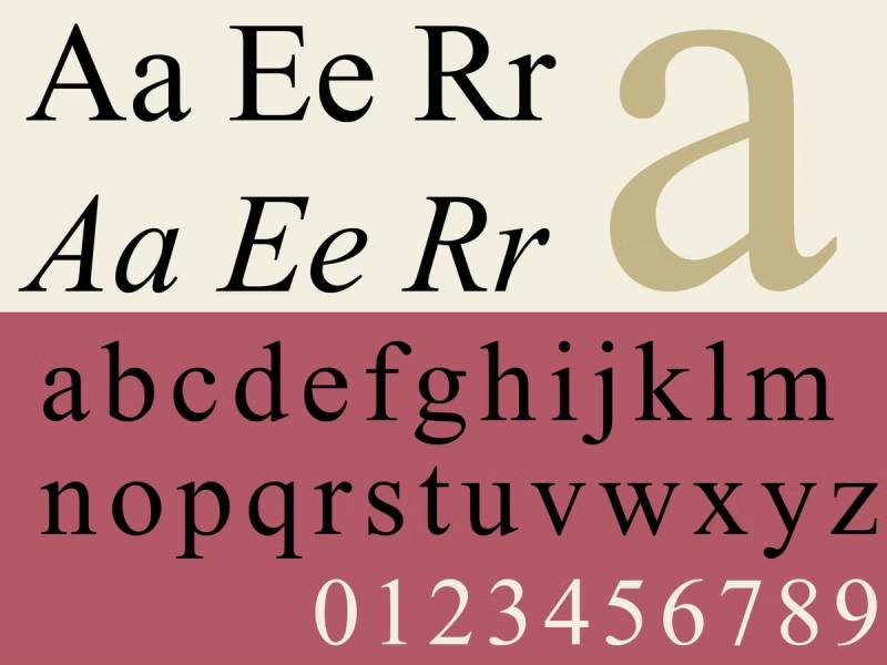
Times New Roman
The Bauhaus Influence: A New Era in Graphic Design
The husqvarna logo history, colors, font, and meaning.

You may also like

Ad Impact: The 19 Best Fonts for Advertising
- Bogdan Sandu
- 20 December 2023

T-Shirt Typography: 30 Best Fonts for T-Shirts
- 21 December 2023
- Slide Library
- Slide Library for PowerPoint
- Downloadable slides and shapes
- Slide Library search
- Search Library via shortcut keys
- Slide Library update alerts
- Rename or delete objects
- Share Slide Library
- Save slides or shapes to Slide Library
- Save presentation to Slide Library
- Manage Templates
- View all templates and set default
- Agenda Wizard
- Create Agenda Slides
- Update Agenda Slides
- Agenda Slide Numbering
- Navigate via Agenda
- Table of Contents
- Import Agenda Items
- Save Agenda Format
- Manage Colors
- Color Palette Toolbar
- Customize Color Toolbar
- Apply fill with outline color
- Recolor Charts
- View RGB color values & names
- Theme Color Tints and Shades
- Share Color Palette with team
- Insert Shapes
- Standard PowerPoint shapes
- Callouts / Speech Bubbles
- Hand Drawn Circles
- Harvey Balls
- Create Mini Slides
- Move to Multiple Slides
- Right Facing Centered Triangle
- Status Indicators
- Arrange and Align Shapes
- Select same color or size
- Select shapes by attribute
- Align shapes
- Align to first selected shape
- Choose Align anchor point
- Align using shortcut keys
- Copy paste position multiple shapes
- Straighten Lines
- Swap positions
- Distribute evenly
- Set Horizontal Gaps
- Set Vertical Gaps
- Squeeze or expand gaps
- Remove gaps
- Group Objects by Row
- Group Objects by Column
- Send to back, bring to front
- Send backward, bring forward
- Flip or rotate
- Group, ungroup and regroup
- Edit Shapes
- Same height, same width
- Copy paste position, size
- Resize shapes
- Slice shapes
- Multiply shapes
- Stretch shapes and fill gaps
- Toggle line weight and style
- Change margins toggle
- Chevrons same angle
- Paragraph Styles
- Save Paragraph Styles
- Apply Paragraph Styles
- Use PowerPoint Indent Increase/ Decrease to apply bullet styles
- Reset Paragraph Styles
- Ticks and Crosses bullets
- Paint Formatting
- Advanced Format Painter
- Position & Size Painter
- Table Format Painter
- Style Painter
- Text Format Painter
- Change Shape Painter
- Chart Format Painter
- Angles & Curves Painter
- Animation Painter
- Cycle Accent Colors
- Format Text
- Fit text to textboxes
- Wrap Text Toggle
- Merge Textboxes
- Split Textboxes
- Increase/ Decrease Font size
- Change Text Case
- Color Bold Text
- Delete Text or Replace
- Insert Superscript text
- Format Tables
- Create table from text boxes
- Convert table to text boxes
- Convert text to table
- Insert columns and rows
- Paste Excel data without source formatting
- Paste Excel data into text box tables
- Export Table or Box Table Data to Excel
- Set cell margins
- Express Table layout
- Table stripes
- Autofit columns
- Evenly space columns
- Align shapes over tables
- Harvey Balls for Tables
- Status Indicators for Tables
- Customizable PowerPoint Shortcut Keys
- Extra PowerPoint shortcuts
- Add PowerPoint shortcuts
- Search shortcut keys
- Reassign PowerPoint shortcuts
- Reset PowerPoint shortcuts
- McKinsey PowerPoint shortcuts
- F4 or Ctrl+Y redo or repeat
- Printable PowerPoint Shortcuts PDF
- How to Print a Custom Shortcuts list
- Search Shortcut Keys
- Searchable PowerPoint Shortcuts list
- Format Toolbar Overview
- Format Toolbar Layout Options
- Lock or Unlock Objects
- Lock objects
- Lock objects to the Slide Master
- Unlock objects
- Proofing Tools
- Fix Lines & Outlines
- Fix Layout, Transitions, Animations
- Fix Punctuation & Language
- Fix Margins, Bullets, Indents
- Check for Confidential items
- Reduce File Size
- Check Slide Master
- Sync Template Settings
- Set Proofing Language
- Change set language for PowerPoint presentations
- Flip PowerPoint Slides
- Flip Slides for Translation
- Slide Numbering
- Manage Slide Numbering
- Slide Numbers with totals
- Add words to Slide Numbers
- Change Starting Slide Number
- Skip Slide Numbers on Hidden Slides
- Slide Navigator
- Footers & Footnotes
- Filename Footer
- Enlarge Footnotes
- Refine Slides
- Add summary slide
- Format slide title
- Display No Fly Zone
- Send slide to appendix
- Camouflage mode
- Format Painter
- Set Grayscale
- Format Images
- Compress file size
- Format Charts
- Charts Toolbar
- Config Options
- Customize Settings
- Dark Mode Display
- Review Slides
- Customizable Status Stamps
- Sticky Notes
- Tag slides with filename and page number
- Share Slides
- Email selected slides in PPT or PDF format
- Print selected slides
- Save selected slides
- Slide Library for Teams
- Team Slide Library
- Create multiple Team Slide Libraries
- Synchronize Team Slide Libraries
- Synchronize Team Slide Library to your company Dropbox/ Box/ OneDrive folder
- Updating your Team Slide Library
- Import entire presentation to the Slide Library
- Share Slide Library with a colleague
- Share Custom Settings
- Share Custom Settings with Team
- Getting Started
- Getting started with PPT Productivity add-in for PowerPoint
- Downloadable PowerPoint Elements for Slide Library
- Tutorial - How to Create Custom Paragraph Styles for PowerPoint
- Can I use PPT Productivity on a Mac?
- PPT Productivity Basic Tools Tutorial
- PPT Productivity Plus Tools Tutorial
- New Features
- August 2023 update: Color Toolbar enhancement, new icons and more
- February 2023 update: New Slide Libraries available to download!
- January 2023 Update: Agenda Wizard, Format Painters + More
- How to copy and paste formatting in PowerPoint
- PowerPoint How To
- What are the most popular PowerPoint shortcuts?
- Where are PPT templates stored? Finding templates in PowerPoint
- Pasting data into a PowerPoint table without source formatting?
- Consulting Toolkit
- How to create effective consulting slides using Minto Principles
- Missing the McKinsey PowerPoint Shortcuts?
- Missing the Accenture QPT for PowerPoint?
- Missing the BCG PowerPoint Tools?
- Missing the Bain Toolbox for PowerPoint?
- How to add Stamps or Stickers to PowerPoint slides?
- Looking for a Consulting PowerPoint Toolbar?
- Top 10 PowerPoint Hacks / Shortcuts used by strategy consultants
- PowerPoint Tips
How to choose the best fonts for PowerPoint Presentations
- November 10, 2023
- Last updated: February 28, 2024
PowerPoint is one of the most popular and versatile tools for creating and delivering presentations. Whether you are pitching an idea, teaching a lesson, or sharing information, you want your slides to be clear, consistent, and compelling. But beyond the storyline, one of the key elements that can make or break your presentation is the choice of fonts.
Fonts are more than just letters and symbols - fonts can help convey meaning, mood, and personality. They can also affect the readability and legibility of your text, which is crucial for keeping your audience engaged and informed.
In this blog post, we look at the different styles of fonts, recommendations of the best fonts for PowerPoint presenting vs printed reports and we share some hints and tips on how to choose the best font for PowerPoint presentations based on your audience and delivery method.
What are the types of fonts?
Before we dive into the specific fonts that work well for PowerPoint, its helpful to have an overview of some basic terminology and categories of fonts. Fonts can be classified into two main groups: serif and sans serif. Here's a quick explanation of each style:
- Serif fonts have small strokes or lines at the end of each character, such as Times New Roman, Georgia, or Garamond. They are often associated with tradition, elegance, and formality.
- Sans serif fonts do not have these strokes or lines, such as Arial, Helvetica, or Verdana. They are often associated with modernity, simplicity, and clarity. They are also more readable on-screen than serif fonts, which can look blurry or pixelated.
There are also other types of fonts, such as script, decorative, or monospaced fonts, but they are usually not recommended for PowerPoint presentations because they can be hard to read (or distracting!).

What are the factors to consider when choosing the best font for presentations?
When choosing a font for PowerPoint presentations, it's important to consider the following factors:
- Readability : How easy is it to read the text on your slides? You want to choose a font that is clear and crisp, especially if you have a lot of text or small font size. You should also avoid using too many different fonts or styles in your presentation, as this can create visual clutter and confusion. Consider as part of this the intended delivery format - for example, will you be presenting the slides in an auditorium or emailing/ printing a deck for individuals to read through on their screen or on paper?
- Design : How well does the font match the theme and tone of your presentation? You want to choose a font that reflects your intended message and brand (or personality, for individual presentations). For example, if you are presenting a creative or playful topic, you might want to use a font that has some flair or fun. However for presenting a serious or professional topic, you might want to use a font that has some weight or authority.
- Style : How do you want to emphasize or differentiate certain parts of your text? You can use different font styles, such as bold, italic, underline, or color, to highlight important words or phrases in your presentation. However, you should use these styles sparingly and consistently, as too much variation can reduce the impact and coherence of your text.
What are some examples of good fonts for PowerPoint presentations?
Based on these factors, here are some examples of good fonts for PowerPoint presentations in 2023.
- Sans serif fonts : These are fonts that do not have small strokes or lines at the end of each character, such as Arial, Helvetica, or Verdana. They are often associated with modernity, simplicity, and clarity. They are also more readable on-screen than serif fonts, which can look blurry or pixelated.
- Simple and clean fonts : These are fonts that have a clear and crisp design, without too much embellishment or decoration. They are also versatile and adaptable, as they can suit different themes and tones. Some examples are Verdana, Roboto, Fira Sans, and Montserrat.
- Fonts that match the font size : These are fonts that look good at both big and small sizes, without losing their quality or legibility. They are also not too thin or too thick, as this can affect the readability of your text. Some examples are Tahoma, Segoe UI, Georgia, and Bentham.
Suggested Fonts available in standard PowerPoint versions from 2007 onwards
There is an almost unlimited number of fonts available for download on the internet, that you could choose to use for your presentations. To keep things easier, we have focused on a list of fonts that are all available in standard PowerPoint.
Some of the simple and clean fonts great for presentations and available in standard PowerPoint:
- Calibri : Calibri is a sans serif font that has a modern and elegant look. It is the default font for PowerPoint since 2007 and it is very readable and versatile.
- Helvetica : Helvetica is another sans serif font that has a clean and sleek look. Helvetica is one of the most popular fonts in the world and it is very clear and adaptable.
- Garamond : Garamond is a serif font that has a vintage and classy look. It is very legible and stylish, as it has a distinctive contrast between thick and thin strokes.
- Gill Sans : Gill Sans is a sans serif font that has a friendly and playful look. It's very readable and expressive, as it has a lot of character and charm.
You can view and compare the fonts in this screenshot:

PowerPoint 2023 Font update including Aptos
In July 2023, Microsoft introduced Aptos as the new default font for PowerPoint. Aptos is a sans serif font that has a modern look. If you are a Microsoft 365 user, you will have access to Aptos from mid 2023. Users on older versions of Office will continue to have the fonts listed above. Aptos replaces Calibri as the default font for PowerPoint (but Calibri and the other fonts listed above continue to also be available in PowerPoint!).
Along with the Aptos introduction, Microsoft commissioned the design of an additional 5 fonts which have been added to PowerPoint, Excel and Word:
- Aptos : a sans serif font that has a modern look, which is being rolled out as the new default Office font for Microsoft 365 users
- Bierstadt : a sans serif font, designed to be more angular and precise than Arial with high readability in mind.
- Grandview : a sans serif font which has been specifically designed as a high legibility font for use in body text, on any device.
- Seaford : a sans serif font inspired by old-style serif text typefaces. While Bierstadt is more angular, Seaford is more organic.
- Skeena : a sans serif font inspired by traditional serif text typefaces. There is intentional contrast between the thick and thin in the strokes. Designed for body text in long documents and presentations.
- Tenorite : a sans serif font, Tenorite was designed to be an easily readable font at small sizes onscreen, with larger punctuation.

Suggested Presentation Fonts to download for PowerPoint
If you don't like the look of any of the fonts available in PowerPoint, you can also download additional fonts. Note that you will need to also embed any non standard fonts in a presentation if you are distributing it to others (refer to the next section for how to do this).
The following fonts are Sans Serif and Serif fonts which are modern and easy to read. They are not available in standard PowerPoint, however you can easily download them online and install them for PowerPoint.
- Lato : Lato is a sans serif font that has a modern and elegant look. It is very readable and versatile, as it comes in different weights and styles. Lato is recommended for both headers and body text in your presentation.
- Roboto : Roboto is another sans serif font that has a clean and sleek look. It is also very readable and adaptable, as it has many variants and styles. Roboto is recommended for both headers and body text in your presentation.
- Bentham : Bentham is a serif font that has a vintage and classy look. It is very legible and stylish, as it has a distinctive contrast between thick and thin strokes. You can use Bentham for headers or sub-headers in your presentation.
- Fira Sans : Fira Sans is a sans serif font that has a geometric and futuristic look. It is very clear and dynamic, as it has a wide range of weights and styles. You can use Fira Sans for headers or sub-headers in your presentation.
- Montserrat : Montserrat is a sans serif font that has a friendly and playful look. It is very readable and expressive, as it has a lot of character and charm. You can use Montserrat for headers or sub-headers in your presentation.

How to embed non standard fonts in PowerPoint presentations
As noted in the section above, if you choose to download a non standard PowerPoint font for your presentation, you need to embed the font in your presentation, if you plan to share the presentation electronically with others. To do this:
- With your presentation open, from the PowerPoint Ribbon, click the File tab and then click Options
- From the left menu select the Save tab.
- The second last menu option is Preserve fidelity when sharing this presentation . Check the Embed fonts in the file check box. We recommend also checking the Embed all characters (best for editing by other people) if you are intending for your presentation to be edited by others.

How to apply fonts to your PowerPoint presentation?
Once you have chosen the fonts that you want to use for your PowerPoint presentation, you need to apply them to your slides. Here are some steps to follow:
- Select the text that you want to change : You can select a single word, a sentence, a paragraph, or the entire slide. You can also select multiple slides at once by holding the Ctrl key and clicking on the slides in the left pane.
- Open the Font dialog box : You can open the Font dialog box by clicking on the Home tab, then clicking on the small arrow in the bottom right corner of the Font group. Alternatively, you can press Ctrl + D on your keyboard.
- Choose the font that you want to use : You can choose the font from the drop-down list in the Font dialog box. You can also choose the font size, style, color, and effects from the same dialog box. You can preview how the font looks like in the Sample box at the bottom.
- Click OK : Once you are happy with your font choice, click OK to apply it to your selected text.
You can also use themes and templates to apply fonts to your PowerPoint presentation. Themes and templates are pre-designed sets of colors, fonts, and layouts that you can apply to your presentation with one click. You can choose from the built-in themes and templates in PowerPoint, or you can create your own or download from online sources.
To apply a theme or template to your PowerPoint presentation, follow these steps:
- Open the Design tab : You can open the Design tab by clicking on it in the ribbon at the top of your screen.
- Choose a theme or template : You can choose a theme or template from the gallery in the Design tab. You can also click on the Browse for Themes button at the bottom of the gallery to find more themes or templates on your computer or online.
- Click on the theme or template that you want to use : Once you click on a theme or template, it will be applied to your entire presentation. You can see how it changes the colors, fonts, and layouts of your slides.

See our tools at work
Book a personal demo with our PPT professionals

Start 30 Day Free Trial
Start your 30 day free trial - Microsoft Office for Windows
Download and Install
Existing customers download to install on a new computer
Related productivity tips

How to change theme fonts in PowerPoint?
This Hints and Tips post provides a brief overview of PowerPoint templates and the steps for how to ...

How can I share a PowerPoint presentation with custom fonts?
Can I share a PowerPoint Presentation containing customized fonts with others who do not have the ...

How to reduce file size of PowerPoint Presentations?
You’ve spent hours creating an awesome presentation, including lots of well thought-out images and...
Microsoft Office
10 minute read
How to Choose the Best Font for PowerPoint Presentations

Saikat Basu
Facebook Twitter LinkedIn WhatsApp Email

Join the Microsoft Office conversation on Slack
Ask a question or join the conversation for all things Microsoft Office on our Slack channel.
An image on a slide may speak a thousand words, but you do need text to explain the finer details. And that’s where choosing the best font for PowerPoint presentations becomes a critical exercise. In short, if you want to make a flawless PowerPoint presentation , you must pay attention to your fonts.
The interesting thing about fonts is that each has a personality. It’s like the three-piece suit that will be out of place at a barbeque but is perfect for an evening at the Savoy.

Want to learn more?
Take your Microsoft Office skills to the next level with our comprehensive (and free) ebook!
Why is choosing the right fonts so critical?
Slides aren’t like the pages of a book. They are billboards on the highway.
When you run through your slides, they will linger for just a few seconds. The words on the slides have to capture interest, send the right message, and support the visuals in those few seconds.
Fonts influence your audience by setting the tone and atmosphere of the presentation. The right choice of fonts or font pairings can make your text stand out by separating it from other elements around it. Typefaces are also brand symbols that help the audience relate to it through the presentation.
Before you get into the deep end, let’s learn the distinction between two major font types.
What are serif and sans serif fonts?
Times New Roman is the classic example of a serif font. The letters have tiny extensions that appear to connect them together in words as one letter leads to the next.
Newspapers and magazines use serif fonts for body text as they are easier to read. Serif fonts have distinct line heights that make them more legible in dense copy.
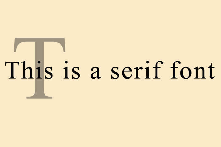
They lose this clarity if you pack them together in the body. That’s why designers recommend sans serif fonts for titles, headings, and captions in your slides.
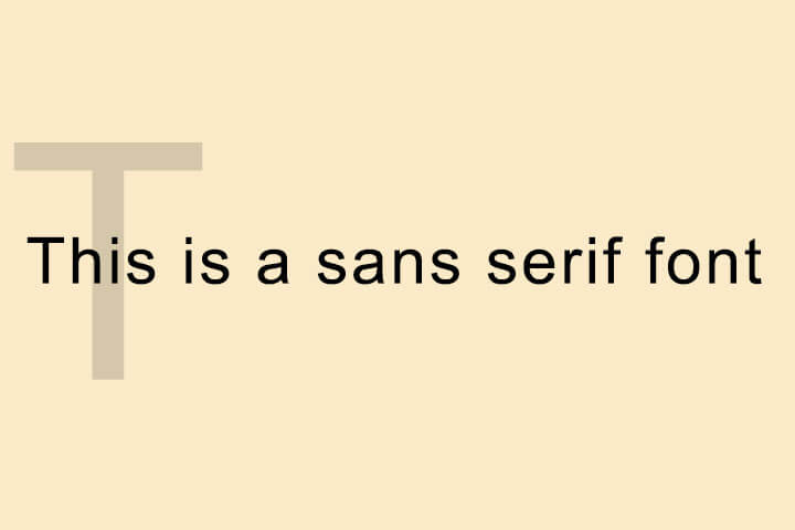
The critical font pair: title vs body text
All Microsoft PowerPoint presentations by default start with two fonts — one font for the headings and one for the body text. This font pairing decides the entire look of the presentation. The theme plays an important role in the font choices and even blank presentations give you a theme to build upon.
The first question you may have to answer is how big your fonts should be? The simple answer is that it depends. Factors like screen size and room size dictate the limits of font size. Font sizes can hinge upon you emailing the presentation or delivering it live on stage or on a PC screen in a remote meeting.
Also, all fonts have an optimum size for legibility. Arial is clear at 12pts while Times New Roman is readable at 10pts.
Most presentation experts recommend these size ranges. The thumb rule — a larger font size with less text on screen is always good.
The default slide in PowerPoint starts with 60pts for section headers and 24pts for body font.
- Header Font: Between 26 and 42 point
- Body Font: Between 18 and 24 point
You can use the same font for both, but that can limit the visual impact of your slide.
10 tips for choosing the best font for PowerPoint presentations
Never sacrifice readability for style. With that motto in mind, follow these Microsoft PowerPoint tips to choose the best fonts for your business presentation or any other.
1. Choose two fonts
Three fonts can be a crowd. Choose two fonts wisely and use size, contrast, and color to combine them for visual interest. Font pairing is a critical part of PowerPoint presentations and you will have to spend a lot of time on this decision. The second font shouldn’t be too unlike or too similar to the primary typeface where you miss the distinction.
Tip: There are many font pairing tools available on the web. But play the TypeConnection typography game if you want to get better at it yourself.
2. Choose standard fonts
You want your presentation to look the same on all devices. Choose from standard fonts and you won’t have to rescue your slides from turning into a mishmash on another screen. You can be more imaginative if you are presenting to children or at Comic Con, but standard fonts are the safest bet always.
Tip: Here’s a complete list of fonts available on Windows 10 .


3. Avoid script fonts and decorative text
Script fonts like Lucida Calligraphy or Gothic fonts like Century are always difficult to read. You can use them if the topic of the talk demands it.
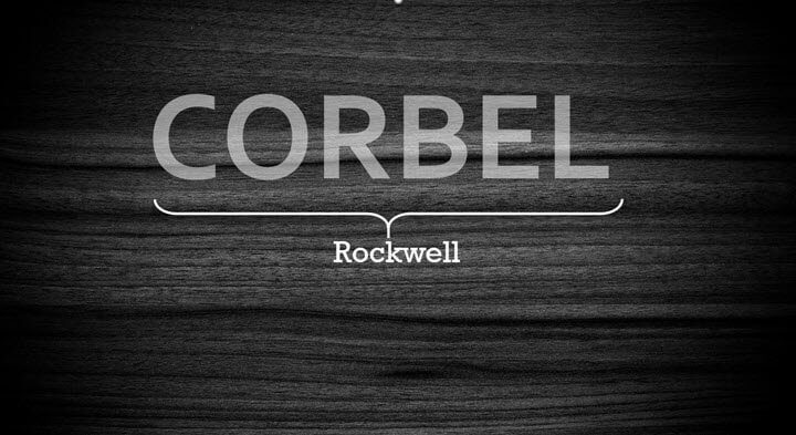
4. Create visual interest with serif and sans serif fonts
As we emphasized earlier, serif and sans serif fonts have their own advantages and disadvantages. You can pair them and tap into their strengths.
5. Select color and create contrast
Go for font colors that are a part of your brand. Using color swatches and precise Hexadecimal or RGB values ensures colors stay consistent across slides.
Also, you might have to check your slide for accessibility for all as someone in the audience can be color blind and may not be able to decipher red or green.
Tip: There are many color palette generators available on the web for free. Try Coolors .
6. Have contrasting text and background colors
Fonts must stand out against the background. The higher the contrast between the two, the better the readability across the room will be. Use the color wheel to pick the background and the font colors. Opposite colors on the color wheel clash with each other and have the maximum contrast. For instance, orange on blue.
Always use the same background on each slide. Text against white backgrounds is not legible in a larger room. For the best results, opt for dark slides with light-colored text.
Tip: Go through a gallery of well-designed PowerPoint templates or use PowerPoint Designer as a shortcut to grasp the interplay of contrast.
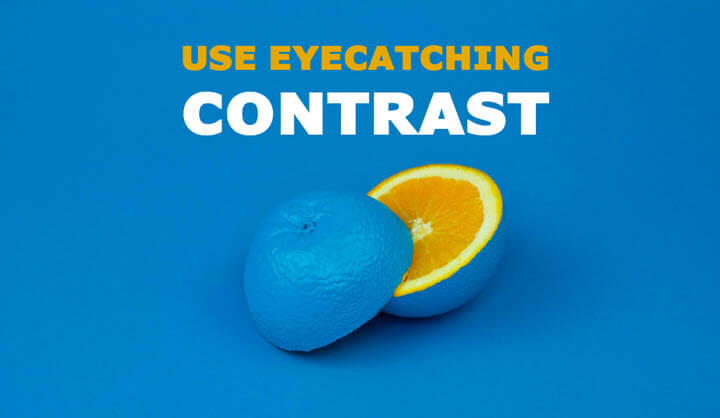
7. Less is more with caps and italics
Don’t capitalize all the letters in the body text as it is difficult to read. Selectively use caps for acronyms and for emphasis. Similarly, choose italics sparingly for quotes or highlighting the names of books, authors, and journal titles, etc.
You can make a creative choice by using italic text sparingly for impact or you can also substitute them with subtle formatting to the standard fonts.
Tip: Caps and italics may be able to work with specific fonts, but you may need access to those fonts. You can use Picsart's text editor to play around with text that may suit your presentation better.
8. Limit the use of animated fonts
Animated fonts can be distracting. Avoid animating your text or use it only if it serves a functional purpose. Ask yourself if it adds clarity to your data or is just a cute effect.
9. Keep an eye on font tracking and kerning
Learn these two typography terms and you will have an easier time placing your words on the slide. Kerning adjusts the spacing between two adjacent letters in a font. Tracking adjusts the space between all letters together. Both influence the readability of text.
For instance, you can avoid using narrow or condensed typefaces. Instead, pick a thicker font and tweak it with tracking and kerning within PowerPoint.
For more on changing the spaces between text, read this Microsoft support article .
Tip: Play the KernType typography game to get familiar with the basics of the two principles.
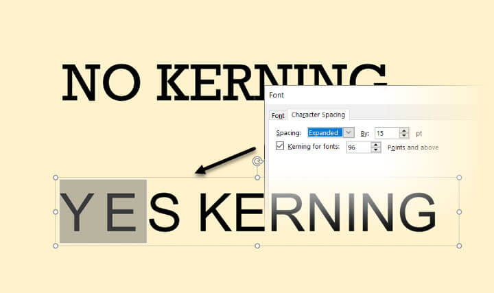
10. Make interesting shape effects
It doesn’t always have to be just about fonts and simple colors. The Shape Effects panel on PowerPoint gives you a lot of control over the finished appearance of text on the slide.
For instance, you can adjust the transparency of the letters. You can also “texturize” the words by using pictures to fill the words instead of a solid fill color.
- Select the word and right click.
- From the context menu, click on Format Text Effects.
- The Format Shape panel is displayed on the right.
- Select Text Options > Text Fill & Outline.
- Choose Picture or texture fill.
You can now use an image or any texture to decorate your words. Picture or texture fills are a creative way to use standard fonts but still make them stand apart on your slides. Of course, never overdo it.
Tip: Shape effects go well with thicker fonts.
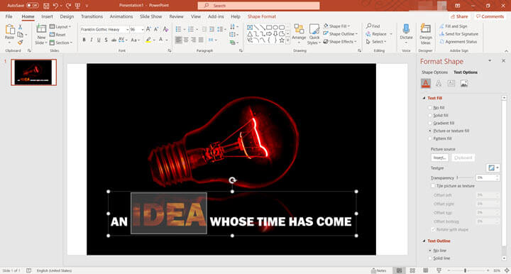
15 of the most versatile fonts you can use in PowerPoint
These fonts (and a few more) are versatile because they are standard fonts and are available on both Windows and macOS. You don’t have to go after fancy typefaces just yet. Focus on your layout. Use the design pointers from the above list and give your slides an attractive makeover.
- Franklin Gothic
- Times New Roman
- Palatino
Think of typography in PowerPoint as design
Practice with your eye. Play one font against the other for interesting unions. Typography isn’t just for selecting fonts and using them to occupy your slide with words. It is an essential design element in any place where visual communication matters. You can design your presentations faster once you work out how fonts work together and learn a bit about color theory.
Want to learn more about how good design comes together? Start with some of the basic and advanced PowerPoint techniques .
Ready to master Microsoft Office?
Start learning for free with GoSkills courses
Loved this? Subscribe, and join 462,890 others.
Get our latest content before everyone else. Unsubscribe whenever.

Saikat is a writer with over 20 years of experience writing and editing technology tutorials for brands such as MakeUseOf, Online-tech-tips.com, Lifewire, Lifehacker, and GuidingTech. His expertise is in topics such as apps, software, artificial intelligence, productivity, and operating systems like Windows and iOS. He hunts for the latest tricks in Microsoft Office and web apps. He has spent more than a decade in marketing and has a background in web development. He doesn't want to get off the learning curve, so a camera and a harmonica claim an equal share of his free time. Find him on LInkedin here.

Recommended
Should You Switch to Microsoft 365? What You Need to Know in 2024
We break down what Microsoft 365 is, and what makes it different from lifetime licenses.

24 Best Microsoft Office Add Ins in 2024
Supercharge your productivity with our picks of the best Microsoft Office add-ins for Word, Excel, PowerPoint, Outlook and OneNote.

What is Microsoft Teams? Everything You Need to Know in 2024
What is Microsoft Teams? Find out in this introductory guide.
© 2024 GoSkills Ltd. Skills for career advancement
🍪 This website uses cookies to improve your experience.
Learn more about our cookies Accept cookies
- Slidesgo School
- Presentation Tips
The best tips for using fonts in presentations

Each design element in a presentation has a crucial role to play. The choice of fonts to use and the way they are employed cannot be a matter of chance.
Learn, below, the best tips for using fonts in your Google Slides or PowerPoint presentations . With these simple tips, it will be easier for you to know which font to use on your slides, how to combine different types, and what tricks you should follow to make your text stand out.
Choose easy-to-read fonts
Limit the number of typographies selected, avoid using similar fonts, create a visual hierarchy, be careful when choosing colors, combine different text weights, maintain harmony with the design, theme, and audience.
Which typography is the most suitable for a presentation? One that is 100% legible for your audience. Always prioritize the use of fonts that are easy to read from a certain distance, as it is essential that everyone can see the main content of your presentation without much effort.
.png)
Minimalist Korean Aesthetic Pitch Deck
When you are editing a Google Slides or PowerPoint presentation, try to put yourself in the shoes of your audience. Ask yourself, "Will this font look right when I put the projector on?”. If you have doubts, discard it and look for another alternative.
.png)
Always use common sense. If you are going to present in class or at work, this is not the time to be creative by using fonts with unusual strokes, which are designed for other uses.
.png)
In order to give coherence to your design, don’t incorporate more than three different fonts in the same presentation! Using too many different fonts will distract the listener, who will not know how you are organizing the content and which parts you want to emphasize.
.png)
Read Across America Day
With your favorite presentation editor already open, during the design process, assign each font a specific use. For example, if you like three different styles, you can use one for titles, one for subtitles, and one for body text.
.png)
Typographies generate a great visual impact. They have the power to highlight the most valuable content, which means that they give strength to one message over another.
When we look at a slide, our eyes scan the information following the order and coherence that has been previously established through the use of different font combinations. For a cleaner design, you shouldn't use fonts that are too similar to each other, but rather combinations that contrast and at the same time complement each other.
Apply the combination of Sans Serif + Serif

Japanese Culture Day
Don't know which typographies generate a good balance? There is a combination of typographic styles that is a hit: a Sans Serif font with a Serif font.
Serif typographies are characterized by being more formal and elegant. You can recognize serif fonts by the small endings at the ends of each letter. Some examples of this type of font are Times New Roman or Georgia .
.png)
On the other hand, we have the opposite side: Sans Serif typographies. They are casual, informal, and more modern. These fonts have simpler lines, which makes them more legible. Within this category, we would highlight Helvetica, Optima, or Futura fonts, as they are more widely used.
Although these two styles are very different from each other, they go great together! Try the contrast generated by introducing them in the same slide.
.png)
Does all the content of a presentation have the same importance? Of course not! In a single slide, you can find many types of text according to their function, such as section headings, subheadings, numerical data, definitions, clarifying data, results, reflections, quotations, and many other options.

Pohang Steel Art Festival Minitheme
Make use of different font sizes to make some text extracts more emphasized by making their size larger. A skillful application of varied font sizes can draw attention to important text elements, guiding readers through your content hierarchy. However, it's not just about size – the spacing between letters, known as kerning, also plays a vital role in optimizing legibility and visual appeal. Discover more about the art of kerning and its impact on typography in our comprehensive guide: What is kerning and how to apply to typography .
.png)
If you want to learn more about visual hierarchy, here is a post about composition tips to design your slides.
What is the point of using the perfect typographies if you use a color that cannot be seen in the background? As we have previously indicated, a presentation must be seen at a reasonable distance and under the expected level of illumination.
Foreign Languages Subject for Middle School: French
The different colors applied must meet the following requirements:
- They must be in line with the design of the template. Apply colors that match your brand or that fit with the basic structure of your presentation. If the template is minimalist and has darker tones, it would not make much sense to use very vivid and colorful tones and in the opposite case, where the design is more colorful, we should not go out of the pre-established schemes.
.png)
- Contrast is necessary. What color is the text written on? The content must have a color that stands out from afar. On a grey background, it is not a good idea to use white text. However, don't overdo it with shades that are too different, either, as they can be quite jarring.
.png)
- Keep in mind where you will be presenting. The lighting, the location of the projector or the size of the room can work against you. Try to reduce risks by opting for clear color combinations.
Both PowerPoint and Google Slides have many tools to set the perfect text format to use. We recommend you modify the weight of your text to highlight keywords or concepts.

Holographic Gradients Consulting Toolkit
Remember that all information is not essential. You must be able to synthesize your content to avoid overloading the slides with a lot of text. Show the essential points and point out the concepts you want your listeners to retain.

Fundraising Business Consulting Toolkit
Basic Customizable Company Profile
Before you start designing your presentation or choosing a template, ask yourself several questions: Who am I speaking to? What is the central theme of my presentation? These two ideas will help you focus on the design as a whole.
All the elements of a presentation must be adapted to the target audience. If your main target is a university class, your choice of fonts and colors will be different than if you are giving a lesson in front of elementary school children.

Science Subject for Pre-K: Identify Basic Colors and Explore Color Mixing

Investment Business Plan
In addition, the main topic of your presentation already limits the fonts to be used, as you would not use some combinations, for example, for a formal presentation in front of investors for your company.
With practice, you will internalize the tips of this post to show the best side of your work in your next presentation. As time is short, we invite you to explore Slidesgo's collection of free Google Slides and PowerPoint templates , where you will find hundreds of templates with different font combinations.
Do you find this article useful?
Related tutorials.
New feature available: edit our templates with Canva
Whenever you need to create, Slidesgo is there. We’re continually enhancing your presentation design process with templates that are primed to impress for any occasion. And in order to let your ideas flow best, comfort is key. How could Slidesgo help you with this? By making you feel right at home with our resources, no matter your preferred platform.You spoke, and we listened. Now, your favorite slides can be accessed on a new platform: Canva! This new format adds to our existing options (PowerPoint and Google Slides), expanding your ways to utilize our first-rate presentation content. We’ve started with a selection of Canva-ready...
How to print PowerPoint notes
Crafting an impactful PowerPoint slideshow and delivering a captivating presentation are distinct skills. The first focuses on designing appealing visuals to convey a clear message, while the second involves employing effective presentation techniques to ensure the audience grasps the idea. The content of this article will help you with the latter part of this process, guiding future presenters on how to print PowerPoint with speaker notes to enhance your presentations success and effectiveness.

Discover Our Online Presentation Software for Free
We have great news for you today! If you’ve been a Slidesgo fan for years (or months, or weeks, or days, or mere hours, we welcome everyone!), you’ll probably know for now that our templates are available mostly in two formats: for use in Google Slides and PowerPoint.Google Slides is a free tool, since you only need a Google account in order to use it. PowerPoint, on the other hand, is part of the Microsoft Office suite, so it’s not a free program, but that didn’t stop it from being one of the most popular options in the world!What if we...

Webinar: Presentation Audit
With more than 15,000 templates released on Slidesgo and a user base composed of millions of people, we estimate that the total number of presentations created adds up to… um, a lot! Our team of professional designers work very hard to provide you with editable slides so that the only thing you need to do is, well, customize the elements to your liking. Starting from any given template, the results may vary a lot depending on the person who edited the contents.Have you ever wondered “Is my presentation good enough?” and wished that an expert on presentations looked at your template...

How to Change Font Size in PowerPoint? [A Complete Guide!]
By: Author Shrot Katewa
![powerpoint presentation font size tips How to Change Font Size in PowerPoint? [A Complete Guide!]](https://artofpresentations.com/wp-content/uploads/2022/02/Featured-Image-How-to-Change-Font-Size-of-Text-in-PowerPoint.webp)
Using the correct font size in your PowerPoint presentation is critical in making it legible! After all, you don’t want your audience squinting at the screen when you are presenting at an auditorium or even when reading it over an email. Thus, it is important to know how to change the font size in PowerPoint.
To change font size in PowerPoint, first, select the text. Then, click on the “Font Size Dropdown” option from the “Font” group on the “Home” tab in PowerPoint. Choose font size 16 or 18 for desktop presentations, and size 30 if your presentation will be seen on a big screen in an auditorium.
In this article, we shall understand how to change the font size in PowerPoint and what font size should you use. Plus, we will also learn how to change the font size of text across all slides within PowerPoint in one go. That, and much more!
So, let’s get started!
1. How to Change the Font Size in PowerPoint?
In Microsoft PowerPoint, you can add text to content placeholders on a slide or to an inserted text box. Once you select the text box or the placeholder, you can change the size of the text.
Besides, you can also change the font size of the slide layouts and the master slide that affects the entire presentation. You can do so by using the “Font” group in the “Home” tab in PowerPoint .
1a. Method 1 – Using the Font Size Dropdown
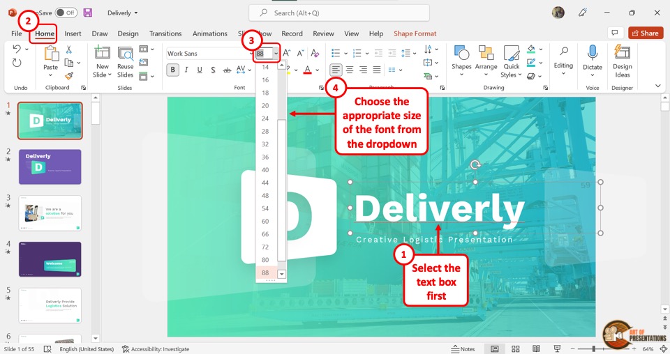
To change the font size, you have to first click on the text box in the slide. Then click on the “Font Size” box in the “Font” group of the “Home” menu.
You can click on your preferred font size from the dropdown list. You can also enter the font size directly in the “Font Size” box using your keyboard.
1b. Method 2 – Using the Increase or Decrease Font Size Buttons
You can also change the font size in PowerPoint slides by using the “Increase Font Size” and the “Decrease Font Size” buttons located at the right of the “Font Size” box.
“Increase Font Size”
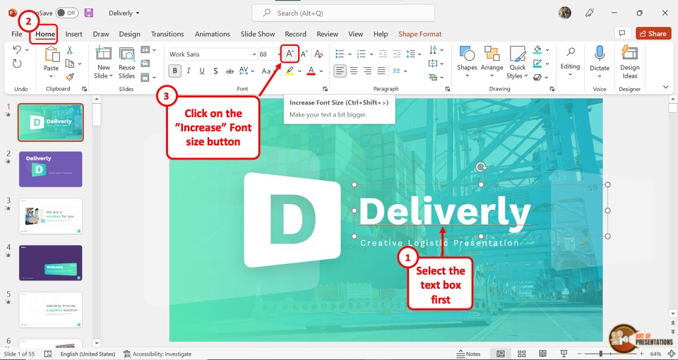
The “Increase Font Size” icon looks like the letter A with an upward arrow. Clicking on the button will increase the font size by 2 points.
Alternatively, you can press the “Ctrl+Shift+>” keys on your keyboard. You can repeatedly click on the button until the text reaches the preferred font size.
“Decrease Font Size”
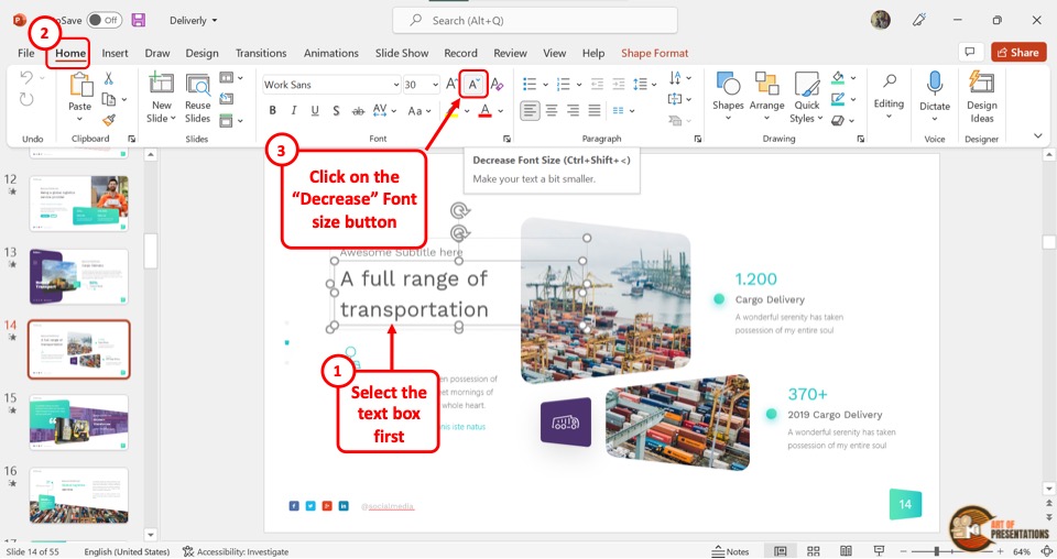
The “Decrease Font Size” icon looks like the letter A with a downward arrow. The font size of the selected text will decrease by 2 points when you click on the icon.
Alternatively, you can press the “Ctrl+Shift+<” keys on your keyboard. You can repeat the process until the text decreases to your preferred font size.
2. How to Change the Font Size on All Slides in PowerPoint?
Changing the font size on a single slide is what you most need. However, sometimes, you also need to change the size of fonts across the complete presentation. In such a scenario, changing the font size on each slide can become really monotonous and time-consuming.
In order to change the font size on all slides in PowerPoint, you will need to use the “Slide Master” in PowerPoint .
Here are the steps that you need to follow in order to change the fonts on all slides of your presentation.
Step-1: Click on the “Slide Master” option
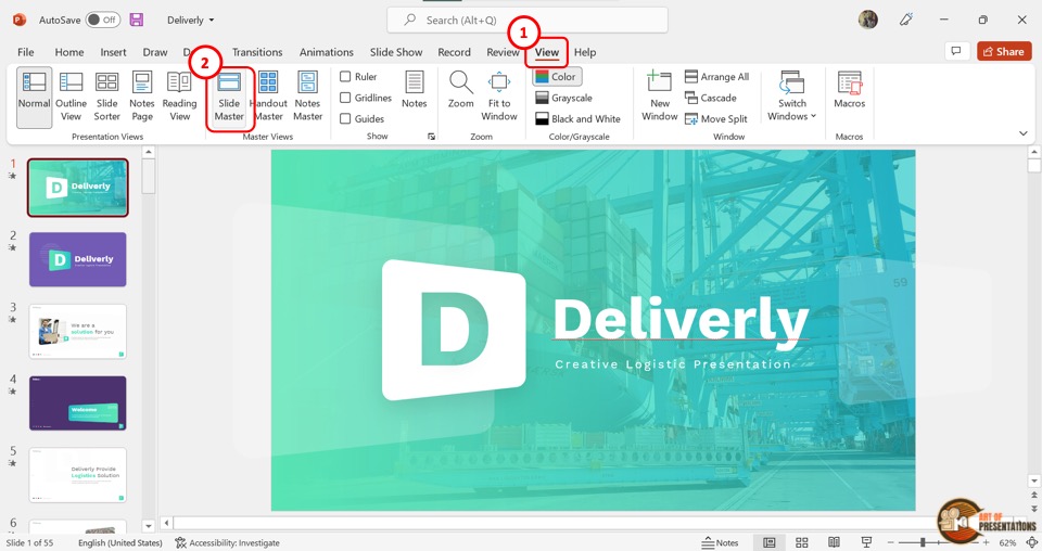
The first step is to open the “Slide Master” view. To do so, click on the “View” tab in the ribbon menu located at the top of the screen.
Then click on the “Slide Master” option in the “Master Views” group of the “View” menu.
Step-2: Click on the master slide
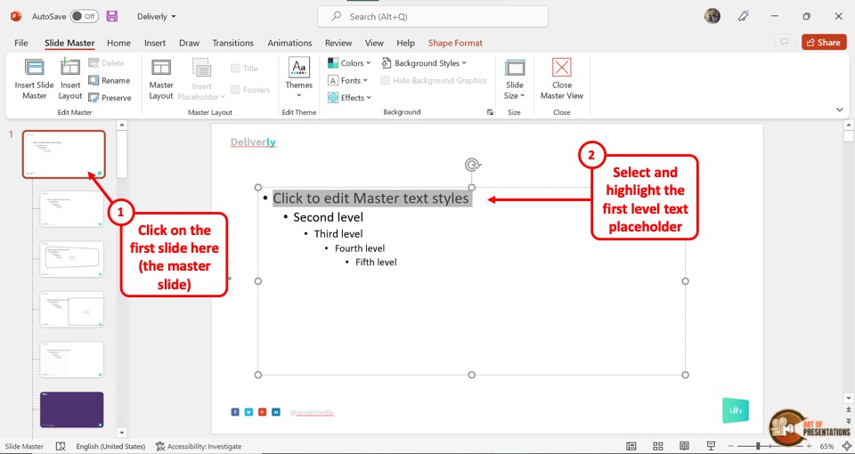
In the “Slide Master” view, click on the master slide. It is the top slide in the slide layout pane located on the left side of the screen.
In the master slide, highlight a bullet level or the entire text to change its font size.
Step-3: Click on the “Font Size” box
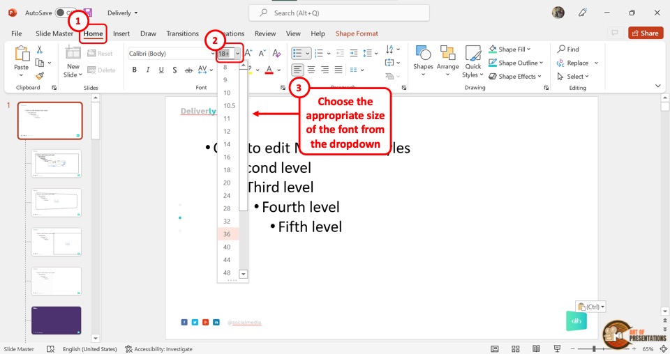
Now you have to click on the “Home” tab in the menu ribbon. In the “Font” group of the “Home” menu, click on the “Font Size” box to type in your preferred font size.
You can also select a font size from the dropdown list.
Step-4: Click on the “Close Master View” option
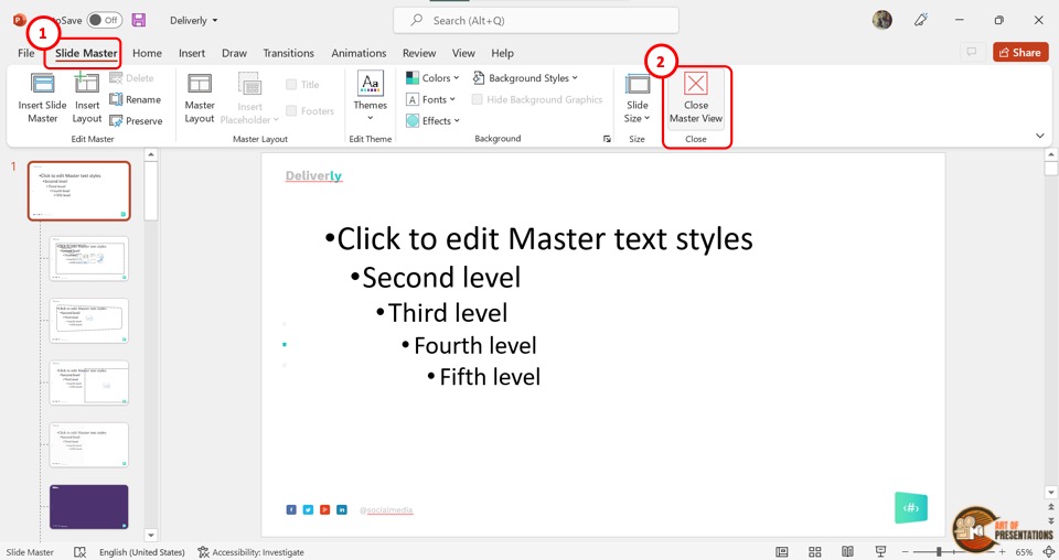
Now all you have to do is click on the “Slide Master” tab in the menu ribbon of the “Slide Master” view.
Then click on the “Close Master View” button to automatically save the changed font size for all texts in the presentation and return to the normal view.
3. How to Change the Default Font Size in PowerPoint?
Microsoft PowerPoint allows you to change the default font size for a presentation. This will affect all the texts in the open presentation file.
3a. Change Default Font Size of All Text in PowerPoint
In PowerPoint, you can add text to either a text box or a placeholder. To change the default font size of all the texts, you have to change the default font size of the placeholder and the text box separately.
To change the default font size of all the placeholders in a presentation, you have to access the “Slide Master” view. Refer to section 2 for the detailed steps of the process.
To change the default font size of all textboxes in the presentation, refer to the steps mentioned in the subsequent section 4.
3b. Change Font Size of Selected Text in PowerPoint
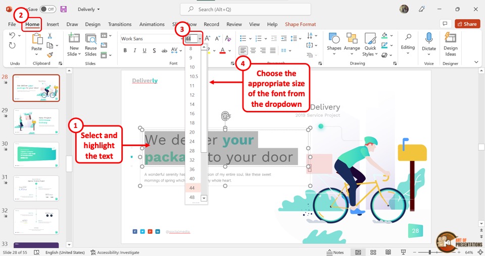
To change the font size of a selected text in PowerPoint, you have to first click on the “Home” tab in the menu ribbon. Then click on the “Font Size” box to select the preferred font size from the dropdown menu, or type in the number inside the box.
You can alternatively press the “Ctrl+Shift+>” keys on your keyboard to increase the font size and the “Ctrl+Shift+<” keys to decrease the font size.
4. How to Change Default Font Size of Text Box in PowerPoint?
In Microsoft PowerPoint, the default font size is 18 points for all text boxes. To change this default font size of the text box, follow the 2 quick steps.
Step-1: Click on the “Font Size” box
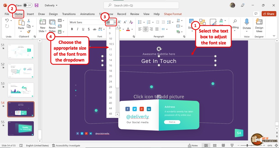
The first step is to click on any text box in the presentation. Then click on the “Font Size” box in the “Font” group of the “Home” tab. You can now select a font size from the dropdown list or type in the preferred font size inside the “Font Size” box.
Consider making any other changes to the text or formatting the text as per your requirement before moving on to the next step.
Step-2: Click on the “Set as Default Text Box” option
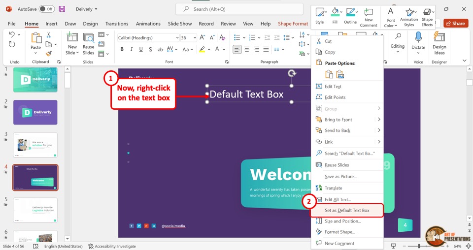
Now all you have to do is “Right-click” on the text box with the changed font size. In the right-click menu, click on the “Set as Default Text Box” option.
Now all new textboxes will have the changed font size as default.
One thing to note here is that the font size of the text in any existing text boxes will not change in your presentation. However, the changes will be visible the next time you add a text box on your slides in PowerPoint.
5. How to Change Font Size Automatically in a Text Box?
Microsoft PowerPoint offers the “Shrink text on overflow” feature using the autofit text options that automatically decreases the size of the text with the size of the text box. However, there is no feature to automatically increase the font size with the text box.
To enable the “Shrink text on overflow” feature, follow the 3 easy steps mentioned below
Step-1: Click on the “Format Shape” option
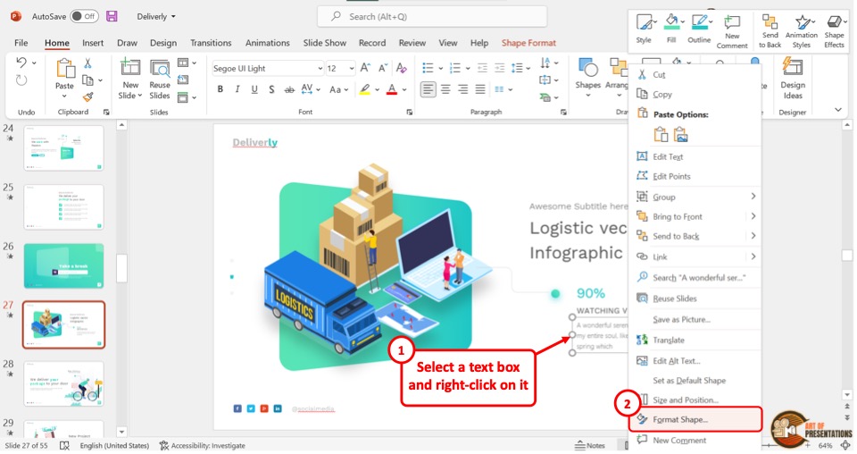
The first step is to “Right Click” on the text box. Then click on the “Format Shape” option from the right-click menu. This will open the “Format Shape” options in PowerPoint on the right side of the screen.
Step-2: Click on the “Text Options” tab
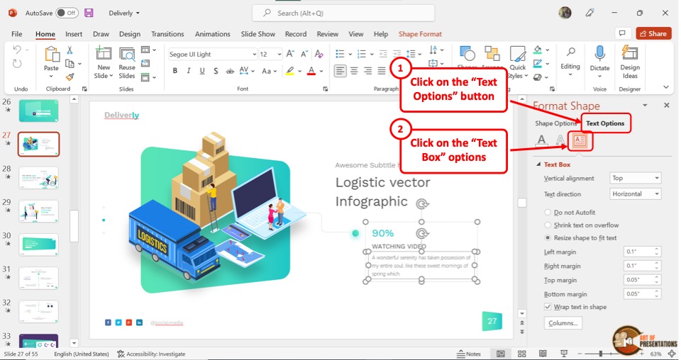
In the “Format Shape” sidebar, click on the “Text Options” tab. Under the “Text Options” tab, click on the “Text Box” option which is the last icon and looks like the letter A in a paragraph.
Step-3: Click on the “Shrink text on overflow” option
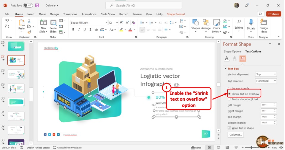
Now all you have to do is click on the “Shrink text on overflow” option in the “Format Shape” sidebar to enable the feature.
5a. How to Prevent Font Size From Changing Automatically?
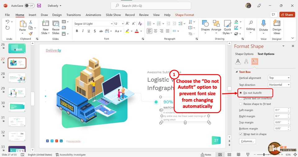
You can also stop the font size from changing automatically with the size of the text box. All you have to do is click on the “Do not Autofit” option in the “Format Shape” sidebar on the right side of the screen.
6. How to Change Font Size of Notes in PowerPoint?
The notes in Microsoft PowerPoint can be used as speaker notes, or even printed out for your audience. Using the “Notes Master” in PowerPoint , you can change the font size of the notes.
Here’s a quick overview of what you need to do –
Step-1: Click on the “Notes Master” option
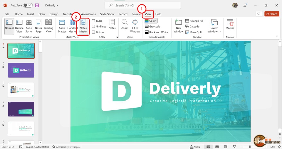
The first step is to click on the “View” tab to open the “View Options in PowerPoint” . Then click on the “Notes Master” option in the “Master Views” group of the “View” menu.
Step-2: Click on the “Home” tab
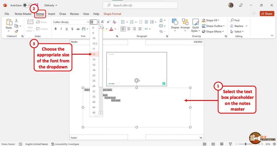
In the “Notes Master” screen, you have to now select the entire text or a bullet level in the placeholder to change its font size. Then click on the “Home” tab in the menu ribbon located at the top of the screen.
In the “Font” group of the “Home” tab, click on the “Font Size” box. Then select a font size option from the dropdown menu or type a font size in the box (as shown in the image in step 2).
You can also click on the “Increase Font Size” button next to the “Font Size” box to increase the font size. Click on the “Decrease Font Size” button to decrease the font size of the notes.
Step-4: Click on the “Close Master View” button
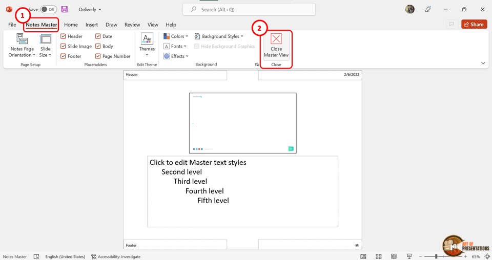
The final step is to click on the “Notes Master” tab in the ribbon menu located at the top of the screen.
Then click on the “Close Master View” button which is the last option in the “Notes Master” tab to save the changed font size for the presentation notes.
7. How to Change Font Size of Footer in PowerPoint?
In Microsoft PowerPoint, the footer present at the bottom of all slides in a presentation is editable in the master slide.
You can change the font size or even edit the footer in PowerPoint using the “Slide Master” view. Here’s what you need to do –
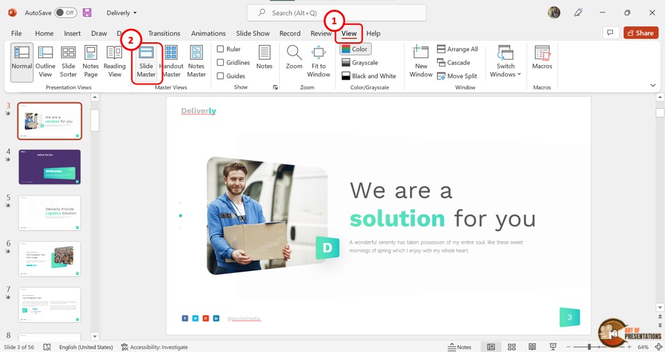
In the menu ribbon located at the top of the screen, you have to first click on the “View” tab. Then click on the “Slide Master” option in the “Master Views” group of the “View” menu. This will open the “Slide Master” view.
Step-2: Click on the footer
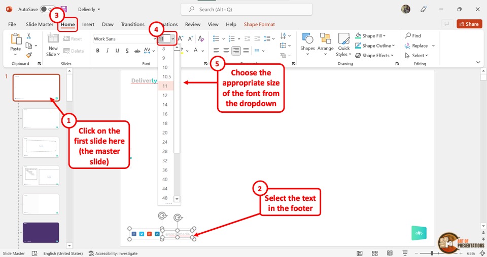
In the “Slide Master” view, click on the master slide which is the top slide in the slide layout pane on the left side of the screen.
Now you have to highlight the text in the footer section located at the bottom of the master slide.
The next step is to click on the “Home” tab in the menu ribbon. In the “Font” group of the “Home” menu, click on the “Font Size” box.
You can now select a font size for the footer from the dropdown menu or type in your preferred number in the “Font Size” box (as shown in the image in step 2).
Finally, you have to click on the “Slide Master” tab in the menu ribbon of the “Slide Master” view. In the “Slide Master” tab, click on the “Close Master View” button to save changes to the font size of the footer and return to normal view.
8. Change Font Size of Data Label of a Chart in PowerPoint?
Sometimes, you also want to change the font size of data labels on a chart in PowerPoint. Well, you can do that too. You can change the font size of each label separately or for the entire chart at once. Here’s how –
8a. Change Font Size of a Single Label
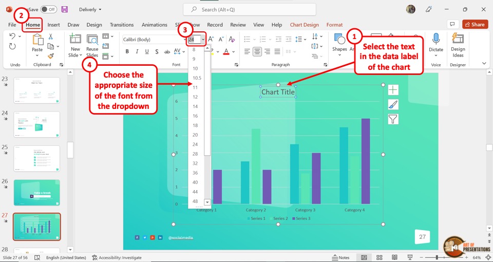
To change the font size of a single label in a PowerPoint chart, click on the label to select it separately. Then click on the “Font Size” box in the “Font” group of the “Home” menu to enter your preferred font size.
You can alternatively click on the “Increase Font Size” icon or the “Decrease Font Size” icon next to the “Font Size” box repeatedly until the label reaches your preferred font size.
8b. Change Font Size of All Labels
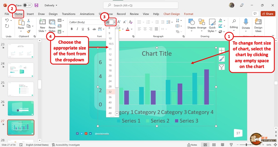
To change the font size of all the labels in a chart at once, click on an empty space inside the chart. This will select the entire chart on a slide.
Now all you have to do is enter your preferred font size in the “Font Size” box in the “Font” group of the “Home” tab in the menu ribbon. You can also select a font size from the dropdown list under the “Font Size” box.
9. What is the Minimum Possible Font Size in PowerPoint?
In Microsoft PowerPoint, the lowest possible font size is 1 point. You can click on the “Font Size” box in the “Font” section of the “Home” menu, and enter any number between 1 to 3600. However, the least possible font size available in the dropdown list under the “Font Size” box is 8 points.
10. Can’t Change Font Size in PowerPoint? Here’s What to Do!
If you cannot change the font size of a text box in PowerPoint, it is likely that the text box is inserted into the master slide or the slide layout.
In the “Slide Master” view, any inserted object except the placeholders is not editable in the normal view.
To be able to change the font size, you have to open the specific slide layout in the slide master view, select the text box, and change the font size of the text.
Step-1: Click on the “View” tab
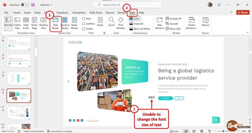
The first step is to click on the “View” tab in the menu ribbon located at the top of the screen. In the “View” menu, click on the “Slide Master” option.
Step-2: Click on the text box
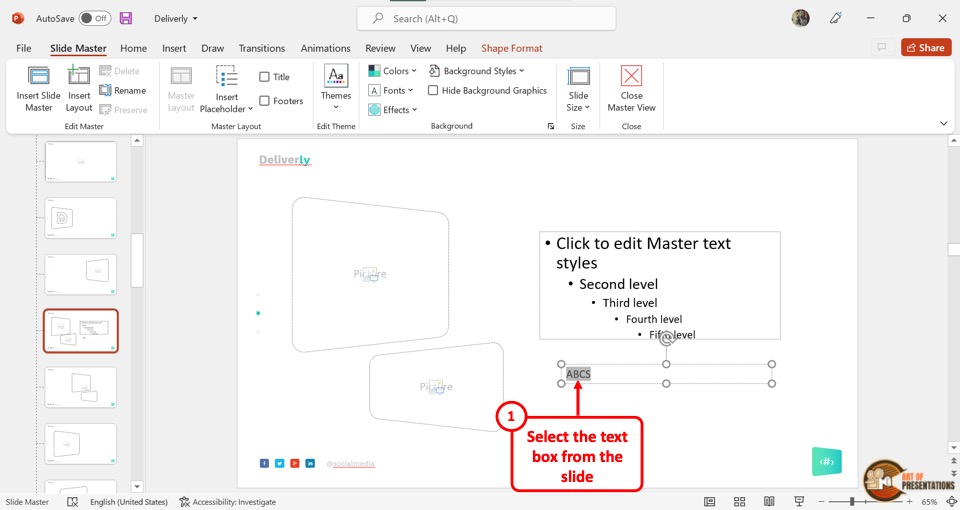
In the slide layout pane of the “Slide Master” view, click on the slide layout containing the uneditable text box. Then highlight the text inside the text box.
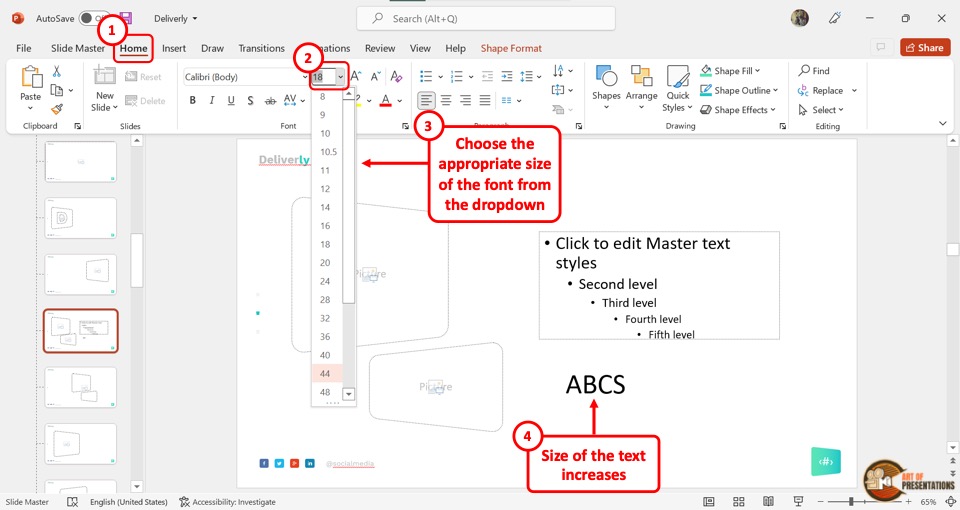
The next step is to click on the “Home” tab in the menu ribbon of the “Slide Master” view. In the “Font” group of the “Home” menu, click on the “Font Size” box. Now all you have to do is type in your preferred font size for the text.
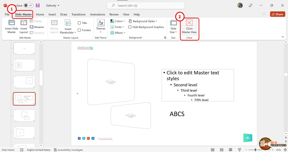
Finally, you can click on the “Slide Master” tab in the menu ribbon. In the “Slide Master” menu, click on the “Close Master View” option to save the changes to the font size of the text box.
Credit to pressahotkey (on Freepik) for the featured image of this article (further edited)
Tips to Pick the Best Fonts for Your Next PowerPoint Presentation
Imagine attending a presentation where, as the presenter begins, you struggle to read the slides from afar due to the use of improper fonts. Despite the presenter’s excellent delivery, your interest wanes within minutes because you can’t easily read the text on the screen. Thus, it is important to pick the right fonts for your presentations.
In this article, we will delve into the tips for choosing the best fonts for your slides. So, let’s get going!
Why Do Fonts Matter?
Choosing the right fonts in PowerPoint is crucial as it significantly impacts readability and audience engagement. Clear and readable fonts ensure that your audience can effortlessly absorb your content. The right font choice can transform your slides from cluttered and confusing to clean and professional, making your message not only accessible but also compelling.
Moreover, fonts are potent tools for setting the tone and reinforcing the message. The subtle nuances of font styles can convey a range of emotions. So, you must avoid mistakes while selecting fonts for your presentation .
How to Pick the Best Fonts for Your PowerPoint Presentation?
1. consider the purpose of your presentation.
Before choosing fonts, it is essential to understand the purpose of your presentation. Is it a formal business presentation, an educational lecture, or a creative pitch? The purpose will guide your font choices.
For instance, for a business presentation, use formal fonts to convey professionalism and reliability and focus on classic fonts like Times New Roman or modern sans serif fonts like Helvetica. Have a look-
Image source
However, for creative slides, feel free to experiment with more unique and decorative fonts that reflect the creativity and innovation of your ideas, but use them sparingly to avoid overwhelming your viewers.
Image Source
2. Understand Your Audience and Accessibility
Knowing your audience is vital in selecting the right fonts. Consider their demographics, preferences, expectations, and any potential accessibility needs.
For instance, if your audience comprises elderly generations, you can use bigger and clearer fonts that can be easily read from afar. Avoid overly cursive fonts that can be difficult to understand.
However, if your audience members are younger, you may opt for more trending and funky fonts.
3. Create a Visual Hierarchy
Creating a visual hierarchy with your fonts is crucial for guiding your audience through your presentation and ensuring that the most important information stands out. Visual hierarchy is the organization of different elements on slides in a way that signifies their importance, helping viewers understand what to focus on first.
By strategically varying font size, weight, and style, you can create a clear structure that directs attention to key points and makes the content more digestible.
For instance, using a large, bold font for headings immediately draws the eye and indicates the start of a new section. In contrast, smaller, regular fonts for body text provide detailed information without overwhelming the viewer.
Headings should be quite larger than the body text. Subheadings, which help break down content into manageable sections, should be smaller than main headings but still larger than the body text.
This tiered approach helps your audience effortlessly navigate through the presentation.
For instance, look at the image below- organizing the font in different sizes and weights guides the viewer toward the hierarchy and shows the difference between various levels of information.
4. Play with Color and Contrast
Playing with color and contrast in your fonts can significantly enhance your presentation’s visual impact and readability. Proper use of color can highlight key information and differentiate between various sections.
For example, in the visual below, look at how the number has been highlighted with a contrasting color. It instantly draws the audience’s attention and showcases the importance of the information.
Additionally, consider the psychological impact of colors. Colors like orange and red evoke excitement and urgency, while cool colors like beige and brown convey calmness and minimalism. By thoughtfully playing with color and contrast, you can enhance your PowerPoint presentation’s visual clarity and emotional impact.
Let us understand with the help of an example. Consider the slide decks given below. While the first one creates a sense of urgency because of the font’s bright red color, the second one conveys a sense of calmness due to the neutral beige shades in its font.
5. Focus on Alignment and Spacing
Focusing on alignment and spacing in your PowerPoint fonts is essential for creating a clean, organized presentation.
Spacing between lines and paragraphs is crucial in maintaining readability and reducing visual clutter. Adequate line spacing ensures that your text doesn’t appear cramped, which can strain the reader’s eyes. A line spacing of 1.2 to 1.5 is typically recommended for body text.
The image below illustrates how spacing can be the difference between a well-crafted slide and a shabby one.
Additionally, proper paragraph spacing helps separate various sections of content, making it easier for the audience to digest the information. Avoid squeezing too much text onto a single slide; break up the content into bullet points or separate slides to enhance clarity and focus.
Consistent alignment and spacing throughout your presentation contribute to a cohesive and polished look. By paying attention to these details, you can improve the aesthetic appeal of your presentation and enhance the overall user experience, making your message more impactful and engaging.
6. Pair Fonts Together
Effectively pairing fonts can elevate your design, creating an aesthetically pleasing look. To achieve a harmonious pairing, consider using complementary fonts that balance each other well. Pairing a bold, attention-grabbing font for headings with a simpler, more legible font for body text ensures readability while maintaining visual appeal.
By thoughtfully pairing fonts that complement each other, you can craft a cohesive and engaging visual experience that enhances the effectiveness of your PowerPoint presentation.
Here are a few examples of how you can pair different fonts together.
To sum it up, fonts are more than just a stylistic choice; they are powerful tools for communication and persuasion in PowerPoint presentations. By understanding the nuances of font types, considering the purpose of your presentation, and implementing effective pairings, you can create visually appealing slides. Remember to prioritize readability, maintain consistency, and use color and contrast to make your presentation visually persuasive.
Leave a Response Cancel reply
Save my name, email, and website in this browser for the next time I comment.
Please enter an answer in digits: two × one =
Ashish Arora
You might also like.

Presentation Background Design: Factors and Best Practices

12 Ways to Make an Engaging Slide Deck and Captivate Your Audience
A Complete Guide to Writing a Clear and Concise Problem Statement

Dashboard Presentations: Data Visualization Made Simpler

15 Best Powerpoint Fonts That Make Your Presentation Designs Stand Out

Table of Contents
Microsoft PowerPoint serves as a crucial tool in the business world, employed by numerous experts for crafting slide decks, delivering presentations, and disseminating valuable insights among colleagues
s and clients. Like other powerful presentation tools, PowerPoint allows users to elevate their presentations using unique effects, animations, geometrical forms, color variations, transitional effects, and many enhancements.
Furthermore, with these advantages, PowerPoint provides an extensive collection of fonts that users can select to improve their presentations’ legibility and overall effectiveness. While fonts are generally classified into four primary categories—Serif, Sans Serif, Script, and Decorative fonts—PowerPoint offers an array of additional fonts that enable you to adeptly communicate your messages and work towards accomplishing your intended objectives.
In this blog, we will share the 15 best PowerPoint fonts you can easily use to make your presentations stand out and get your messages across. Let’s get started.
What are Presentation Fonts?

Presentation fonts refer to the specific typefaces or styles of lettering chosen and used in visual aids such as slideshows, slides, and other presentation materials. These fonts play a critical role in shaping the overall appearance, readability, and impact of the content presented.
Presentation fonts encompass a variety of characteristics, including letter shapes, sizes, spacing, and overall design, which collectively contribute to the visual appeal and effectiveness of the presentation. Selecting appropriate presentation fonts is essential for conveying information clearly, maintaining audience engagement, and enhancing the overall aesthetics of the materials.
Different fonts evoke different moods and convey varying levels of formality, influencing how the audience perceives and interacts with the presented content. As such, choosing the right presentation fonts is a strategic decision that can significantly contribute to the success of a presentation.
Creating an impactful presentation involves numerous elements, and one crucial aspect that significantly influences its effectiveness is the choice of fonts. Fonts are pivotal in determining how your audience perceives, understands, and retains your content. The right selection of fonts can transform an ordinary presentation into a visually appealing and engaging masterpiece.
Here are the 15 best fonts for presentations that can elevate your designs and make them stand out.
1. Helvetica Neue

Helvetica Neue is a popular sans-serif font known for its clean, modern, and versatile design. Created by designer Max Miedinger in 1983, Helvetica Neue retains the timeless appeal of the original Helvetica while incorporating subtle refinements. It’s balanced proportions and neutral letterforms make it a go-to choice for various design applications, including print and digital media.
The font’s simplicity and clarity contribute to easy readability, even at small sizes and on screens, making it an excellent choice for PowerPoint presentations. Helvetica Neue’s lack of decorative elements and inherent legibility make it suitable for conveying information with a straightforward and professional aesthetic. Its widespread availability across different platforms and devices ensures consistent presentation.
As a result, Helvetica Neue has become an iconic and widely used typeface in branding, advertising, and design, representing a harmonious blend of modernity and functionality.

Arial is a basic sans-serif font frequently employed in presentations for its simplicity and readability. Designed by Robin Nicholas and Patricia Saunders, it offers a clean and straightforward appearance that ensures legibility, even on screens or projectors.
Arial’s uniform stroke widths and basic letterforms contribute to a modern and professional visual impression, making it suitable for various content types, from titles to body text. It’s versatility and widespread compatibility across platforms and devices guarantee a consistent viewing experience.
While some critics view it as lacking distinctiveness, Arial’s ubiquity and familiarity make it a reliable choice for conveying information effectively in presentations, maintaining focus on content without distracting flourishes.

Calibri is a contemporary sans-serif typeface designed by Lucas de Groot for Microsoft. Introduced with Microsoft Office 2007, Calibri quickly gained popularity due to its exceptional legibility on both screens and in print. Its clean, rounded letterforms and consistent stroke widths create a smooth and modern appearance, contributing to an approachable and professional aesthetic.
Calibri’s optimized design for digital displays ensures clarity even at small sizes, making it a favored choice for body text in presentations. The font’s neutrality and balanced proportions offer versatility, suitable for various content styles, from formal reports to casual presentations.
Calibri’s inclusion as the default font in Microsoft Office has led to its widespread adoption, making it a standard choice for documents and presentations, particularly in digital contexts.

Georgia is a classic serif typeface designed by Matthew Carter and introduced by Microsoft in 1993. Drawing inspiration from traditional typefaces found in print, Georgia is designed for optimal legibility, particularly in digital environments.
Its distinctive features include high contrast between thick and thin strokes and bracketed serifs, giving it an elegant and timeless appearance. Georgia’s serifs help guide the reader’s eye along the text, making it suitable for longer passages and body text in presentations. It also features tall lowercase letters and gives presentations a classic look.
The font’s warmth and character evoke a sense of familiarity and tradition, which can lend a touch of sophistication to both print and digital materials. Its readability, versatility, and aesthetic appeal have made Georgia popular for conveying information with clarity and a touch of classic refinement.
5. Garamond

Garamond is a classic serif font with a rich historical lineage, named after the renowned French engraver Claude Garamond. The typeface we commonly refer to as Garamond is a modern interpretation of his work. Designed with an emphasis on elegance and readability, Garamond features balanced proportions and subtle variations in stroke width, creating a harmonious and refined appearance.
Its serifs, the small decorative flourishes at the end of letter strokes, contribute to a smooth reading flow and guide the eye across the text. Garamond’s design makes it particularly suitable for printed materials and documents where conveying a sense of tradition, sophistication, and authenticity is essential.
Garamond has seen various adaptations over the centuries, resulting in different variations. Each version maintains the essence of its historical roots while adapting to contemporary typographic standards. Garamond’s timeless charm and ability to evoke a sense of classic craftsmanship make it a popular choice for formal presentations, books, and other materials where an air of prestige and legacy is desired.

Futura is a geometric sans-serif font style that epitomizes modernity and minimalism in typography. Designed by Paul Renner in the 1920s, Futura broke away from traditional letterforms by embracing clean, geometric shapes with uniform strokes and simple, unadorned lines. Its distinctive design is characterized by circles, triangles, and rectangles, giving it a distinct futuristic appearance.
Futura’s bold, straight-edged letterforms exude a sense of order and efficiency. Its lack of serifs and the decorative extensions at the end of letter strokes enhance its clarity and readability, particularly in large display settings. Futura’s minimalist aesthetics have influenced a myriad of contemporary typefaces and design movements.
Futura’s versatility lies in its ability to convey both a sense of technological advancement and artistic expression. It is frequently used in modern designs, branding, advertising, and presentations seeking a sleek and forward-thinking visual identity. Futura’s timeless design has ensured its enduring popularity and continued relevance in various design contexts, making it an iconic choice for conveying a sense of progress and innovation.

Lato is a modern sans-serif font designed by Łukasz Dziedzic. Introduced in 2010, Lato has quickly gained popularity for its balanced and approachable design. Its name, “Lato,” is the Polish word for “summer,” which reflects the font’s friendly and warm character.
Lato is known for its clarity and legibility, making it suitable for various applications, including presentations. Its letterforms feature open proportions and rounded curves, contributing to a pleasant reading experience on print and digital screens. Lato comes in a variety of weights and styles, allowing for flexibility in design and layout.
The typeface’s versatility shines through in its clean, professional appearance and adaptability to different design contexts. Lato maintains a harmonious balance between formality and friendliness, whether used for headings, body text, or captions. This versatility, combined with its extensive character set and multilingual support, makes Lato an excellent choice for presentations that aim to convey information clearly while maintaining a modern and inviting visual style.
8. Rob o to

Roboto is a contemporary sans-serif font designed by Christian Robertson and introduced by Google in 2011. Engineered with the modern digital landscape in mind, Roboto strikes a delicate balance between simplicity, readability, and a touch of uniqueness. Its name is derived from the word “robot,” aligning with its clean and technical appearance.
Roboto’s letterforms exhibit a neutral, clean design characterized by consistent stroke widths and minimal embellishments. This design choice enhances legibility across various sizes and platforms, making Roboto an excellent choice for both digital and print applications, including presentations.
The typeface’s distinctive features, such as its open letter shapes and rounded terminals, add a subtle touch of character without sacrificing clarity. Roboto offers a range of weights and styles, allowing for versatile use in different sections of presentations, from titles to body text.
Its widespread adoption as the default font in many Google applications, including the Android operating system, has contributed to Roboto’s familiarity and recognition. Its pragmatic yet refined design makes it suitable for conveying information with a contemporary and professional demeanor while incorporating individuality into your presentation designs.
9. Montserrat

Montserrat is a contemporary sans-serif typeface designed by Julieta Ulanovsky, tailored to enhance your presentations. With its clean and modern aesthetic, Montserrat adds a touch of sophistication to your slides while maintaining readability. Its squared letterforms exude a professional yet approachable vibe, making it perfect for titles, headings, and body text.
This font’s versatility shines through its various weights, providing options for emphasis and hierarchy in your presentation. Montserrat’s geometric design ensures a polished look that captivates the audience’s attention. Whether projected on a screen or printed, Montserrat remains legible and stylish, contributing to a cohesive and visually appealing presentation.
Incorporating Montserrat into your slides elevates their visual impact, giving your content a contemporary edge that resonates with modern audiences. Its adaptability and charm make Montserrat an excellent choice for crafting captivating presentations that effectively convey your message while showcasing a touch of design flair.
10. Playfair Display

Playfair Display is an elegant and timeless serif typeface designed to add a touch of sophistication and class to your presentations. Created by Claus Eggers Sørensen, Playfair Display is reminiscent of traditional typography with its high contrast between thick and thin strokes, resembling calligraphic forms.
This typeface is like a well-dressed speaker on stage – its stylish serifs, and graceful curves lend an air of authority to your titles and headings. Playfair Display’s classic appearance evokes a sense of refinement, making it ideal for conveying important information or adding a touch of elegance to your slides.
Whether you’re aiming for a formal presentation or want to infuse a sense of luxury into your design, Playfair Display provides a distinct visual impact. It’s versatility and historical charm make it a favorite for adding a touch of sophistication to your presentation’s visual narrative, ensuring your content stands out with a touch of timeless elegance.
11. Century Gothic

Century Gothic is a sleek and modern sans-serif typeface designed to bring a contemporary edge to your presentations. With its clean lines and geometric shapes, Century Gothic exudes a sense of simplicity and professionalism, making it perfect for conveying a modern and minimalist aesthetic.
Imagine Century Gothic as the “less is more” of typography – its absence of serifs and uncluttered design adds a touch of sophistication without overwhelming your content. This typeface’s even letter spacing and consistent stroke widths ensure excellent readability, whether projected on a screen or printed.
Century Gothic’s versatility shines through in both titles and body text, making it a reliable choice for various presentation elements. Its simplicity and modernity allow your content to take center stage, while its contemporary flair adds a touch of visual interest.
Incorporating Century Gothic into your presentations offers a fresh and up-to-date look, capturing the essence of modern design. Its streamlined appearance creates a professional and polished impression, helping your content shine with a modern, clean, and confident visual identity.
12. Bebas Neue

Bebas Neue is a bold, attention-grabbing sans-serif font designed to inject impact and dynamism into your presentations. Created by Ryoichi Tsunekawa, Bebas Neue exudes a sense of confidence and strength with its striking letterforms and commanding presence.
Think of Bebas Neue as the font that demands to be heard – its all-caps design and strong lines make it perfect for titles, headers, or any element you want to emphasize. This typeface’s assertive personality adds an energetic and modern edge to your presentation, ensuring your content stands out.
Bebas Neue is like the bold speaker on stage who captivates the audience’s attention. Its no-nonsense appearance conveys a sense of urgency and importance, making it a powerful tool for making key points or driving home impactful messages.
Incorporating Bebas Neue into your presentations infuses them with vigor and visual intensity, instantly elevating your content’s presence. Its robust and powerful aesthetic ensures that your message is communicated with strength and authority, leaving a lasting impression on your audience.
13. Quicksand

Quicksand is a friendly and informal sans-serif font designed to infuse a touch of playfulness and creativity into your presentations. Created by Andrew Paglinawan, Quicksand’s rounded letterforms and approachable style create a welcoming and casual atmosphere.
Think of Quicksand as the font that brings a smile – it’s soft edges and gentle curves evoke a sense of friendliness, making it perfect for adding a warm, relaxed vibe to your slides. This typeface’s informal charm is like a friendly conversation that engages your audience in a comfortable and approachable way.
Quicksand is ideal for conveying approachability and approachability in presentations, whether you’re using it for captions, bullet points, or headings. Its youthful and cheerful appearance adds a touch of personality, capturing attention without overwhelming your content.
Incorporating Quicksand into your presentations adds a delightful and human touch, creating an atmosphere that encourages interaction and connection. Its informal yet professional flair ensures that your content is relatable and engaging, making your presentation a memorable and enjoyable experience for your audience.

Tahoma is versatile, legible, and one of the most popular sans-serif fonts designed for optimal readability in various digital and printed contexts. Created by Matthew Carter, Tahoma exudes a sense of clarity and professionalism, making it an excellent choice for presentations.
Imagine Tahoma as the dependable communicator – its well-defined letterforms and even spacing ensure straightforward and easy reading, whether on screens or in print. This typeface’s balanced proportions and clean design create a sense of order and organization, ideal for precisely conveying information.
Tahoma’s adaptability shines through in its versatility – it works seamlessly for both titles and body text, maintaining a consistent and cohesive visual identity. Its straightforward yet polished appearance ensures that your content remains the focus.
Incorporating Tahoma into your presentations provides a dependable and straightforward approach, allowing your information to be conveyed with accuracy and professionalism. It’s reliability and understated elegance make Tahoma a trustworthy companion for ensuring your content is clear, organized, and easily understood by your audience.

Corbel is a sans-serif font designed by Jeremy Tankard. With its clean and contemporary appearance, Corbel brings a sense of simplicity and readability to various design projects, including presentations.
Imagine Corbel as the modern communicator – its straightforward letterforms and even spacing ensure clear and easy reading, whether displayed on a screen or printed on paper. This typeface’s unpretentious yet sleek design balances professionalism and approachability, making it suitable for a wide range of applications.
Corbel’s versatility is evident in its various weights and styles, allowing for adaptability in design. It can seamlessly transition from titles to body text, maintaining a consistent look while adding visual interest.
Incorporating Corbel into your presentations offers a modern and functional approach where information is communicated clearly and efficiently. Its uncluttered elegance ensures that your content takes center stage, while its contemporary flair adds a touch of visual appeal. Corbel is like a dependable and modern companion that ensures your message is effectively communicated stylishly and readable.
10 Tips for Choosing the Best PowerPoint Presentation Fonts
Creating a visually appealing and effective PowerPoint presentation involves various elements, and one of the most crucial components is the choice of fonts. The fonts you select play a significant role in conveying your message, setting the tone, and enhancing the overall aesthetics of your presentation. Here are ten tips to guide you in choosing the best PowerPoint presentation fonts:
1. Readability is Key
Prioritize readability above all else. Choose fonts that are easy to read, even from a distance. Avoid overly intricate or decorative fonts that might distract or confuse your audience.
2. Consistency Matters
Maintain font consistency throughout your presentation. Limit yourself to a maximum of two or three font types to ensure a cohesive and polished look. Use one font for headings, another for body text, and perhaps a third for accents or emphasis.
3. Consider the Audience
Tailor your font choice to your audience. For professional or academic presentations, opt for classic and formal fonts. Experiment with more unique and expressive options for a creative or casual audience.
4. Reflect on the Content
The fonts you choose should reflect the content and message of your presentation. Formal content might call for a serif font, while contemporary or tech-related subjects may pair well with a modern sans-serif font.
5. Think About Branding
If your presentation represents a company or brand, align your font choices with their existing branding guidelines. Consistency in font usage reinforces brand identity and professionalism. If your brand has a modernized style, consider using a modern serif font to complement your brand style.
6. Pay Attention to Style
Different fonts convey different styles and moods. Serif fonts can evoke tradition and formality, while sans-serif fonts often feel modern and clean. Script fonts exude elegance, and decorative fonts add flair.
7. Balance Contrast
Pair fonts with contrasting characteristics. Combine a bold, attention-grabbing font for headings with a more understated font for body text. The contrast helps guide the reader’s eye and maintain visual interest.
8. Test for Legibility

Test your chosen fonts on different screens and devices to ensure legibility. What looks good on your computer might appear different when projected on a larger screen. For effective PowerPoint presentations, the best font size to use is:
- 36-44 points for titles
- 28-32 points for subtitles
- 24-28 points for body text
- 18-22 points for image captions
- 16 points for footnotes
Adjust to venue and audience. Prioritize readability to ensure your message is easily conveyed and understood.
9. Avoid Clashing
Steer clear of font combinations that clash or compete for attention. Fonts should complement each other and work harmoniously to enhance the overall design.
10. Trial and Feedback
Create sample slides with your selected fonts and gather feedback from colleagues or peers. Their input can provide valuable insights into your font choices’ overall impression and effectiveness.
Selecting the best PowerPoint presentation fonts involves a thoughtful and strategic approach. By prioritizing readability, consistency, and alignment with your content and audience, you can create a visually compelling and impactful presentation that effectively conveys your message and leaves a lasting impression. Remember that font choices are just one aspect of a well-designed presentation, so pair them with engaging visuals and well-crafted content for a comprehensive and successful result.
Bottom Line
Overall, the choice of fonts in your PowerPoint presentation plays a pivotal role in shaping your message’s visual impact and effectiveness. By carefully considering factors such as readability, style, and audience, you can create a harmonious and engaging visual experience. Remember that fonts are not just decorative elements; they are powerful tools that can enhance your content’s clarity, professionalism, and emotional resonance.
Whether you opt for classic serif fonts that exude tradition and authority, modern sans-serif fonts that convey a sense of clarity and innovation, playful scripts that infuse personality or work with custom fonts, your font choices should align with your content’s goals and context. Consistency and balance across font types, sizes, and styles contribute to a polished and cohesive presentation that captivates and informs your audience.
Ultimately, the art of selecting the right fonts involves a thoughtful blend of creativity and strategic intent. By adhering to the principles and perspectives discussed in this blog, you can boldly start exploring different blogs, transforming your PowerPoint presentations into compelling visual narratives that leave a lasting impression on your audience.
Related articles

Ready to create more designs for lesser costs?


Think Outside The Slide
Ten Secrets For Using PowerPoint Effectively
You can take many courses on how to use PowerPoint from a technical standpoint, but when it is used effectively, it can add tremendously to our presentations. Here are ten secrets based on years of experience in developing and using presentation slides that will help you move from being technically proficient to using PowerPoint effectively.
1. Start by creating an outline
The most important part of any presentation is the content, not the graphical appeal. That is why you should develop your presentation with the content first, before deciding on the look (colours, graphics, etc.) Create a good structure for your presentation by reflecting on the goal of the presentation ( more details in this article ), what your audience is thinking right now, and what points you need to make in order to move the audience from where they are to where you want them to be ( like a GPS ). Write an outline on paper or use sticky notes so you can move ideas around. By creating an outline first, you ensure that the content of your presentation is solid before you concern yourself with the visual elements. Here are links to some articles that deal with common types of presentations: Status Update , Presenting a Recommendation , and a Sales presentation .
2. Use Contrasting Colours
If you want your audience to be able to see what you have on the slide, there needs to be a lot of contrast between the text colour and the background colour. I suggest a dark background with light text – I usually use a medium to dark blue background and white or yellow letters. Some prefer a light background and dark letters, which will also work well – which you choose will depend on personal preference. Don’t think that just because the text looks fine on your computer screen that it will look fine when projected. Most projectors make colours duller than they appear on a screen, and you should check how your colours look when projected to make sure there is still enough contrast. To check that your colors have enough contrast, use the Color Contrast Calculator . Use the tool in this article to take into account the challenges of those who have color deficiency .
3. Use a big enough font
When deciding what font size to use in your presentation, make sure it is big enough so that the audience can read it. I usually find that any font size less than 24 point is too small to be reasonably read in most presentation situations. I would prefer to see most text at a 28 or 32 point size, with titles being 36 to 44 point size. The only reason I would use a font less than 24 point is when adding explanatory text to a graph or diagram, where you could use a 20 point font size. If you are given a small screen in a big room, your font will look smaller because the image will not be as big as it should be. In this case, see if you can get a larger screen, use a wall instead of a screen to project on, move the chairs closer to the screen or remove the last few rows of chairs. I’ve put together a chart that lists how far away the last row of your audience should be based on the size of screen, font size and visual acuity testing – use the Font Size chart here . (If you are selecting colors and fonts to design a PowerPoint template, you will want to get the book Building PowerPoint Templates Step by step with the experts. Read more and order here .)
4. Stop the moving text
When text comes on the screen, we want the audience to read the text, then focus back on the presenter to hear the message. If the text moves onto the screen in any way – such as flying in, spiral or zooming – it makes it harder for the audience members to read since they have to wait until the text has stopped before they can read it. This makes the presenter wait longer between each point and makes the audience members focus more on the movement than on what is being said. I suggest the use of the “Appear” effect, which just makes the text appear and is the easiest for the audience to read. This article explains how proper use of builds helps focus the audience. So you don’t have to stand beside your computer to advance each build on the slide, use this remote , the one I have relied on for over a decade.
5. Turn the pointer off
During a presentation, it is very annoying to have the pointer (the little arrow) come on the screen while the presenter is speaking. It causes movement on the screen and draws the audience attention from the presenter to the screen. The pointer comes on when the mouse is moved during the presentation. To prevent this from happening, after the Slide Show view has started, press the Ctrl-H key combination. This prevents mouse movement from showing the pointer. If you need to bring the pointer on screen after this, press the A key. If the pointer does appear during your presentation, resist the urge to press the Escape key – if you do, it will stop the presentation and drop you back into the program. Press the A key or Ctrl-H to make the pointer disappear.
6. Use visuals instead of text slides
Every two years I ask audiences what annoys them about bad PowerPoint presentations. The latest survey confirms that audiences are more fed up than ever with the overload of text on slides (see the latest survey results here ). Instead of using slides that only contain text, use visuals such as graphs, diagrams, photos and media clips to engage the audience (see the SlideShare below for some ideas). I’ve developed a method for selecting visuals in my book Select Effective Visuals . Do you use Excel data in PowerPoint? If so, read this page with advice on presenting financial information effectively .
7. Have Slides at the End of Your Presentation
The last slide you speak to should not be the last slide in your presentation file. You should have three identical copies of your last speaking slide so that if you accidentally advance one too many times at the end of your presentation, your audience never knows because you don’t drop into the program, the slide looks like it has not changed. After these slides, you should include some slides that answer questions that you expect to be asked. These slides will be useful during Q&A sessions after the presentation. The final slide should be a blank slide so that if you go through all the other slides, you have a final backup from dropping into the program.
8. Be able to Jump to Any Slide
PowerPoint has a feature that allows you to be able to move quickly and seamlessly to any slide in your presentation. To do so, you need to know the slide numbers. The easiest way to print a list of the slide numbers and associated slide titles is to go to the Outline View and collapse the details for each slide (there is a button on the left side of the screen in this view that will do this). Then print the view. To jump to any slide, just enter the slide number on the keyboard and press the Enter key. This will move you directly to that slide. This technique is very useful for moving to a prepared Q&A slide or for skipping parts of your presentation if time becomes an issue.
9. Blank the screen
Sometimes we want the image on the screen to disappear so that the audience is focused solely on the presenter. There are two ways to do this. The first is if you want to blank the screen with a black image, similar to shutting the projector off (we used to do this all the time with overhead projectors by just shutting the projector off). Just press the period key (.) on the keyboard and the image is replaced with a black image. Press the period key again and the image is restored. This article explains three uses for a black slide that blanks the screen. Using a remote, such as the one I rely on , allows you to blank the screen without having to be at your laptop.
10. Draw on the screen during a presentation
Sometimes it can be valuable to be able to draw on the screen during your presentation to illustrate a particular point or item. This can be done in the following way. Press the Ctrl-P key combination to display a pen on the screen. Then, using the left mouse button, draw on the slide as you wish. To erase what you have drawn, press the E key. To hide the pen, press the A key or the Ctrl-H key combination.
When you employ these secrets to use PowerPoint effectively, you will greatly enhance your audience’s understanding of your message and help to make your presentation the best it can be.

One of the most common requests from presenters looking to deliver more effective presentations is how to create a presentation the audience will understand and act on. My book “GPS for Presentations” shows you a method for planning your presentation. Learn more and get your copy of GPS for Presentations
How do you know what visual to use to communicate a particular point? Start with my six category decision method explained my book Select Effective Visuals .
When you are ready to learn how to create these effective visuals, get step-by-step instructions in my Implementation Guides .
Are you looking for a customized workshop where your staff can learn to create PowerPoint presentations that have a clear message, focused content, and effective visuals? Click here to learn more about my customized in-house workshops . If you are an individual who wants to learn these skills at your own pace, check out my guided self-study course .
Did you find this article helpful? If so, use the menus above to check out the great learning tools and free resources to help even more! Click here to e-mail a link to this article to others.

Dave Paradi has over twenty-two years of experience delivering customized training workshops to help business professionals improve their presentations. He has written ten books and over 600 articles on the topic of effective presentations and his ideas have appeared in publications around the world . His focus is on helping corporate professionals visually communicate the messages in their data so they don’t overwhelm and confuse executives. Dave is one of fewer than ten people in North America recognized by Microsoft with the Most Valuable Professional Award for his contributions to the Excel, PowerPoint, and Teams communities. His articles and videos on virtual presenting have been viewed over 4.8 million times and liked over 17,000 times on YouTube.
By Dave Paradi
Dave Paradi has over twenty-two years of experience delivering customized training workshops to help business professionals improve their presentations. He has written ten books and over 600 articles on the topic of effective presentations and his ideas have appeared in publications around the world . His focus is on helping corporate professionals visually communicate the messages in their data so they don't overwhelm and confuse executives. Dave is one of fewer than ten people in North America recognized by Microsoft with the Most Valuable Professional Award for his contributions to the Excel, PowerPoint, and Teams communities. His articles and videos on virtual presenting have been viewed over 4.8 million times and liked over 17,000 times on YouTube.
The Dos and Don’ts of Font Selection in PowerPoint Slides
Matthew Chase
Font selection plays an important function in visual-verbal exchange. The fonts you pick can make or break your slides, influencing how your target audience perceives and engages together with your content material. In this text, we’ll delve into the dos and don’ts of font selection in PowerPoint slides to help you create visually attractive and powerful shows. Clear, legible fonts decorate comprehension and retention, while overly ornate or hard-to-read fonts can hinder knowledge.
Dos of Font Selection:
When choosing a font for your PowerPoint slides , consider the following dos to ensure your presentation is visually appealing and effectively communicates your message.
- Choose a font that matches the topic and audience: The font you choose should reflect the tone and message of your presentation. For example, formal typefaces might call for serif fonts, while modern casual typefaces could benefit from sans-serif typefaces. When choosing a font, consider the preferences and expectations of your audience to ensure it matches your message.
- Prioritize readability by choosing clear, legible fonts: Clear, accessible fonts are important to ensure your audience can easily understand your content. Avoid ornate or overly fancy fonts that may be hard to read, especially at a distance. Choose fonts with clean lines and clear lines that maximize understanding and participation.
- Remain consistent throughout the presentation: Consistency is key to achieving a professional and consistent look for your PowerPoint slides. Choose one or two lines and use them consistently throughout your presentation for title, body, and subtitle. Using consistent fonts helps visualize coherence and makes your presentation look polished and well-crafted.
- Consider font size for variety: Your font size plays an important role in readability and visual design. Headlines should be large and prominent to capture the attention of the audience, while body text and headlines should be relatively small but legible Make sure your font size is appropriate for distance to ensure clarity and that you have understood.
- Use font changes strategically for emphasis: Bold, italicized, and underlined fonts can be used to emphasize points and add visual interest to your slides, but use these changes sparingly and moderately to avoid overwhelming the audience. Reserve these changes for important information or topics to highlight specific details without distracting from the overall message.
- Test font appearance on different screens and projectors : Before finalizing your font selection, it is important to test how the selected font looks on high-quality screen projectors on your computer screen It may not render correctly when applied show on the big screen. Test your fonts in different lighting conditions and screen resolutions to ensure they remain readable and look good in all settings.
Don’ts of Font Selection:
- Avoid using too many fonts in one presentation: Using too many fonts can be visually cluttered and inconsistent, thus reducing overall cohesion in your slides Stick to two fonts or three additional ones to maintain a professional and polished look.
- Stay away from decorative or overly subtle fonts: Fonts with too many ornaments or intricate patterns can be visually appealing but can often be difficult to read, especially in small sizes or distant Choose simple, legible characters that clarify priority over preparation He gave it.
- Don’t use fonts that are too small or hard to read: Font size plays an important role in legibility, especially in presentations where the audience may be viewing your slides from a distance. Avoid using too small fonts or thin fonts, as they can be difficult to read, especially for individuals with low vision.
- Avoid using all caps: While all caps may seem like a form of emphasis, using them for large text can reduce readability Mixed chapter text is easy to read and understand, so reserve all lines for short titles or individual words or phrases.
- Don’t forget accessibility: Choose fonts that are easy for visually impaired individuals to read. Avoid fonts with very thin lines or low contrast between text and background, as it can be difficult for some people to see Put inclusive fonts first and make sure the fonts you choose are for your entire audience can be obtained.
- Avoid using trendy or novelty fonts: While trendy or novelty fonts may seem fun and unique, they can quickly become outdated and detract from the professionalism of your presentation. Stick to classic, timeless fonts that are easy to read and will stand the test of time.
By avoiding these font choice pitfalls you can ensure that your PowerPoint presentation is clear, cohesive, and effectively communicates your message to your audience Remember to keep ahead with readability, consistency, and accessibility of your font choices to create a lasting impression. It’s possible to create a persuasive presentation.
Tips for Font Pairing
Pairing fonts effectively can enhance the visual appeal and readability of your PowerPoint slides. When choosing two fonts, consider complementary styles and contrasting weights to create visual interest without sacrificing unity. For example, combining a bold sans-serif font with a simple script font can create dramatic contrasts that draw attention to key points. Look for tools and resources to analyze letter pairs, such as online guides and printed websites, to find combinations that work well together.
Best Practices for Font Usage
In addition to deciding on the proper fonts, bear in mind how you use them within your PowerPoint slides. Use white area and alignment strategically to enhance readability and draw attention to vital factors. Avoid overcrowding your slides with text or pictures, as this could crush your audience and detract from your message. Instead, focus on creating visually attractive slides that convey your content truly and concisely.
Keep font size, color, and style consistent throughout the presentation for a cohesive and professional look. Stick to limited colors to avoid eye clutter and ensure readability. Remember that when it comes to using fonts, less is often more — prioritize simplicity and clarity to effectively convey your message to your audience.
In conclusion, font choice is an important part of creating an effective PowerPoint presentation. By following the dos and don’ts outlined in this article, you can ensure that your slides are engaging, engaging, and accessible. Use the principles of font choice in your future presentations to maximize impact and effectively convey your message to the audience. Remember, the right font can make all the difference in effective visual communication.
Written by Matthew Chase
I'm Matthew, the author of a blog with tips on how to create effective PowerPoint presentations. I want my readers to improve their academic skills.
Text to speech
Byte Bite Bit
How to Change Font Size in PowerPoint: Simple Steps for Effective Presentations
Changing the font size in PowerPoint can seem daunting, but it’s actually a breeze once you get the hang of it. Whether you’re trying to emphasize a key point or ensure your entire presentation looks cohesive, adjusting the font size is essential. To change the font size in PowerPoint, select the text or object, navigate to the “Home” tab, and simply select your desired size from the “Font Size” box. This straightforward method works across different versions of PowerPoint, including PowerPoint for Microsoft 365, 2021, 2019, and 2016.

Imagine preparing for a critical presentation and realizing your text isn’t legible from the back of the room. Been there, done that! By tweaking the font size, you can make sure everyone in the audience gets the message loud and clear. There’s even a nifty trick: use the “Ctrl + A” command to select all text in your slide, and adjust the font size in one go. It’s incredibly satisfying to watch your presentation transform from cluttered chaos to clean and readable.
Speaking of neat presentations, don’t overlook the “Master Slide” feature. This lifesaver lets you change the font size for all slides at once, ensuring uniformity and saving you time. You’ll find it under the “View” tab, in the “Slide Master” section—perfect for those marathon editing sessions. Embrace these tips and watch your presentation skills soar! 🌟
- 1.1 Utilizing Slide Master for Efficient Editing
- 1.2 Enhancing Presentation Design
- 1.3 Applying Fonts and Text Formatting
- 1.4 Incorporating Various Objects
- 1.5 Finalizing the Slide Appearance
- 1.6 Managing Views and Windows
- 1.7 Improving Accessibility
- 1.8 Optimizing Content Placement
- 1.9 Utilizing PowerPoint’s Advanced Features
- 2.1 Organizing Slide Content for Clarity
- 2.2 Using Slide Transitions and Animations
- 2.3 Mastering Audience Engagement
- 3.1 Choosing the Right Font for Your Presentation
- 3.2 Replacing Fonts Across Your Slide Deck
- 3.3 Setting Default Font Size and Style
- 3.4 Accessing and Using the Font Menu
- 4.1 Exploring Subscription Benefits and Features
- 4.2 Accessing Training Courses and Learning Material
- 4.3 Connecting with PowerPoint Communities and Experts
Customizing Your PowerPoint Template
Customizing your PowerPoint template ensures a cohesive and professional look for your presentations. I’ll discuss using slide masters, enhancing designs, managing text formatting, and more key features, ensuring your slides stand out.
Utilizing Slide Master for Efficient Editing
In Slide Master view , I can edit the master slide to make global changes to my presentation. This view includes a layout of all slide templates in my deck. Modifying the slide master allows me to consistently format items like fonts , colors , and background styles across all slides.
For instance, I can change my font once and see it reflected on all the slides. This saves me time and ensures uniformity. I also can add or modify placeholders for text and images, ensuring each slide adheres to a standard design. It’s crucial to remember to click Close Master View after making the changes to see them applied.
Enhancing Presentation Design
To elevate my presentation design, I explore the Design tab . Here, I can apply themes and change the color schemes. I personally like customizing themes to align with my brand or message.
For instance, I adjust the background colors and add effects to shapes, like shadows or reflections. I use the Background Group to fine-tune the visual aspects, ensuring each slide looks engaging yet professional. Uniformity in design elements like colors, fonts, and effects can significantly improve the visual appeal of my PowerPoint presentation.
Applying Fonts and Text Formatting
Formatting text in PowerPoint requires attention to detail. On the Home tab , the Font group lets me change fonts, adjust font size, and alter text attributes like bold, italic, and underline. I can select specific text and use the mini toolbar for quick changes.
To ensure consistency, I use the Replace Fonts feature. This tool lets me switch fonts across all slides with a few clicks. If I need to emphasize certain points, using different font styles and sizes is the way to go. I tend to keep body text easy to read by choosing legible fonts and setting an appropriate font size .
Incorporating Various Objects
Integrating objects like shapes , text boxes , and images can make my slides more dynamic and informative. I often include charts and graphs to present data visually. By inserting shapes and customizing their appearance with colors and effects, I can highlight key points.
Adding text boxes allows me to position text precisely where it’s most effective. Additionally, utilizing bullet points and numbered lists can break down complex information into digestible chunks. Images and icons can also complement my text, providing visual cues to reinforce my message.
Finalizing the Slide Appearance
Before finalizing, I review the slide appearance by checking for consistency in design elements. I often adjust the background style and ensure all placeholders are correctly aligned.
It’s also important to check the footer settings. Adding a footer with the presentation title or page numbers can make the slide deck look polished. Lastly, I ensure that any additional elements like logos or watermarks are placed uniformly across slides.
Managing Views and Windows
PowerPoint offers multiple views to manage your presentation efficiently. I switch between Normal view for editing slides and Slide Sorter view to reorder them.
In Slide Master view , I make bulk changes to the master slide, affecting all layouts. Presenter view is a handy tool to use during the actual presentation, showing speaker notes and upcoming slides. Being able to manage these different views allows me to control my presentation’s structure and flow, making editing a breeze.
Improving Accessibility
When customizing templates, accessibility is key. I’ve found tools in PowerPoint that help me make slides accessible to all audiences. Using Alt Text for images ensures those using screen readers can understand visual content.
High contrast text against the background helps readability. I also use clear fonts and avoid overly complex slide designs. Testing presentations with PowerPoint’s built-in accessibility checker helps identify and fix potential issues.
Optimizing Content Placement
Content placement can make or break a presentation. I use guides and gridlines to align text and objects, creating a clean layout. Consistency in positioning headings, bullet points, and images is crucial.
Using placeholders effectively ensures a uniform look. I often visualize where the audience’s focus should be, placing the most critical information at eye level. This structured approach helps ensure the message is clear and engaging.
Utilizing PowerPoint’s Advanced Features
Exploring advanced features in PowerPoint can dramatically enhance your template. I frequently use animation and transition tools to create smooth flow between slides. Custom animations make elements appear dynamically, grabbing attention.
Another powerful feature is hyperlinking , allowing me to create interactive slides, linking to other slides or external resources. Utilizing collaboration tools enables me to work with others simultaneously. And with PowerPoint for Microsoft 365 , I benefit from frequent updates and training courses, expanding my skill set continuously.
Effective Presentation Techniques
Creating a powerful PowerPoint presentation involves more than just changing fonts. It requires careful organization, thoughtful use of animations, and strategies to engage the audience effectively. Let’s dive into each of these crucial aspects.
Organizing Slide Content for Clarity
A clear slide organization is key to conveying your message effectively. I always ensure that each slide has a single focus point. This helps keep the audience from feeling overwhelmed. Use bullet points to break down information into digestible parts. For example:
- Title : Clear and concise.
- One main idea per slide .
- Bullet points : Use for multiple pieces of related information.
Images and graphs should be used sparingly and for emphasis. Always ensure text boxes are aligned and sized appropriately. Avoid clutter!
Using Slide Transitions and Animations
Slide transitions and animations can enhance your presentation when used correctly. I prefer subtle transitions like “Fade” for a professional look. Avoid over-the-top animations that can distract from your content.
Animations should serve a purpose. For instance:
- Emphasizing points : Highlight key text.
- Revealing information sequentially : Keep the audience focused.
Be consistent with your animation choices to maintain a cohesive feel throughout the presentation.
Mastering Audience Engagement
Engaging your audience goes beyond slides and animations. Speak directly to them. Use eye contact and express enthusiasm about your topic. Ask rhetorical questions to keep them thinking. I sometimes insert quick, relevant anecdotes to make the content more relatable.
Encourage interaction. Open the floor for questions periodically. Use simple, clear language to ensure everyone understands your points. Remember, a presentation isn’t just about delivering information; it’s about making a connection with your audience. Engage, excite, and enlighten them at every turn.
Tips for Selecting and Managing Fonts
Managing fonts in PowerPoint presentations can elevate readability and engagement. Below are practical strategies focusing on font selection, replacement across slides, setting default sizes, and more.
Choosing the Right Font for Your Presentation
Fonts play a massive role in how your audience perceives your slides. I recommend considering a few factors when choosing your fonts:
Readability : Avoid fonts that are too stylized or hard to read.
Consistency : Stick to no more than two different fonts—one for headings and another for body text.
Style : Match the font style with the theme of your presentation. For a corporate look, use sans-serif fonts like Arial or Calibri.
Audience : Think about who will be viewing your slides. Make sure the font is appropriate for the setting and audience.
Replacing Fonts Across Your Slide Deck
Replacing fonts across all slides can be a time-saver. Here’s how I typically do it:
Go to the Home tab on the ribbon bar.
Click on the arrow next to “Replace” in the “Editing” group.
Select “Replace Fonts” from the drop-down menu.
In the Replace Fonts dialog box, choose the font you wish to change and the one you want to use instead.
Click “Replace” to apply changes across all slides.
Setting Default Font Size and Style
Setting a default font size and style can standardize your presentation. To do this:
Open your PowerPoint presentation .
Click on the “View” tab and select “Slide Master” .
Select the slide master thumbnail at the top of the sidebar.
Set the desired font size and style in the Font group on the Home tab .
Close the Master View to apply these defaults to all slides.
Accessing and Using the Font Menu
Navigating the Font Menu can be straightforward when you know where to look:
Home Tab : The font group is located here, containing options to change font type, size, and style.
Font Size Box : Clicking the drop-down menu here lets you select or type a custom font size.
Bold, Italic, Underline : Quickly format your selected text using these typical style buttons.
More Options : Click the Font dialog box launcher (small diagonal arrow) to access additional formatting options such as character spacing.
Utilizing these sections and tools ensures that your presentation looks cohesive and professional. Make sure to explore all the options available in the font menu to fully customize your text easily.
Leveraging PowerPoint’s Tools and Resources
Understanding how to change the font size in PowerPoint is just the beginning. Utilizing PowerPoint’s tools and resources helps to maximize productivity and create more compelling presentations.
Exploring Subscription Benefits and Features
If you’re using PowerPoint for Microsoft 365 , you’re in for a treat. The subscription provides access to a range of exclusive features and frequent updates. For example, Designer can optimize slide layouts effortlessly, and Ideas offers automated suggestions.
Additionally, cloud storage via OneDrive ensures your presentations are always backed up and accessible from anywhere. Automatic saves mean you never lose your progress.
Accessing Training Courses and Learning Material
Diving into training courses can elevate your PowerPoint skills significantly. I found Microsoft Learn to be an incredible resource. They offer structured, self-paced modules that cover every nook and cranny of PowerPoint.
Besides, other platforms such as LinkedIn Learning and Udemy also provide in-depth tutorials specific to various aspects of PowerPoint. Don’t forget to check out official webinars from Microsoft, which are often loaded with tips directly from the experts.
Connecting with PowerPoint Communities and Experts
Being part of a community can be enlightening. PowerPoint forums and Microsoft Communities are fantastic platforms to ask questions, share tips, and learn from others. I’ve found answers to many queries simply by browsing through these forums.
Moreover, engaging with PowerPoint experts on social media or joining LinkedIn groups can be invaluable. Experts often share their latest insights, tips, and best practices. Sometimes, you even find free live sessions or workshops hosted by them.
Participating in these communities keeps me updated and inspired. Engaging with like-minded individuals often spawns new ideas and learning opportunities.
In leveraging PowerPoint’s extensive tools and resources, both your efficiency and presentation quality can significantly improve. By exploring subscription benefits, accessing learning materials, and engaging with communities, I believe anyone can become a PowerPoint pro.
Related posts:
- How to Save PowerPoint as Video: Step-by-Step Guide for Beginners
- How to Add Notes to PowerPoint: A Step-by-Step Guide for Enhanced Presentations
- How to Edit Background Graphics in PowerPoint: Step-by-Step Guide for Effective Presentations
- How to Track Changes in PowerPoint: A Step-by-Step Guide
- How to Create Master Slides in PowerPoint: Easy Guide for Professionals
- How to Compress Media in PowerPoint: Enhancing Performance and Quality
- How to Make a Shape Transparent in PowerPoint: Step-by-Step Guide
- How to Change Footer in PowerPoint: A Step-by-Step Guide
- How to Save a Template in PowerPoint: A Step-by-Step Guide
- How to Add Multiple Animations to One Object in PowerPoint: Step-by-Step Guide
- Click the Part of the PowerPoint Interface Where You Would Add Content to Slides: A Simple Guide
- What Is Microsoft PowerPoint Used For? Discover Its Essential Applications
Leave a Comment Cancel reply
Save my name, email, and website in this browser for the next time I comment.

Correct Font Size for PowerPoint Presentations
Presentations are a great tool to impart knowledge and communicate your message to many people at the same time. Not being able to easily read text can annoy people very quickly. Presentations may think that a font size or color looks fine on their computer screen. But what often looks great on your screen might not look the same when shown on a projector screen. Here is some time tested advice on how you should use fonts in your presentation.
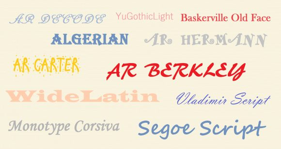
What Is The Best Color for Fonts in a Presentation?
Make sure that the font is in contrast with its background. If the color of the font and the color of the background is too similar, then even a large font will be difficult to read. You might want to avoid Red-Green, Orange-Blue, and Red-Blue color combinations. Instead, try using White or Yellow text on a Dark Background.
Learn to optimize your presentation for people with common forms of color blindness here .
What Is The Best Font to Use in a Presentation?
Common are the best fonts for PowerPoint e.g. Arial, Times New Roman, Calibri, etc. They are simple, universally accepted, and they won’t be problematic when you share your presentation with other people using email.
Only use a fancy third-party font when the presentation computer will have that font installed on it, and if you’re willing to make another version of the presentation for emails.
What Is The Best Size for Fonts in a Presentation?
The size of fonts to use in a presentation depends on the visual acuity of the audience. Perfect vision is 20/20. According to Dave Paradi , font size should be 36 to 44 points for titles, and 24 to 32 points for normal text. That is if we assume that most people in the audience will have a 20/40 visual equity. This is a very conservative number, and it should work for pretty much anyone.
Topics Best color font for PowerPoint presentations Best font size for PowerPoint presentations best fonts for PowerPoint Best fonts for PowerPoint presentations Using new fonts in PowerPoint
Category Presentation Tips
Written by Ahmad
Ahmad is a technology blogger and a Computational Physicist. He breaks down the science of delivering presentations, and shows how to make use of a presentation in business, productivity, and much more
Leave a Reply Cancel reply
Your email address will not be published. Required fields are marked *
Save my name, email, and website in this browser for the next time I comment.
Best PowerPoint Templates
PPT Diagrams & Slide Designs
Microsoft PowerPoint Backgrounds
Privacy Policy
Advertising


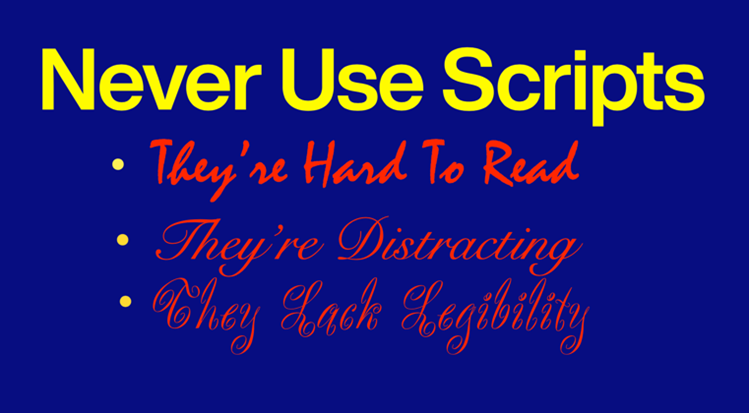


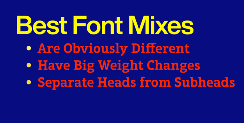
IMAGES
VIDEO
COMMENTS
Presentation font size: Dos and don'ts
Think Outside the Slide has a great font cheat sheets for a number of different screen sizes. 7. Turn Off Animations. Don't let all those PowerPoint tricks suck you in. Moving text, zooming words, letters that fly in from the side of the screen - they are all difficult to read. And really distracting.
Minimum Font Size: A Rule of Thumb. As a general rule, the minimum font size for readability in presentations should be 24 points. This size ensures that your text is legible for most in-person and large-screen virtual presentations. However, this can vary based on several factors discussed below.
What Are the Best Fonts to Use in PowerPoint PPT ...
Selecting the correct font size
Tips for creating and delivering an effective presentation
Keep this from happening by embedding your font in PowerPoint using these easy steps: Click the "File" tab. Move down to the lower-lefthand corner of the window and click "Options.". Click "Save" on the left side of the screen. Scroll down to the section titled "Preserve fidelity when sharing this presentation:".
Calibri. The default champ for a reason! Calibri is friendly and easy on the eyes, making it a solid pick for lengthy presentations where you don't want to tire out your audience. Tahoma. Tahoma's like Arial's more laid-back sibling. It's simple, clear, and does the job well, especially in smaller sizes. Verdana.
How to choose the best fonts for PowerPoint Presentations
Most presentation experts recommend these size ranges. The thumb rule — a larger font size with less text on screen is always good. The default slide in PowerPoint starts with 60pts for section headers and 24pts for body font. Header Font: Between 26 and 42 point. Body Font: Between 18 and 24 point.
Content. Choose easy-to-read fonts. Limit the number of typographies selected. Avoid using similar fonts. Create a visual hierarchy. Be careful when choosing colors. Combine different text weights. Maintain harmony with the design, theme, and audience. Choose easy-to-read fonts.
Step-3: Click on the "Font Size" box. Now you have to click on the "Home" tab in the menu ribbon. In the "Font" group of the "Home" menu, click on the "Font Size" box to type in your preferred font size. You can also select a font size from the dropdown list. Step-4: Click on the "Close Master View" option.
This font can help you create strong titles and distinguishable headings as well as keep your body text looking neat and organized for the most beautiful presentations. 7. Maine: Book Antiqua. Moving on to presentation fonts, here's a clean and modern font based on the roman typeface, Book Antiqua.
Consistent alignment and spacing throughout your presentation contribute to a cohesive and polished look. By paying attention to these details, you can improve the aesthetic appeal of your presentation and enhance the overall user experience, making your message more impactful and engaging. 6. Pair Fonts Together.
The fonts you select play a significant role in conveying your message, setting the tone, and enhancing the overall aesthetics of your presentation. Here are ten tips to guide you in choosing the best PowerPoint presentation fonts: 1. Readability is Key. Prioritize readability above all else. Choose fonts that are easy to read, even from a ...
Here are ten secrets based on years of experience in developing and using presentation slides that will help you move from being technically proficient to using PowerPoint effectively. 1. Start by creating an outline. The most important part of any presentation is the content, not the graphical appeal. That is why you should develop your ...
Don't use fonts that are too small or hard to read: Font size plays an important role in legibility, especially in presentations where the audience may be viewing your slides from a distance ...
Open your PowerPoint presentation. Click on the "View" tab and select "Slide Master". Select the slide master thumbnail at the top of the sidebar. Set the desired font size and style in the Font group on the Home tab. Close the Master View to apply these defaults to all slides.
The size of fonts to use in a presentation depends on the visual acuity of the audience. Perfect vision is 20/20. According to Dave Paradi, font size should be 36 to 44 points for titles, and 24 to 32 points for normal text. That is if we assume that most people in the audience will have a 20/40 visual equity.
Change font size on all slides in PowerPoint
While the answer can vary from project to project, here are some thoughts from DeckRobot to guide you. The Formula. A quick search of the Internet will tell you that the minimum size is from 18 to 36 pt. Admit it - that's quite a range!#nbsp; Figuring that out is more complicated. Dave Paradi created a formula for font size based on the ...
Bold type, size and font changes work fine for typographic emphasizers. Italics with underlines, bold type with drop shadows, and outline fonts with internal textures make presentation graphics look more like circus posters than business communication. How to Create Hierarchy in a PowerPoint or Keynote Slide