Home Blog PowerPoint Tutorials How to Make a Gantt Chart in PowerPoint

How to Make a Gantt Chart in PowerPoint
Even if you are unfamiliar with Gantt charts, you might have seen project schedules represented visually across a series of horizontal lines. These charts help monitor completed tasks and review the schedule in line with the planned timeline for a project. In this article, we will discuss the benefits of Gantt charts and show you how to make a Gantt chart in PowerPoint.
Why use a Gantt Chart in PowerPoint?
Gantt charts are commonly used in PowerPoint to help visualize project timelines through presentation slides. Gantt charts are used as a project management tool that helps plan and schedule projects and provide a visual footprint to assess if the project is on track. The visual representation of a Gantt chart can help represent activities based on a set timeline to project the estimated timeline and assess actual progress made against the planned activities.
Common Questions About using Gantt Charts in PowerPoint
Some of the most common questions about using Gantt charts in PowerPoint are answered below.
a). Can I create Gantt Charts in PowerPoint?
Yes, Gantt charts can be created in PowerPoint using PowerPoint templates and various methods, including charts, tables, and PowerPoint Shapes.
b). Can I add task dependencies in a Gantt chart in PowerPoint?
Yes, adding tasks and dependencies in PowerPoint Gantt charts is easy, as each section is editable.
c). Is it possible to customize the appearance of the Gantt chart in PowerPoint?
Depending on how your Gantt chart is made, PowerPoint Gantt charts can usually be edited using formatting features such as Shape Format, Table Design, and Chart Design options.
d). Can I add more tasks to the Gantt chart after creating it in PowerPoint?
Yes, most Gantt charts and templates are editable and can be modified to add more tasks.
How to Create a Gantt Chart in PowerPoint
You can create a PowerPoint Gantt chart using various methods or use PowerPoint templates . In the examples below, we will show you how to create a Gantt chart in PowerPoint using a bar chart and PowerPoint Shapes.
Create a Gantt Chart using a Bar Chart in PowerPoint
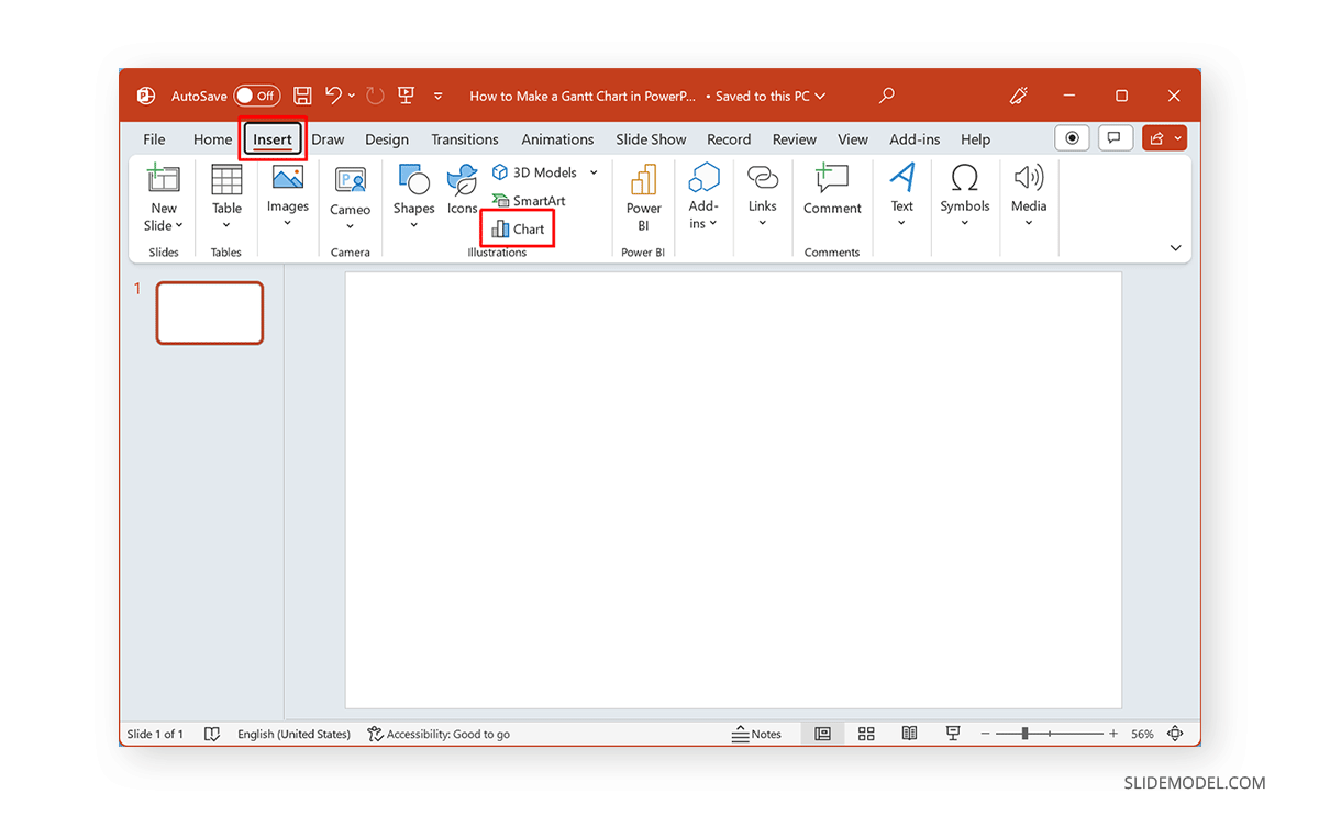
Step 1: Go to the Insert tab in PowerPoint and select Chart .
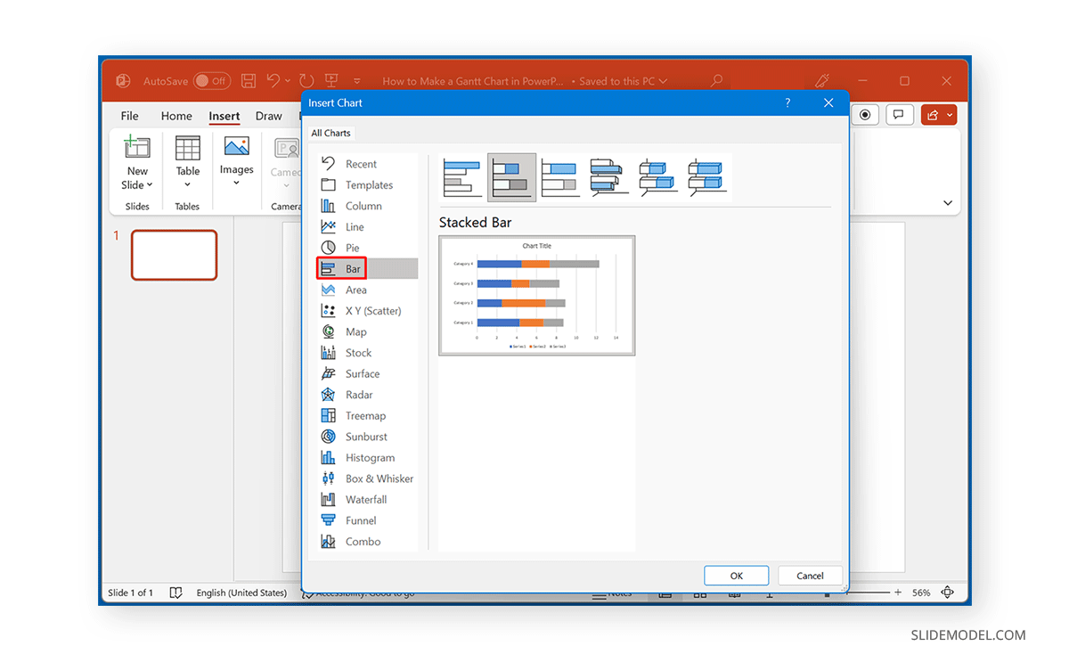
Step 2: Select Bar from the Insert Chart dialog box and select a Stacked Bar Chart to insert in PowerPoint.
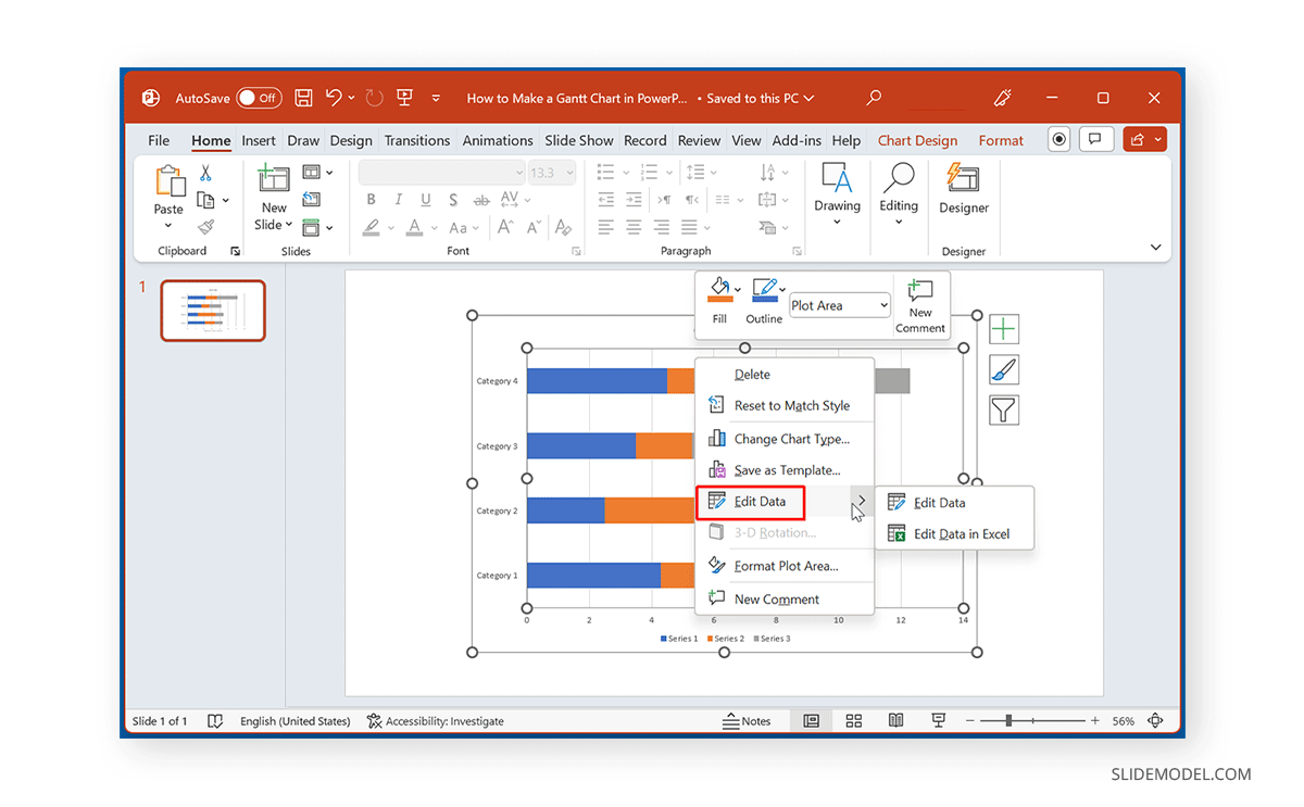
Step 3: Edit the default bar chart. You can do this by selecting Edit Data via the right-click menu or from the Chart Design tab.
Step 4: Edit the chart information to reflect details for your Gantt chart. You can use a combination of dates, days, tasks, or other sequences to design your Gantt chart.
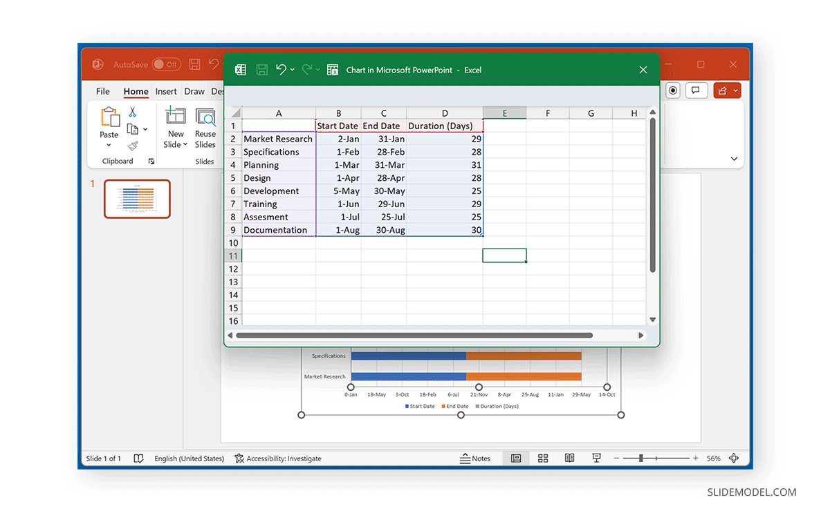
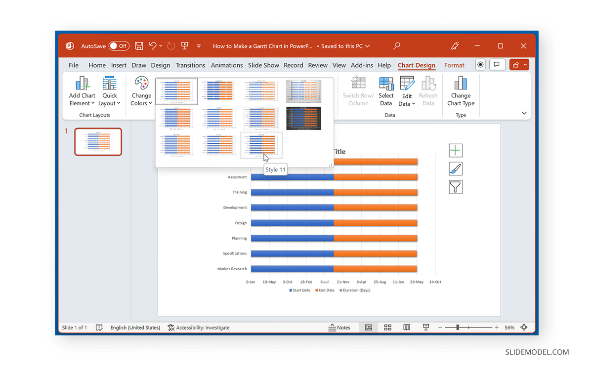
Step 5: Select a chart style and colors for your Gantt chart from the Chart Design tab. You can also format the layouts using Chart Design -> Quick Layouts .
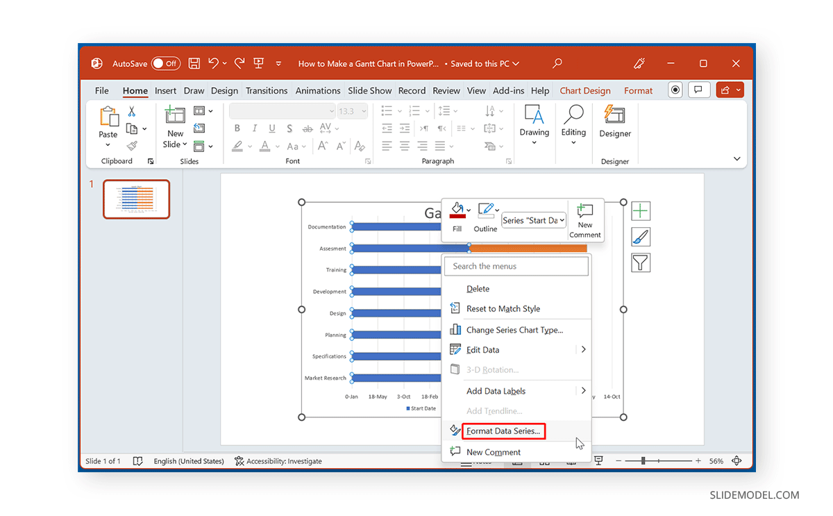
Step 6: Right-click the chart and select Format Data Series .
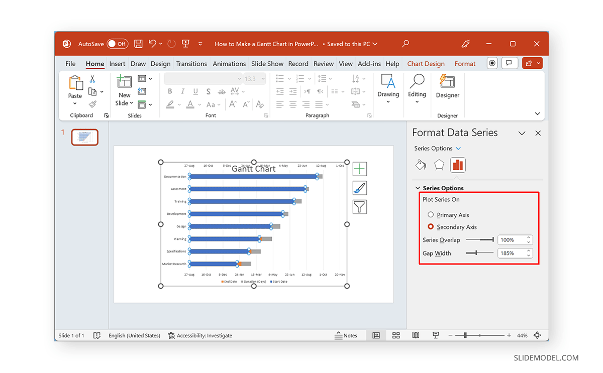
Step 7: From the Series Options on the right pane, select the format for your Gantt chart. For example, you can stick to the Secondary Axis only and hide the Primary Axis (as shown below).
Step 8: From Format -> Shape Fill , remove the fill color for one of the Axis to hide it.
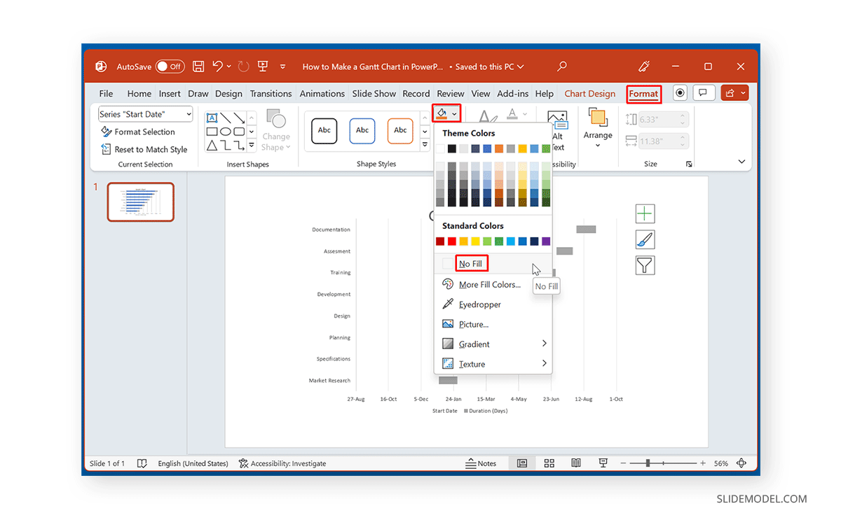
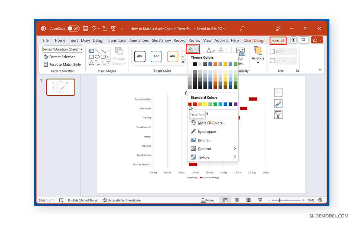
Step 9: Select a color for the Axis you intend to show to highlight it.
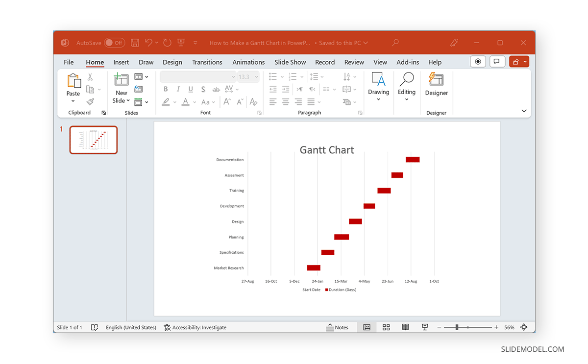
Below is an example of a Gantt chart showing the Secondary Axis across a timeline.
Create a Gantt Chart using a Bar Chart in PowerPoint using a Table and PowerPoint Shapes
Step 1: To create a Gantt chart using a table and PowerPoint Shapes, insert a table in a PowerPoint slide via Insert -> Table .
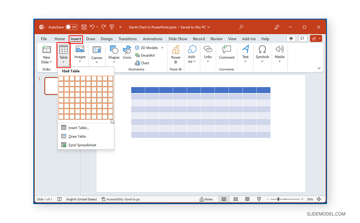
Step 2: Depending on the requirements for your Gantt chart, label the table, such as by adding activities and a timeline.
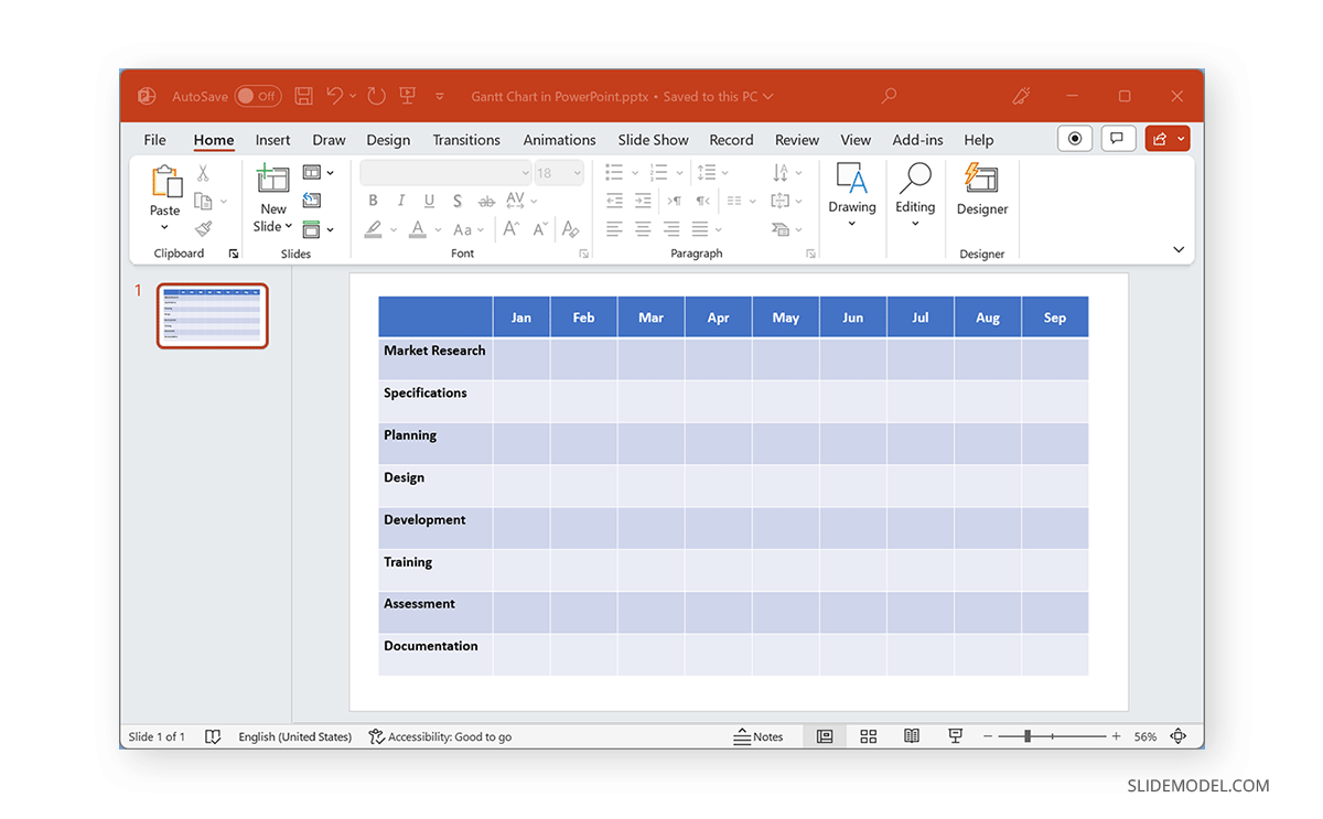
Step 3: Select a shape to mark your timeline on the Gantt chart. You can use shapes based on activities or workflow or pick a desired shape to highlight activities across dates, months, weeks, etc.
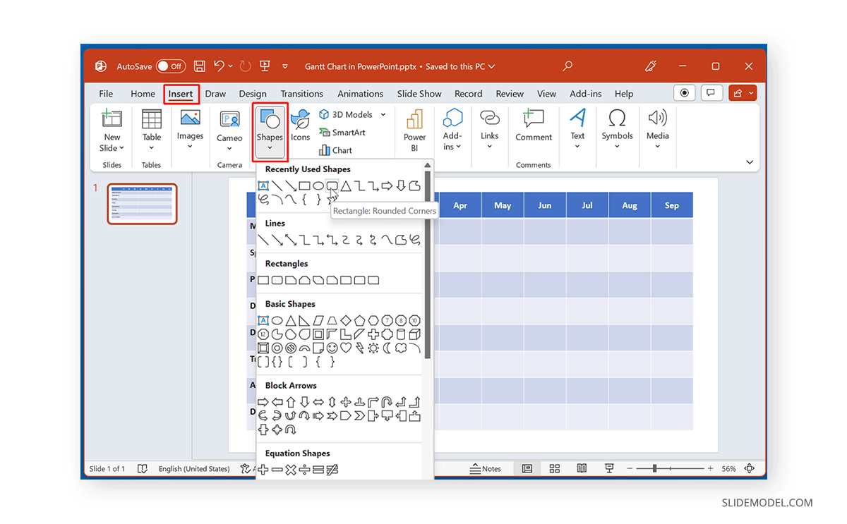
Step 4: Mark the Gantt chart with the selected shape to create a timeline for your activities.
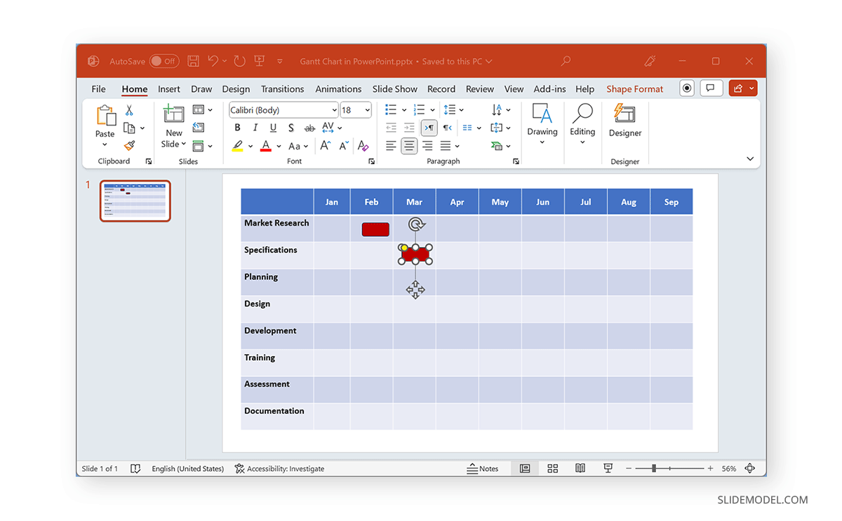
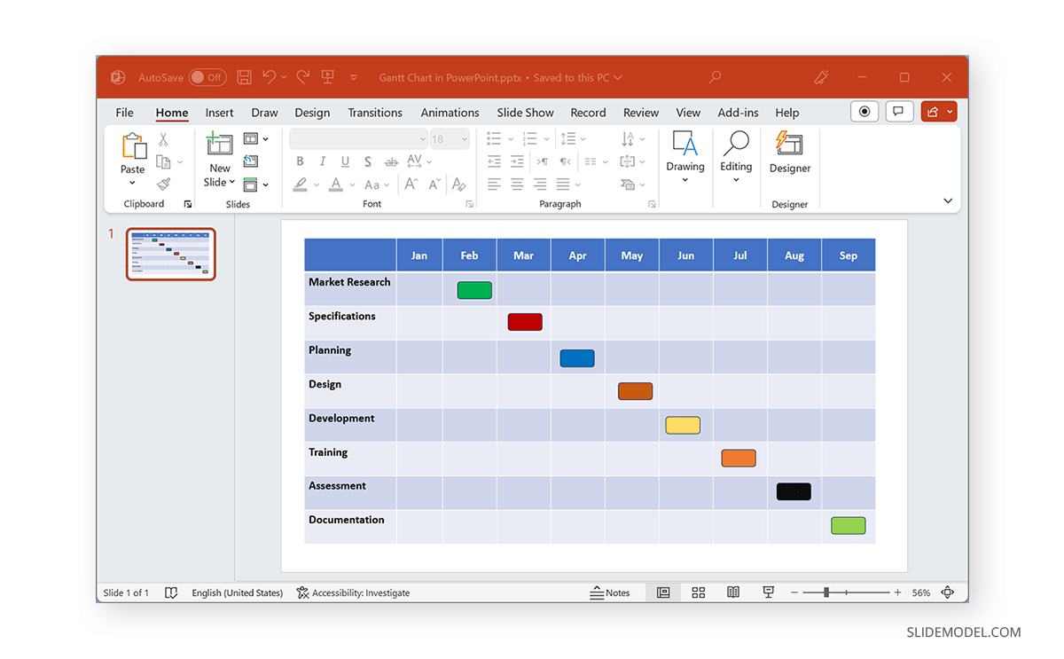
Below is an example of a Gantt chart created using a table and rectangle shapes.
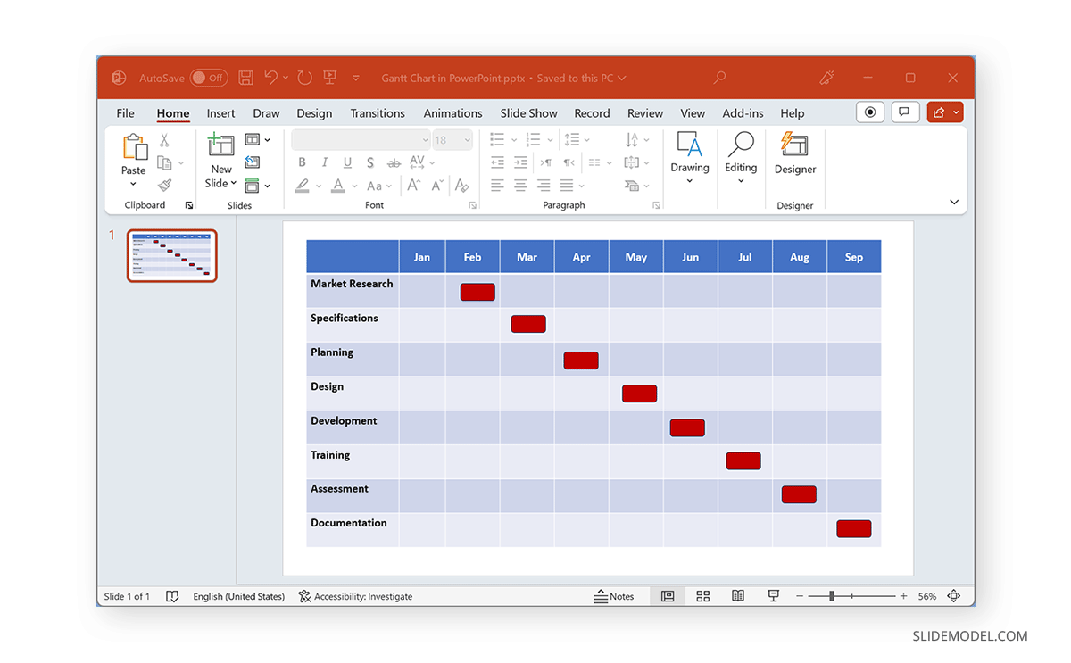
Using the Shape Format tab, you can also format the added shapes on your Gantt chart. From here, you can change the color of the shapes, shape styles, and alignment of the added shapes.
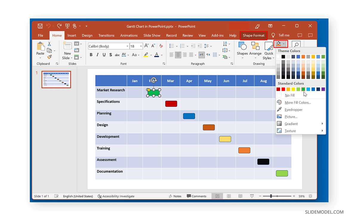
With the help of a simple table and PowerPoint Shapes, you can create customizable Gantt charts that can be easily edited and adjusted according to need.
Create a Gantt Chart using PowerPoint Templates
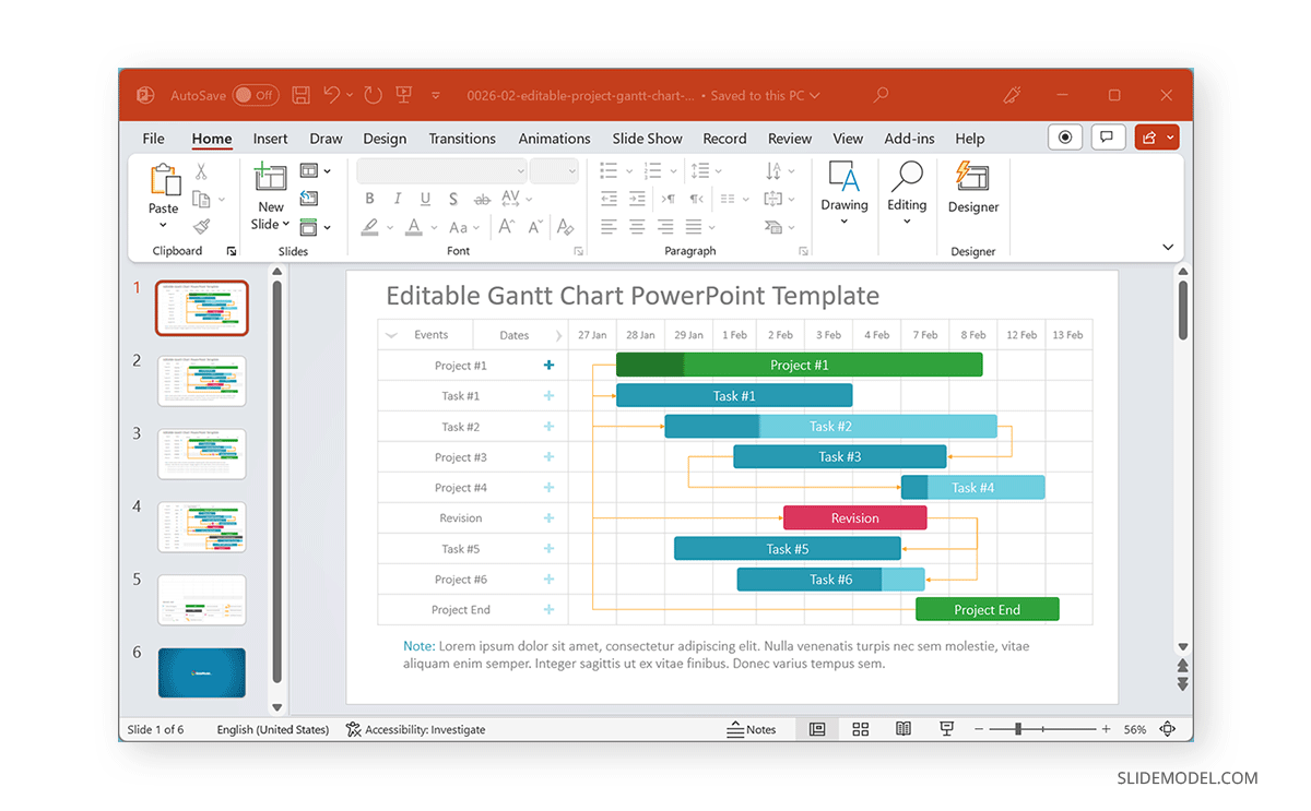
You can use PowerPoint templates to create Gantt charts to save time and effort. SlideModel provides a variety of Gantt Chart Templates that can help you easily design your charts by adding text to placeholders and adjusting the given timeline markers.
Yes, Gantt charts can be created in PowerPoint using templates, charts, tables, and shapes.
Yes, you can easily add tasks and dependencies in PowerPoint Gantt charts, as each section is editable.
Yes, depending on how your Gantt chart is made, you can customize it using formatting features such as Shape Format, Table Design, and Chart Design options.
To create a Gantt chart using a bar chart, insert a Stacked Bar Chart via Insert -> Chart, edit the data to reflect your timeline, and format the chart using the Chart Design and Format Data Series options.
Insert a table via Insert -> Table, label it according to your requirements, and use shapes to mark your timeline. Adjust the shapes and table as needed to complete your Gantt chart.
Using PowerPoint templates, such as those provided by SlideModel, can save time and effort. These templates come with placeholders and timeline markers that can be easily adjusted.
Gantt charts help visualize project timelines, plan and schedule projects, and provide a visual footprint to assess a project’s progress.
You can format shapes using the Shape Format tab, where you can change the added shapes’ color, style, and alignment.
Third-party templates, such as those from SlideModel, offer more comprehensive customization features and editable designs that are easier to customize than default templates.
Final Words
You can create Gantt charts in PowerPoint using bar charts or tables and shapes in PowerPoint. However, using readymade templates can help reduce your time and effort in creating and designing such charts. While you can use default Gantt Chart PowerPoint templates by Microsoft 365, third-party templates like the ones provided by SlideModel come with more comprehensive customization features with editable Gantt chart designs that are easier to customize.
Like this article? Please share
Gantt Charts, PowerPoint Shapes Filed under PowerPoint Tutorials
Related Articles
Filed under PowerPoint Tutorials • October 23rd, 2024
How to Duplicate a Shape in PowerPoint
Speed up your presentation design workflow by learning how to duplicate a shape in PowerPoint. Ideal to create custom layouts in minutes.
Filed under PowerPoint Tutorials • October 9th, 2024
How to Make a Shape Transparent in PowerPoint
Improve the aesthetics of your slides by learning how to make a shape transparent in PowerPoint. An ideal resource for creating complex graphic effects.

Filed under PowerPoint Tutorials • July 17th, 2024
How to Apply Text Shadow in PowerPoint
Become a master of shadow effects in PowerPoint. Follow this step-by-step tutorial on how to apply text shadow.
Leave a Reply
Number of items in cart: 0
- Your cart is empty.
- Total: $0.00

- PowerPoint Templates
- PowerPoint Diagrams

PowerPoint Gantt Chart: A Complete How-To Guide
In today’s fast-paced project management environment, visualizing tasks and timelines becomes crucial for success. A PowerPoint Gantt chart offers a clear and effective way to showcase project schedules, helping team members understand project milestones and deadlines at a glance. By integrating a Gantt chart in PPT, you enable a streamlined communication process, fostering a collaborative work environment. Whether you’re using the best project management software or manually creating schedules, the intrinsic value of a PowerPoint Gantt chart lies in its ability to simplify complex project information into an easy-to-understand visual format, making it an indispensable tool for project managers and teams across various industries.
This article will guide you through the steps on how to create a Gantt chart in PowerPoint, from manually crafting one to leveraging automated tools such as Office Timeline. Furthermore, it will explore different PowerPoint Gantt chart templates that can provide a head start in your chart creation process. Additionally, effective tips for creating impactful Gantt charts in PowerPoint will be shared, ensuring your charts are not only visually appealing but also functionally rich in conveying your project’s timeline. By the end of this guide, you will be well-equipped to create, customize, and utilize a Gantt chart for PowerPoint, enhancing your project presentations and management efforts.
How to Manually Create a Gantt Chart in PowerPoint
Set up a stacked bar chart.
To begin creating your Gantt chart in PowerPoint, start by setting up a basic graphic as a Stacked Bar chart. This will be the foundational structure of your Gantt chart. Once you complete this initial step, a standard chart along with an Excel table pre-filled with placeholder data will be inserted onto your PowerPoint slide. You can then replace this data with your own project-specific information. • Go to the Insert tab • click on Chart • select Stacked Bar • Click OK

Enter Project Schedule Data
The next step involves entering your project schedule data into the chart. Break down your project into main phases or tasks, which will form the basis of your graphic. Assign a start date, end date, and duration for each task, which is the number of days required to complete each task.

Format for Gantt Chart
After setting up your Stacked Bar chart and entering the data, you need to format your graphic to transform it into a Gantt chart. Achieve this by making the blue sections of the bars transparent, leaving only the grey sections visible. These remaining bars will represent the tasks on your Gantt chart, clearly delineating the timeline of each project phase.

Customize Your Gantt Chart (Optional)
Finally, customize your Gantt chart to make it unique and tailored to your project’s needs. This customization can involve adjusting the color schemes, and text alignment, and adding specific design elements that enhance the readability and aesthetic appeal of your Gantt chart, ensuring it effectively communicates the project timelines and milestones.
Pre-designed PowerPoint Gantt Chart Templates
Using pre-designed Gantt chart templates in PowerPoint offers significant advantages. Primarily, they save time and effort as you are not required to create charts from scratch. Simply download a template and input your project details. These templates are designed to be highly customizable, allowing you to modify colors, and fonts, and add specific design elements like logos or notes, making your chart unique and tailored to your project’s needs.For those looking for the best project management tools , Gantt chart templates are an essential resource to streamline processes and improve task tracking efficiency.
Moreover, Gantt chart templates enhance project organization and visibility. They help in defining project scope, identifying critical paths, and allocating resources effectively. By providing a clear visual timeline of tasks and milestones, these templates keep the team informed and reduce the need for constant updates and meetings. This not only improves collaboration among team members but also aids in proactive management of the project, ensuring that all tasks are completed on time.
Tips for Creating Effective Gantt Charts in PowerPoint
1. Choosing the Right Template When selecting a PowerPoint Gantt chart template, it’s crucial to choose one that aligns with the specific needs of your project. Templates vary in complexity and design, from simple timelines for straightforward projects to more detailed charts that include dependencies and milestones for more complex initiatives. Utilize the available free templates such as the Simple Gantt Chart or the Project Management Gantt Chart to get a head start.
2. Customizing for Enhanced Visual Appeal Customization is key to making your Gantt chart not only functional but also visually appealing. Consider changing the color, shape, or pattern of task bars to differentiate between types of tasks or milestones. Adding specific project information like task names, start dates, and completion percentages directly on the Gantt bars can also enhance clarity and provide essential details at a glance.
3. Maintaining Clarity and Legibility To maintain clarity and ensure that your Gantt chart is easy to understand, keep the design simple and organized. Avoid clutter by limiting the amount of text and focusing on essential elements such as tasks, durations, and dependencies. Use clear, legible fonts and appropriate bar heights to make the information accessible. Regularly update the chart to reflect current progress, and consider using styles and effects sparingly to maintain legibility.
Throughout this guide, we have explored the intricacies of creating and utilizing a Gantt chart in PowerPoint, highlighting the steps involved. By dissecting the process from choosing the right template to customizing your chart for maximum visual appeal and clarity, we’ve underscored the immense value that well-crafted Gantt charts bring to project management. They not only simplify complex project timelines into digestible visuals but also enhance communication and collaboration within teams, making them indispensable tools in today’s project-driven work environment.
As we conclude, remember that the effectiveness of a Gantt chart in PowerPoint hinges on its ability to clearly convey project timelines and milestones. Utilizing pre-designed templates can significantly ease the creation process, providing a professional look with minimal effort. However, the customizations and attention to detail in presenting the information are what truly elevate your Gantt chart. Whether you’re managing a small team project or overseeing a large-scale enterprise initiative, the insights gained here should empower you to leverage PowerPoint Gantt charts to their fullest potential, driving your projects to successful completion.
FAQ’S
To manually construct a Gantt chart in PowerPoint, start by opening PowerPoint and setting your slide to a Blank layout from the Home tab. Next, navigate to the Insert tab and click on Chart in the Illustrations section. From the All Charts list, select the Bar category and then choose the Stacked Bar type for your Gantt chart.
To edit a Gantt chart in PowerPoint, double-click on the chart area (but not directly on the bars) to open the Bar Styles window. In the Name column, choose the type of Gantt bar you wish to format, such as Task or Progress, and then click on the Bars tab to change the color, shape, or pattern of the bars.
To build a basic Gantt chart, begin by setting up your project details. Then, add tasks to your project and schedule them accordingly. Next, incorporate important project milestones and establish dependencies for tasks that require them. Finally, invite participants to your project and assign tasks to the responsible individuals.
To make a timeline chart in PowerPoint, go to the Insert tab and select SmartArt. In the Choose a SmartArt Graphic gallery, click on Process and then double-click on a timeline layout of your choice. You can choose from layouts like Basic Timeline and Circle Accent Timeline, or use any process-related SmartArt graphic.
Categories: How To Presentations
Latest Products

Business Pitch Deck PowerPoint Tem...

Modular PowerPoint Template

Funnel Diagram PowerPoint Template

Business Presentation Template for...

Business to Business Marketing Pla...
- Business (20)
- How To (18)
- Inspiration (3)
- Knowledgebase (18)
- PowerPoint Tutorials (2)
- Presentations (33)
- How to Create a Gantt Chart in PowerPoint
- Tips to create Gantt chart
Recent Blog Post

AI Homework Helper in Creating P...

Mobile friendly Presentations: S...

Guide to Creating Effective Busi...

Top Virtual Presentation Tips

Insights into Crafting an Effect...
Related blog post, popular blog post.

PowerPoint Presentations Evolving wit...


10 Psychological Tricks to Keep Your...

How Roadshow Presentations Impact Bus...
Featured products, business presentation template for po....

Business Deck Template for PowerPoint

Brando Multipurpose PowerPoint Template
Share your valuable opinions cancel reply.
Critical PowerPoint Shortcuts – Claim Your FREE Training Module and Get Your Time Back!

2 Crazy-Fast Ways to Make a Gantt Chart in PowerPoint
- PowerPoint Tutorials
- Charts & Data Viz
- March 24, 2016
How do you quickly turn your Excel data into visual PowerPoint layouts in minutes, rather than hours? There are two super fast ways to do this:
The first technique we’ll cover is an insanely clever PowerPoint hack (that few know about), and the second is an awesome add-in you can get to do all of the heavy lifting for you.
They both adhere to the Golden Rule of Speed Training:
Never do anything manually in PowerPoint that PowerPoint can automatically.
Whereas most people would insert shapes and copy/paste and/or retype their text, moving from Excel to PowerPoint, we’re going to focus on getting PowerPoint to do the heavy lifting for you, because…
The less manual-mumbo-jumbo you have to do to build your graphic, the more you can get done!
For this PowerPoint tutorial, I’ll focus 100% on creating Gantt Charts or timelines, but the same rules and hacks apply to any other Excel data you might have, BUT…
Let’s first get this out of the way.
Yes…your Gantt Chart data is easy to type up and hold in Excel (what I call listy-Excel ).
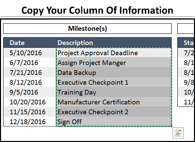
But it looks 1,000% better when presented properly in PowerPoint (what I call vsual-PowerPoint ).
That’s why I advocate taking your Gantt data from Excel and pushing into PowerPoint, AND…
I’ll show you how to do it (see the graphic below) in less than 12 minutes with pure PowerPoint skills, and then how to do it 24x faster (in less than 30 seconds) using an add-in.
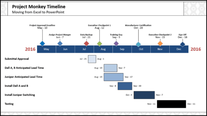
And the two main obstacles you need to overcome when moving form listy-Excel to visual-PowerPoint are:
Obstacle #1: Getting started without going crazy
Getting your Excel information in PowerPoint shapes that you can then fully manipulate is a no-starter for most people…
BUT it doesn’t have to be!
What can take most people 10, 20 or even 60 minutes to pull off, I’ll show you how to do in just a few minutes.
Obstacle #2: Updating the data after the fact
This is the classic Excel to PowerPoint challenge. How do you quickly update your information without spending hours re-manipulating your objects or having to start all over again?
That’s where these two clever techniques come into play…
The first is an insanely clever PowerPoint hack (that few know about); and the second is an add-in you can get to do all of the heavy lifting for you.
And even though you will fall in love with the add-in (covered below), the first hack is something EVERY PowerPoint Ninja should know, so don’t skip ahead just yet.
Technique #1: DIY your Gantt chart
This first technique is a PowerPoint hack that every professional should know, as it makes moving between Excel and PowerPoint almost too easy.
This is the fastest way I know of (other than the add-in) to turn lists of data into Excel, into visual layouts in PowerPoint. This is PowerPoint Speed Training at its best!
Visual learners can watch the video below, otherwise skip the video and read on.
You are currently viewing a placeholder content from YouTube . To access the actual content, click the button below. Please note that doing so will share data with third-party providers.
For Mac users, you can see the caveats for doing this below. You can also learn more about creating Gantt charts on a Mac here .
Note: This works best for single columns. If you have multiple columns, you will need to repeat these steps multiple times, but don’t worry…it’s fast and fairly painless.
Step #1: Copy the data from your Excel spreadsheet
From PowerPoint, navigate to Excel and select the range of data that you want to turn into individual shapes in PowerPoint.
Step #2: Paste your column of data into PowerPoint as text
After copying your information in Excel, hit ALT + TAB to flip back to PowerPoint and hit CTRL + V to paste…
And immediately notice that you have a Paste Special icon in the lower right-hand corner of your pasted object.
To learn other cool Windows 10 shortcuts like Alt + Tab, check out the video below, or see our blog post here .
Note: The icon below only shows up when you first paste something into PowerPoint. If don’t see it, delete the object on your slide and hit CTRL + V again.

Open up the Paste Special dialog box and select the last option, Keep Text Only
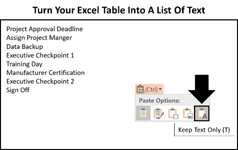
Although it doesn’t look like you have a lot at this point, bear with me…
Step #3: Convert your list of text into SmartArt
Select the text box on your slide (so that you have a solid outline around it), navigate to the Home Tab, open up the Convert to SmartArt dropdown and you want to focus on two options here.
This is VERY IMPORTANT.
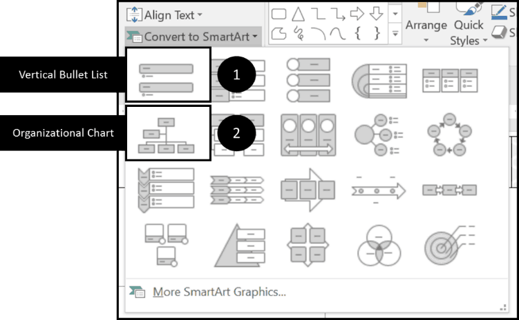
Option #1: The vertical bullet list
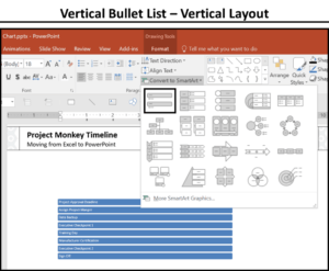
Selecting the Vertical Bullet List option turns your graphic into a vertical column of shapes. In this case, the Vertical Bullet List is perfect for the categories and dates beneath our timeline.
Option #2: The organizational chart
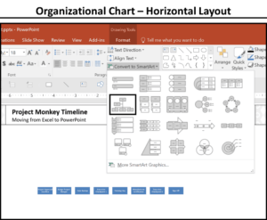
Pick either one of these (I will continue on with the vertical layout).
If you’ve never seen that before, that should already explode your mind…but we are just getting started.
Regardless of which of the two different layouts you use, just make sure you don’t stop here. Next you want to…
Step #4: Pick your SmartArt graphic
Select your SmartArt graphic and hit the ungroup shortcut (CTRL + SHIFT + G) twice.
- CTRL + SHIFT + G the first time breaks the graphic into a group of objects
- CTRL + SHIFT + G a second time breaks the graphic down into individual objects
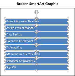
Doing so gets all of your Excel data into individual rectangles that you can then work with which is much faster than trying to retype it yourself.
Step #5: Repeat for your other columns of Excel data
Repeat the same process for whatever additional columns of Excel data you need to convert to PowerPoint shapes for your Gantt chart graphic.

Again, make sure you choose the correct SmartArt graphic to get your shapes started in the correct position.
Note: For the dates, I used a custom excel data format “mmm – dd” to get the month’s name and the actual date.
Step #6: Rearrange, format, and align your objects
From here, you will need to rearrange, format and align your objects.
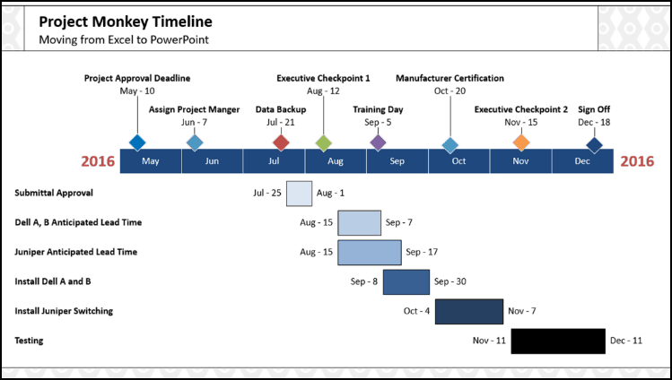
There are 3 major downsides to this technique:
Downside #1: Manually arranging and formatting your objects
Although the SmartArt Ninja trick for turning your Excel data into PowerPoint objects is awesome, you still need to manually update, format and align your objects.
How long it takes you depends on how much speed training you’ve had.
Downside #2: The timeline is not 100% exact
Let’s face it, if you are manually moving things around in PowerPoint for a timeline, things will not be 100% exact.
In the graphic above, I guesstimated where the dates start and stop…I didn’t not figure out the exact place where Sept-8 should line up with the Sept rectangle, for example. In this case I think it’s fine, but if you want 100% precision, you want the add-in I’m about to show you next.
Downside #3: Updating the Gantt chart
As the graphic is manually built by you, updating your Gantt Chart requires you to do it manually. There is no way to dynamically link the Gantt Chart up with your Excel spreadsheet.
On the flip side, there is an add-in that will do ALL of this heavy lifting for you.
Technique #2: The Office Timeline add-in
Now let’s look at the big guns for building Gantt Charts quickly – the Office Timeline+ add-in.
If you build lots of project charts and timelines like this, you simply need to get the Office Timeline+ add-in which does ALL of the heavy lifting for you including:
- Building the entire graphic for you
- Allowing you to quickly change elements within the graphic
- Allowing you to quickly update the data sets
- Building the time sequence for you and keeping it all exact (and I mean PERFECTLY exact)
If you have a lot of Gantt charts to create and manage, you’re going to want the Office Timeline+ add-in as it will not only make building the original Gantt chart easier…
But will also allow you to dynamically update the Gantt chart after the fact, which is super cool!
You can download a free version of Office Timeline add-in here , just note that to paste from Excel to PowerPoint, as I show you below, you will need the paid version.
That said, we think this add-in does SO MUCH, that the price is a big time steal!
Step #1: Start a new Office Timeline+ graphic
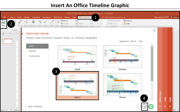
Select the Office Timeline+ tab in your Ribbon (1). Then, select New, in the upper left-hand corner (2).
Next, select your graphic style, I’ve selected the Metro style here (3). And finally, select the arrow to advance to the Milestones tab (yes, it’s that easy!) (4).
Step #2: Copy and paste your milestones
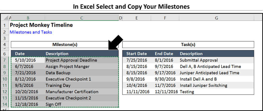
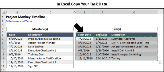
Hit ALT + TAB to toggle to Excel (if you already have it open). In your Excel sheet select your milestones (make sure to include the dates as well) and hit CTRL + C to copy them.
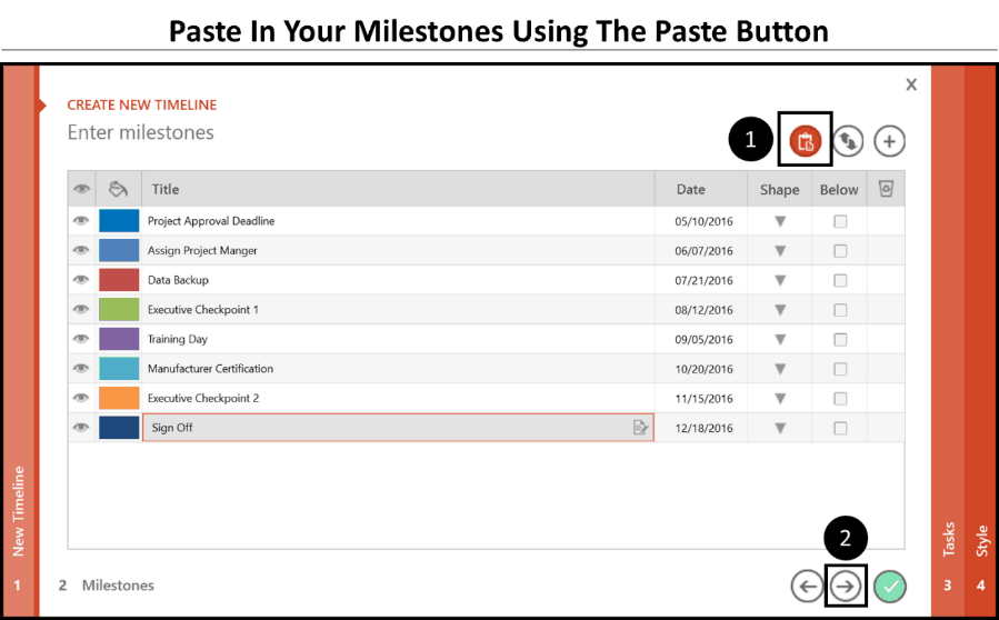
Now ALT + TAB back to PowerPoint, and in the Milestones window, paste in your milestones using the paste Icon (1)
To see the ALT + TAB shortcut in action, see Top Windows 10 Shortcut #5 below.
After pasting, click on the right arrow to navigate to the Tasks tab (2).
Step #3: Copy and paste your tasks into the wizard
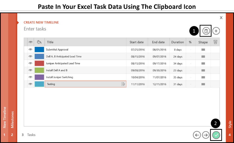
Once more, hit ALT + TAB to jump back to PowerPoint and using the paste icon up in the upper right-rand corner, paste in your task data (1).
Now click the check-mark to finish (2).
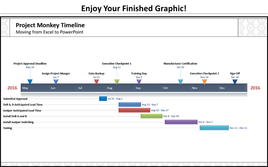
Step #4: Appreciate your chart!
Holy smokes, this chart was created in less than 30 seconds! That is the fastest way to make a Gantt chart in PowerPoint that I know of.
The add-in will insert a new slide (it’s a special Office Timeline+ slide that helps run the graphic), so you’ll need to add your Title and/or Subtitle back, but that’s a small price to pay for all of the time savings.
Step #5: Format your graphic
At this point there is a TON you can do to format and customize your graphics. To see my 5 favorite formatting features of Office Timeline+, including how to turn your graphic into a table, check out the 5 Favorite Office Timeline+ Tricks blog post .
Next steps for your Gantt Chart or timeline
Before we get to formatting the graphic, let’s look at what we have accomplished.
Instead of manually adding shapes to your PowerPoint slide and copying/pasting or retyping your text, which violates our Golden Rule of Speed Training:
Never Do Anything Manually That PowerPoint Can Automatically Do For You
Instead we looked at:
- How to turn your Excel data into PowerPoint shapes using and breaking SmartArt graphics. Remember, you can stack your data both vertically and horizontally.
- How to use the Office Timeline+ add-in to crank out Gantt charts and timelines 24 times faster than you could on your own.
And the truth is that, using the Office Timeline+ add-in…
The fun has just begun!
Once your information is within the graphic, there is a TON of formatting the graphic can AUTOMATICALLY do for you, all of which I cover in the following post.
What’s Next?
Related articles.
- What is a broken link chart in PowerPoint (and how to fix it)?
- Bar chart trick: Right aligning categories (PPT, Word, and Excel)
- PowerPoint settings: program level vs. presentation level
- What is a linked Excel chart in PowerPoint?
- Set Up Slide Show: Customize how your PPT presentations run
About The Author
Popular Tutorials
- How to Strikethrough Text (l̶i̶k̶e̶ ̶t̶h̶i̶s̶) in Word, Excel & PowerPoint
- How to Make Animated Fireworks in PowerPoint (Step-by-Step)
- Strikethrough Shortcut (l̶i̶k̶e̶ ̶t̶h̶i̶s̶) for Word, Excel & PowerPoint
- How to Create a Flash Card Memory Game in PowerPoint (Like Jeopardy)
- Keyboard Shortcuts Not Working: Solved
PowerPoint Tutorial Categories
- Strategies & Opinions
- Shortcuts & Hacks
- Presentation Design
- Pictures, Icons, Videos, Etc.
- New Features
- Miscellaneous
We help busy professionals save hours and gain peace of mind, with corporate workshops, self-paced courses and tutorials for PowerPoint and Word.
Work With Us
- Corporate Training
- Presentation & Template Design
- Courses & Downloads
- PowerPoint Articles
- Word Articles
- Productivity Resources
Find a Tutorial
- Free Training
- For Businesses
We help busy office workers save hours and gain peace of mind, with tips, training and tutorials for Microsoft PowerPoint and Word.
Master Critical PowerPoint Shortcuts – Secure Your FREE Training Module and Save Valuable Time!
⌛ Master time-saving expert techniques.
🔥 Create powerful presentations.
🚀 Propel your career to new heights.
We value your privacy – we keep your info safe.
Discover PowerPoint Hacks Loved by Industry Giants - KKR, AmEx, HSBC!
Over 114,880 professionals in finance, marketing and sales have revolutionized their PPT skills with our proven methods.
Gain FREE access to a full module of our premium PowerPoint training program – Get started today!
We hate spam too and promise to keep your information safe.
You are currently viewing a placeholder content from Facebook . To access the actual content, click the button below. Please note that doing so will share data with third-party providers.

IMAGES
VIDEO